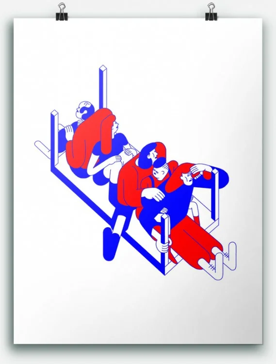
Street scenes, building a sense of community and turning the unseen into heroes
I felt instantly at home after meeting Sarah Adams, she was warm and gracious and we hit it off straight away. Our encounter was through her partner who fixed my musician boyfriend's trumpet, which I swear is not a euphemism for something else, he actually repairs instruments.
Anyway, after a few catch ups with heart-warming new friends, I discovered Sarah had done more than a stint in the world of illustration, but was adamant that wasn’t ‘happening’ anymore. Out of curiosity I asked to see some of her work, but she became shy and introverted, only adding to my intrigue.
In the end she did let me see one or two pieces, and I was bowled over with what she’d presented, it had such an impact. I felt like I knew the places on the page she’d drawn, the people she’d depicted. I was brought up in Hackney, the place in question, so her ability to show it off with such a visceral energy kinda broke me.
I was hell bent on speaking to Sarah further not only to bring her work to the forefront, but also to lift the proverbial shadow she’d casted over it.
Once we’d aligned our schedules I rocked up to her place with a packet of custard creamed biscuits in one hand, and a note full of questions in the other, and it wasn’t long until she jumped in to tell me about her work-space. Yeah this bit is my corner, I have all my special books, my paints, and this is how I organise it. It very much says a lot about me…course it’s a mess, and I think it's good to show it in a complete and utter mess.
I add that most artists liked working in a disorganised functional space which she considers and smiles at. Totally, but this has evolved over 10 - 20 years actually, I was doing a lot of photoshop on my computer which is why I have this big screen, I did a few books which I had to relay and send online.
Books? This is news to me. We've spoken a few times and Sarah’s never mentioned about being published, not that she’s obliged to but this revelation feels even more of a privilege, to see her ready to share something she’d been initially so modest about. I was going through the drawers to show you what I have and it’s a bit of a mish mash, there are loads of really old stuff, but it’s all been a journey.
What has led you to this point? Oh god it goes right back to Central Saint Martins in London when I did a post grad in illustration, which was about 30 years ago and it sort of built from there. I went on to do magazine illustration, then I started to get into children’s books because someone saw my work, and I ended up working for Walker books. I went on to do a post grad in children’s illustration after that.
Sarah's partner comes in as she’s talking and she politely tells him that she’s busy, before seamlessly carrying on from where she left off. So I took some key bits out, like the sketch book I showed you.
She begins to flick through a series of drawings of kids playing, sitting, jumping and I take the opportunity to ask if she can remember when her love of art started?
When I was around 15 I had to start looking at what to do for a career, and I remember looking through these books and one of them said something about being an illustrator, and I never thought of doing that. At that point the direction changed, and I went and did an art foundation.
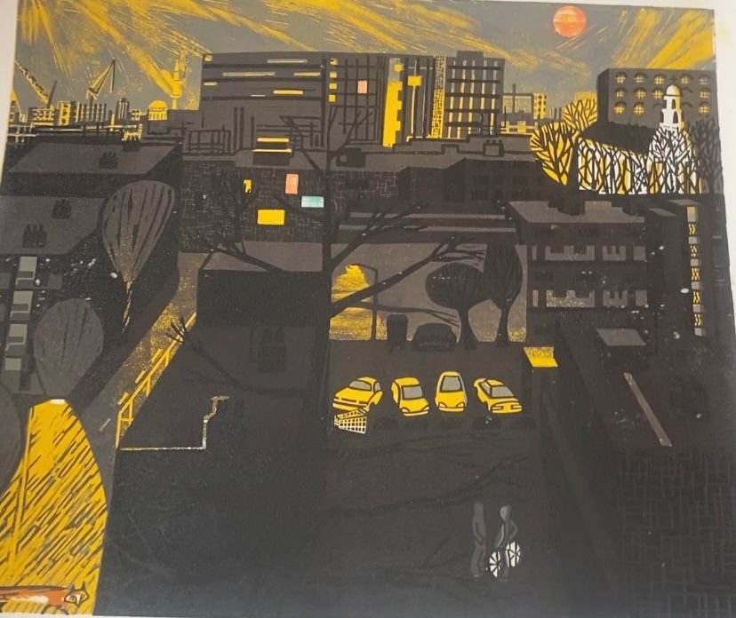
I hate to ask the next question especially as I can see Sarah is surrounded by a sweet shop of memories, but I wonder if she can choose three pieces that represent her work. She goes ahead and rummages through papers in her blue dungarees and red long sleeved top, to show me a lino cut print she made. Ok, so, this is my estate…I just love the view outside my window and this is it at night. The lino print has many elements from intricate markings of light and dark, the London’s skyline in the distance, the fox below with an abandoned shopping trolly in the scene and I get the sense of what is often synonymous in Sarah's work whether she knows it or not, and that’s to make the often forgettable or lost subject the hero of her work.
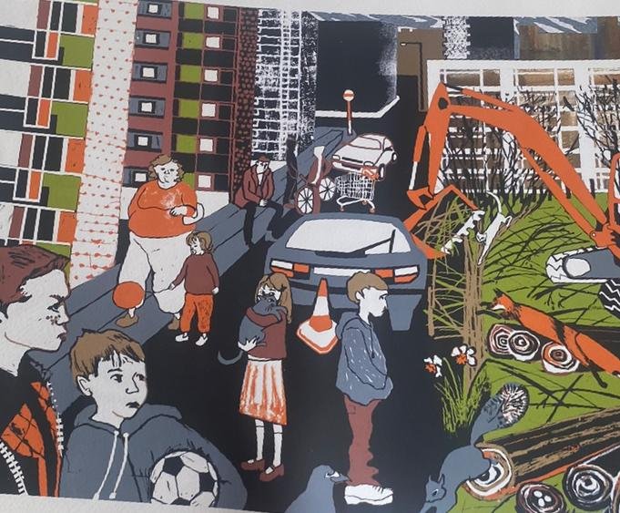
Oh and there’s this, it’s based around the fairytale ‘The red shoes’ she says drawn to another of her pieces. I basically wanted to update the story because I’ve always loved it. The expressions that Sarah captures in this eclectic street scene where the protagonist Karen is on the run, is full of character; and I’m so taken with the illustration’s punchy authenticity that I can almost smell the chip fat clinging to the pavement and hear reggae bouncing in the air. I am transported.
Sarah finally sets her heart on the third piece with a project called ‘Lucas Eden’. It’s about a boy and his grandmother who moved to an estate like this. Sarah is now on her feet, directing my gaze outwards to a grey sky and concrete jungle of 30 or so flats below, the setting has an important relationship with the story she’s about to embark on.
So, Luca and his grandmother moved here from eastern Europe, I haven’t specified where exactly but they’ve been given a place to stay. They look out of the window and see land, and want to create a garden because they feel isolated coming from a different country. But this land is in danger because the authorities want to build on it, so they try to save it. Sarah goes on to talk about where she lives and what that means to her.
There’s been a movement on our estate and in our community garden about bringing people together. Local people have taken ownership of that around here, they’ve not been led by councils or paid people, they’ve taken initiative themselves to expand it. It’s very much resident led here, and longer lasting because of it.
I want to know what Sarah believes makes a good illustrator? Having a sense of place, I think you can take inspiration from your own experience, where you live, or the people you know. I think it makes it more personal, now most of my work is based around London but in some cases in children’s books they like to sell more internationally and they don’t always encourage a sense of place because they think it limits the sale of the book, so it can be a bit generic, but personally I feel like it’s more interesting if there is a sense of place.
Sarah looks out of her window as she’s done so many times today, half with concern and the other with a palpable sense of happiness. I’ve gathered that her starting point has a lot to do with where she’s from and what’s in her community, but she also highlights how our differences can have a great effect on the people who live there.
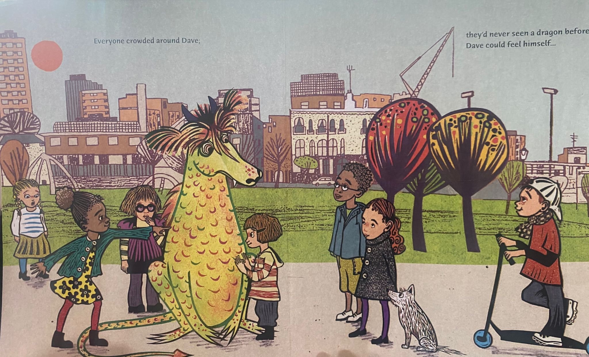
This is apparent in ‘Dave and Violet’, one of Sarah's published children’s books, about a little girl helping a dragon fit in. This story is set in Shoreditch park, and I dunno, I sometimes think about
Dragan -Dragan is Sarah's partner who’s Serbian - I think he’s never felt quite 100% accepted here, and I’m quite protective of that.
Sarah's body language changes slightly as she comforts herself by wrapping an arm loosely around her waist, and the other on her opposite shoulder.
When I was a child I was very quiet and I didn’t really say much, and I remember the harder I tried to please the other kids the harder it was for me, I feel like they disliked me more. I remember feeling frustrated and how unhappy I was; I was being bullied and that...and this character, Dave the dragon, he wants to help but the harder he tries the worse it is. And he’s trying so hard that he gets nervous and starts to heat up, flames come out of him and he makes it even worse. That’s based on how I felt as a kid. So it’s a mix of things, and I guess Violet is like me…but I think a lot of artists base their work on their own experiences, something real.
Sarah shows me another of her children’s book called ‘Gary and Ray’ and I see the familiar theme loneliness being probed again, as she flicks through the pages there’s a hint of surprise in her voice as she admits I seem to write characters who are lonely and don’t belong, I guess as a kid I felt lonely and I wanted to belong.
I think living around here on the estate there’s a lot of people that are isolated and forgotten about, you don’t often see them but I know they are there.
I agree with Sarah that loneliness is not an easy state to live with, that it should be talked about more often and tackled head on, having said that I see many of her stories resonating with those reading them, as a reminder they are not alone and that hope is never too far away.
Sarah not only champions her often displaced characters with spirit and awareness, she also puts her money where her mouth is and is an active member of her community; and what I love about her work is its pure honesty and definite style.
She has a great ability to draw your eye across the page and hold a mirror up to the world she creates, whether it be a place outside your door or the subject that lives behind it. That’s what makes her work so special.
Memoirs of a gaze, the portraits of Carole Pueo
Carole Puéo is a painter with a passion for literature and music. She nourishes her reflection and her painting with a double curriculum as a visual artist and an art historian. She has studied feminist art and gender studies.
A Digital Suicide by Liam Scully | The book launch preview at Matt's Gallery
Come, and look on sadistically at an act of public execution for the new epoch.
Private life has certainly become public life and private life has become art; Tracey Emin gave us her bed, and now Scully gives us every poke, post and private message of his online life. Come, and look on sadistically at an act of public execution for the new epoch; the “digital suicide” of Liam Scully.
A heavy online-liver from 2008-2013, Scully decided to delete social media and eliminate his online presence. When committing this deed of “digital suicide”, Facebook offers the opportunity to download all your data; even that thought deleted. You can relapse and return to as you once were, or scan through every sordid detail of your online past.
Post-Snowden, Scully has taken ownership in reclaiming his online self and spent a year artistically documenting this data to publish to the public. Every page of meta-data has been printed onto pink thermal electrocardiograph paper and every photograph has been recorded in drawings, collages, marks, rubs, spillages and stains. The digital has become as permanent on paper as it is online; provoking fascination, sensational gratification, and concern. Their vulnerable, chunkily-crafted beauty has been bound in five large-scale, limited edition books which will be on display on Friday 13th November (1830-2100); as well ‘In loving memory’, a limited edition obituary-book by friend and art writer Elizabet Homersham.
Friday 13th November, 1830 – 2100 @ X MARKS THE BÖKSHOP, Matt’s Gallery, 42-44 Copperfield Road, London, E3 4RR
Ilse Moelands : A touch of heart, a mark on paper
Dutch illustrator Ilse Moelands’ drawings awaken emotions in an utterly beautiful way. Freshly graduated, she’s on the verge of publishing a book and continues to translate her fascination for the Far North into stunning drawings.
Dutch illustrator Ilse Moelands’ drawings awaken emotions in an utterly beautiful way. Freshly graduated, she’s on the verge of publishing a book and continues to translate her fascination for the Far North into stunning drawings.
Ilse Moelands: I’ve always doubted about my future and thus I had a lot of difficulties choosing the right study; would I become a doctor, an artist? I have always loved fashion and it’s influence on our culture and identity. To me fashion is about people and their characteristics and for a while I wanted to continue in that direction, ignoring the fact that I can’t sew at all. I thought I’d give it a go and ended up enjoying the drawing part the most. I wanted to draw all the time, so I decided to change studies and go for Illustration Design at ArtEZ. I like the directness of drawing and printing. Sewing and designing fashion is a much slower process.
Tell me something about your drawing process.
Often my urge to draw awakens when I am fascinated or frustrated. Then my ideas flow out of me on paper. I like to draw when I am alone, because I really have to be focused and concentrated.
You use a lot of older techniques such as thinner press and lino press, this is quite unusual in our digital era. Why these techniques and how did you come in touch with them?
I like to start with something physical, so I can smell the material; I want to have paint and ink on my hands. I just love the imperfection. It’s not that I don’t like digital work. I think there are a lot of possibilities working digital, but it’s not my cup of tea. At the art academy we had a really nice printing workshop. During my last year I spent as much time as possible in the workshop experimenting with all kinds of techniques and became intrigued with the older ones.
Your work instigates deep emotions, from the love for family to shame and loneliness. Are these feelings you experienced yourself when working on your drawings?
Yes. I always start with a very strong emotion, because it’s the only way I can make satisfying images. I think the world is a weird, crazy place and making art is my way to deal with that. It’s like therapy. But I try to make my work for other people as well. Emotions are a good starting point, but I always try to twist it in a way, so a lot of people can relate to my stories and images.
Where do your ideas come from and when is an idea good enough to execute?
People and their stories inspire me a lot. I am pretty hard on myself, so things aren’t good enough for me very easily. But I am still learning to let go of this perfection, and sometimes I overthink things and I stop myself from making art. But I always try to remember that small ideas can lead to big beautiful projects.
Talk to me about your fascination with the Far North, what is it that attracts you to it and inspires you to create illustrations?
I have worked and lived amidst the snow, polar bears, seals, and Inuit, I grew a fascination with the extreme living conditions those people have to deal with and how they remain a balance of sensitivity and strength. The hard, isolated existence and the respectful way these people treat nature provide the basis for the graphic story I’ve created for my graduation. The Inuit are very proud people however I can’t help but feel they are a bit lost, uprooted from their original culture as times have changed so much there. This idea had an immense impact on me and on my work. I went there with a lot of questions, but I came back with even more. I would love to go back there one day and maybe live even more primitively and remotely.
You went to Upernavik, Greenland for half a year. How did you end up there and what is the most important thing you’ve learnt?
A year ago I applied for the Artist in Residency Program in the Upernavik Museum. After waiting impatiently for a very long time, I was so happy when I received a letter saying they had chosen me to go there. The most important thing I learnt during my stay in Greenland is to be more calm and relaxed. Nature dictates the rhythm of life, so you either go with the flow or feel very miserable. I had to let go.
You're currently working on a book with Julia Dobber; tell me something about this project?
Next to the Greenland project, I needed something else so that when I was stuck with one project, I could escape into the other. I met Julia through a mutual friend and I instantly fell in love with her stories. Her work is about people who get through things, but nobody knows exactly what. For my graduation we compile six stories and complimenting drawings. Finishing them we both felt that there needed to be more, so our plan is to make twelve in total. I can’t wait to continue our exciting project and have the finished product in front of me.
Is there a particular artist you would love to work with?
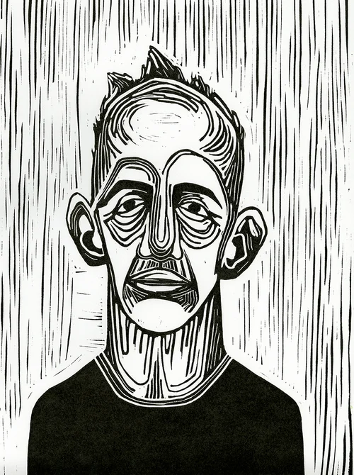


Several. I really like the work of photographer Jeroen Toirkens. He’s a Dutch documentary photographer who followed several Nomadic cultures around the world for years. Also fashion collective ‘Das leben am Haverkamp’, which is founded by some of my old fashion classmates. I really like what they are doing and they inspire me to carry on. Maybe one day we can do a project together.
What is your plan for the future now that you have graduated?
I always hate this question... It feels very definite to talk about the future. I can only dream about it. I would love to have a little workshop with all kinds of presses so I can make special prints and books. I hope I can do more residencies and visit other countries. I went to Myanmar a few years ago and I really want to go there again to start a new project. But there are a lot of other things I dream about, for instance more collaborations like the one with Julia Dobber. I really like dreaming..
We interview Frankie Shea, founder of Moniker Art Fair
Moniker Art Fair returns for its sixth year, on October 15–18 at the Old Truman Brewery, having firmly established itself as London’s premiere event for contemporary art with its roots embedded in urban culture.
Moniker 2014
Moniker Art Fair returns for its sixth year, on October 15–18 at the Old Truman Brewery, having firmly established itself as London’s premiere event for contemporary art with its roots embedded in urban culture.
Building on the foundations of five years experience and it’s continued success, Moniker Art Fair will be again venue-sharing with London’s leading artist-led fair, The Other Art Fair, in what will be a showcase of independent and established talent all under one roof in East London’s iconic Old Truman Brewery.
This exciting spectacle will attract 14,000-plus visitors to the capital’s East End, forming one of the major satellite events of London’s Art Week when 60,000 visitors descend on the city to form an unparalleled international art audience. The partnership emphasises both fairs formidable reputations for showcasing artists operating under the radar of the traditional art establishment. Over a period of four days and across 21,000 sq. feet in The Old Truman Brewery’s impressive interior, this compelling combination promises to generate much interest and exposure this coming October.
BM - Why did you decide to start an art fair?
FS - The fair was started out of frustration.
I was running a gallery and representing several artists within the street art genre with great success. The artists I worked with had strong primary and secondary markets and I was keen to secure wider exposure for them but found it difficult to break into the UK art fair circuit. So in keeping with the ‘do-it-yourself’ street art ethos, I decided to form my own fair focusing on street art and its related subcultures.
BM - Does the name Moniker refer to the use of pseudonyms by many street artists?
FS – Yes. I was working with friend and artist Felix Berube (AKA Labrona), a Canadian freight train painter who told me all about Moniker Culture and the Hobos of America. I registered ‘Moniker Projects’ as a domain name before I even thought of the fair I think.
BM - What sets Moniker apart from all the other art fairs that are so ubiquitous this time of year?
FS – We’ve established ourselves as London’s premiere event for contemporary art with its roots embedded in urban culture. This is what ties the fair together and we have firmly put East London back on the art fair map in doing so. We’re an unpretentious fair, accessible and unpretentious. You won’t find many obscure pictures on white walls with gallery assistants glaring at you at our fair. Every day is fun, we are known for generating a friendly unintimidating art buying atmosphere. It’s become one of the highlights of London’s Art Week for many people.
BM - You have decided to accept Bitcoins this year, why is this?
Nick Walker, Decibel No.1 . Art of Patron space curated and produced by Moniker Projects
FS – A mixture of reasons. I met several people from the Bitcoin community this year who really sold the benefits of the digital currency to me. Plus they were genuinely nice people who welcome social change. I wanted to know more about the decentralised system so decided to curate a 50ft Bitcoin inspired installation that will integrate artworks by Ben Eine, Schooney and Toonpunk. Bitcoin will be accepted as valid tender throughout the fair, not necessarily because we believe Bitcoin will our saviour(!), but exploring possible alternatives to the current financial system is a good thing.
BM - How do you select the Moniker-represented artists?
FS – Initially I like their art and then I like them. Sometimes it happens the other way around, I like the artist and begin to understand their work and their paintings may grow more and more on me.
BM - Which are the most exciting artists that we should look out for at this years fair?
FS – I’m looking forward to seeing work by SA artist Kilmany-Jo Liversage, Betz from Etam Cru, French Street artist Bom.k who debuts at the fair and Apolo Torres. Legendary Bristol stencil artist Nick Walker will be exhibiting his brand new ‘smoke series’ body of work in the Art of Patron space along side multidisciplinary artist Lauren Baker. The Renaissance is Now installation is going to be off the wall.
5 London Art Fairs you can’t say no to
Have you ever heard of the phenomenon ‘the fear of missing out’? Well then you better get rid of all plans in your agenda and all excuses in the making, as these 5 London Art Fairs are too good to pass on.
When.. October 15-18th
Where.. Old Truman Brewery
Besides bringing 130 emerging talents to the stage and enlightening you with the next big thing in terms of art, the ‘other’ in ‘The Other Art Fair’ stands for more than you can possibly want from a creative event like this. Besides innovative creative workshops for the curious and intrepid amongst us, talks by art experts and past exhibitors, shows, films and installations, there will also be a surprise event that most likely will knock you off your feet.
When? December 4th-6th
Where? Bargehouse at Oxo Tower Wharf
If you are obsessed with graphic design, print and everything illustration based, The London Illustration Fair, which has earned the title of the only London based event dedicated to illustration, will feel like utopia to you. Bringing buyers and artists together in one creative environment, the fair has both an eclectic audience as well as a massive assortment of cutting-edge artworks.
When.. October 14-17th
Where.. The south end of Regent’s Park
With 160 galleries from over 25 countries in the world, it is safe to say Frieze London is the most impressive contemporary art fair in London. Celebrating its 13th anniversary, the fair goes big, presenting contributions by artists such as Asad Raza, Jeremy Herbert, Lutz Bacher and winner of the Frieze Artist Award 2015 Rachel Rose. Organising inspiring talks, interactive installations, underground chambers and the return of the beautiful Sculpture Park, Frieze London is a feast for the senses.
When.. November 8th
Where.. Bloomsbury Holliday Inn
This boutique-style photography fair will astonish you with vintage masterpieces, unusual findings, and an abundance of specialist knowledge. Whether you are there to absorb the nostalgic atmosphere or to browse for photos that complete your collection, London Photography Fair will leave a mark on your memory.
Image via www.widewalls.ch
When.. October 15-18th
Where.. Old Truman Brewery
Celebrating urban culture within contemporary art, Moniker Art Fair brings something unique to the scene and foundations of a matchless experience. Voicing a new generation of street artists and introducing Bitcoin to art fans, it challenges the status quo.
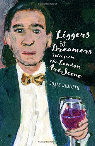
Liggers & Dreamers : a new book by Josie Demuth
Artists are doing it for themselves – or are they?... Tales from the London Art Scene
IT’S EXHAUSTING! Keeping up with three very resourceful artists at the same time for a Q&A session. Three of the creative arts' liveliest talents. First, Josie Demuth; a prolific author and the founding editor of La Bouche Zine. Second, Jason Gibilaro; a contemporaneous artist and the cover artist of Josie Demuth's new book; Liggers and Dreamers. And our third musketeer is illustrator extraordinaire Ian Wright whose visual art work has spanned four decades.
Liggers and Dreamers by Josie Demuth, Cover artwork by Jason Gibilaro
Unusual combinations often produce the most interesting read, as you’ll see in this article. Now, we are gathered in the basement of the famed unconventional Vout-O-Reenees Art Club and gallery The Stash, to share their unique insights on preparing for their major test yet, of their life’s work and more importantly to talk about Demuth’s manic short story book titled Liggers & Dreamers; Tales from the London Art Scene. To complement, and celebrate, the book launch, there is an exhibition of Liggers and Dreamers art by Jason Gibilaro, and Ian Wright’s photos from his collection of Arts Herbert’s on show at The Stash Gallery. Josie Demuth’s new book is innovative with no time for baloney. She goes for the jugular. A very tongue in cheek, tickling and fiercely observed manuscript on an extraordinary scale about liggers (derrière -licking persons) and dreamers (groupies & sycophants) of the London art world. A well written story on how they make their way through London’s elite art scene as well as the ruthless behaviour of a gang of intriguing and flamboyant personalities, as they diligently make their way all around London’s most fashionable gallery private views and bashes for the sole purpose of freeloading on champagne, decent wine and canapés “like a flock of seagulls”. Josie alleges that there are these individuals, “uninvited freeloading party goers”; for who it’s the art of being seen and accepted at art exhibitions rather than a passion for the often hollow modern art on show.
Demuth said: “We are having the unveiling of Liggers & Dreamers on a Friday so that all the liggers can come, after all there wouldn’t be a book and exhibition without them”. In harmony with Demuth, the proprietor of Vout-O-Reenees Art Club Sophie Parkin affirmed: “I will be making extra canapés knowing how Liggers swoop in on any free food and drinks”. Liggers & Dreamers is a fascinating work of creative writing by someone with tremendous imagination. However, some very identifiable famous individuals from the worlds of music and art also make an appearance in the novel. J. D. disputes strongly that any similarity is thoroughly accidental. Yeah right! We believe you Josie Demuth. Also, there’s a wry, shrewd narrative to her story that throws-up constant parallels with pale imitation celebrities and thespians, who regularly gate crash occasions for that chance to take a selfie and share via social media to prove that they have arrived...
Now welcome to the discussion with the three musketeers – oh yes, artists.
This is a very audacious and highly speculative book with some mischievous narrative, which could easily attract extreme dislike towards you. Why was it important that you write this book?
Josie Demuth: Whoa! That is severe. It is not an attack on freedom of expression. It is important for me to write this novel because it focuses on some very interesting characters. And being somebody that has been gallery hopping myself in the last few years, I found these characters to be very worthy of note in the gallery world. I felt and believe they must be documented. I initially started by writing short stories about them in The International Times, then when the list got produced in Cork Street gallery in a covert operation to blacklist these liggers – I thought right away this will be a great narrative for a novel. And my novel only focuses on about a dozen liggers for now. There are a lot more characters that I might report on in another book. A ligger is a freeloader. They go to parties and functions or corporate events with the view of getting freebies. I think everybody loves a freebie. But then again, liggers come in categories; there are some mild liggers and there are chronic liggers and there’re some arch liggers too. In my book you will find all sorts. And yeah, there are those who do gallery hopping that have substance, no doubt about that. So I don’t see how anyone would direct any hate towards me.
I love Charlie by Jason Gibilaro. Acrylic on canvas, 118cm x 153cm, 200
Jason Gibilaro is the book cover artist of Liggers and Dreamers. How did that come about?
Jason Gibilaro: let me answer that. I met Josie way back at an exhibition I staged and I am very interested in the team of liggers and dreamers. I did a small experimental drawing piece and sent it to a mate of mine and he ended-up sending it to Josie and others, and everyone liked it. One thing led to another and Josie liked the drawing and it ended up as the cover of the book. I am very proud of the cover.
Collaboration can be a tad tricky. Was it easy working with Josie or would you rather not work with her again?
Jason Gibilaro: Oh yes, she was nightmarish. (Just kidding!). I will work with her again if the opportunity arises. The final drawing on the cover was a consensus. Yes, we had several meetings with others, but at the end everybody decided that my painting was the one for the book. Initially I was for the image I did for the I love Charlie thing, but what the heck? This cover is very artistic. I am an artist in my own right and it’s just a coincidence to work with an author. It’s an opportunity to do some exploring and add to my repertoire. I see Josie as an artist who personally engages.
Is Josie Demuth shrouding as one of the characters in this book?
Josie Demuth: Yes someplace. The book mirrors and captures the spirit that I believe in. I have been gallery hopping myself for years, so I am in there somewhere and I have witnessed these sort of quirky little scenario situations, so to tell this sort of story, I have to be a part of the story. I implicate myself in things I do. For Liggers & Dreamers, there was no way I could have written it just standing outside saying look at this; this is good or this is terrible or whatever.
Is it fair to describe J. D. as an eccentric, provocateur or just ridiculously over-dramatic with tremendous imagination?
Ian Wright: Let me answer that question. (Why are you guys taking it in turns to answer for Josie, is hilarious) I know that to write this book took a long time and, of course, some imagination. It was a work in progress and I can also understand why some persons would conclude – especially the press like you, that she is being provocative and over dramatic. We are living in interesting times as far as the arts or creative arts are concerned. I think this is just a segment of the arts that she has hit upon and it’s interesting to inform the wider public what is going on in the art world. She is brutally honest about what she thinks, not at all over dramatic. I wouldn’t say she is provocative and dramatic. But if she provokes a debate or a response about freeloaders, great. We all like a bit of drama. I like a bit of drama too.
The Collector by Jason Gibilaro. Acrylic on paper, 17.50cm x 27.00cm, 201
How does this ménage à trois work – professionally?
Ian Wright: We are eccentric in different ways. We all have our different interests but also have similarities too. It is fair to say that our eccentricity works greatly for us. And it is fair to say the book and the art exhibition is kind of a celebration of eccentricity. At the end of the day, be you a writer, painter, architect or poet, we are all artists in the creative arts. So why can’t we work together. It’s something we should see more and more and these boundaries will become very fluid.
Photo by Ian Wright. The Painter and the Poet from The Art Herbert Series, 2009. 6x9 inch
Photo by Ian Wright. The all star Hackney Wick sand gang, 2015. 16x12 inch
...
This threesome Josie Demuth, Jason Gibilaro and Ian Wright seemed destined to be both notable polemicists and visionary creators. An avant-garde underground art movement of the modern era. They have been able to transcend the rather claustrophobic boundaries of the art world. About Liggers & Dreamers, I find it thoroughly frenetic and fresh - highly recommended. Read it and I bet, you will see freeloaders and hangers-on in a totally different light. And it’s not pretty.
An exhibition of Liggers and Dreamers Art by Jason Gibilaro & Ian Wright’s photos is on show at The Stash Gallery, 30 Prescot Street, London E1 8BB
September 11 - September 27
Liggers & Dreamers – Tales from the London Art Scene by Josie Demuth
A preview of Judy Chicago's Star Cunts & Other Attractions
The Riflemaker Gallery will play host to Judy Chicago once again with work both acquainted and un-introduced. Meet her Star Cunts & other attractions; a feminist-fired suite of her historic sculptures, paintings and archival pieces.
Image credit - Judy Chicago at work in her china-painting studio in 1974. Courtesy of Through the Flower Archives
By Suzanna Swanson - Johnston
From 14th September - 31st December 2015, the Riflemaker Gallery will play host to Judy Chicago once again with work both acquainted and un-introduced. Meet her Star Cunts & other attractions; a feminist-fired suite of her historic sculptures, paintings and archival pieces.
Artist, writer, educator, pioneer and artistic-punk-rocker, Judy Chicago created the feminist art movement; reacting to to social and political injustice during the revolutionary times of the 1960s and 1970s that she rose to prominence in. The history of art was the history of the white bourgeois man, till it was remoulded in the hands of Judy Chicago. Her art is dry-witted, dirty-talking, socially-pointed, intricate, fecund, frank, kick-ass-colourist abstraction. It dresses up in a history of representational feminine imagery in order to draw on the historical associations, and subvert them. Rifle-maker offers us a peep-show of the elements unseen.
In their exhibitive debut, on show are porcelain test plates which chronicle Chicago’s studies of china painting in preparation for the Dinner Party. In her key note work, Chicago created the symbolic history of women in Western civilisation and brought the diminished voices of 39 historical and mythological female figures to the table…literally. Using her distinctive multi-disciplinary-multi-media style, Chicago incorporated subject matter into the method by drawing on the traditionally feminine applied arts for the place settings. Along the 49ft triangular table sits embroidered runners, ceramic flatware, embroidered gold napkins, 2000 inscribed tiles and china plates with hand-painted vaginas; the studies for which are on show. Also featured are a series of steel dome sculptures and the eponymous Star Cunts - a set of prismacolour and pastels on paper - that lean towards her earlier minimalist style but still carry the prevailing feminist and feminine forms that characterise her work.
2015 marks quite the year for Chicago; she will simultaneously carry seven shows across Europe which stands as quite the testimony to her continuing influence, impact, relevance and status as ’America’s most important living artist’; this is one dinner party invitation I wouldn’t pass up.
‘Star Cunts & Other Attractions’ : Riflemaker Gallery, 79 Beak Street, London
14th September - 31st December 2015
All images courtesy Riflemaker Gallery
Charles Avery alternative reality at Edinburgh Art Festival 2015
This year's Edinburgh Art Festival brings the immersive and complex conceptual world created by Charles Avery to engulf us.
This year's Edinburgh Art Festival brings the immersive and complex conceptual world created by Charles Avery to engulf us.
Edinburgh’s annual arts festival sets off 30th July, combining contemporary art exhibitions as well as those of more historic movements. Working with leading art spaces throughout the UK, the festival is a month long happening bringing us exhibitions, events and talks from a wide range of great artists including Charles Avery.
Represented by Ingleby Gallery, Avery is presenting more detailed insight into his imagined island with The People and Things of Onomatopoeia. Beginning in 2004, The Islanders series has continued to present the intricate details of his imagined land, evolving to give the audience understanding of the complexities of the inhabitants’ personalities, the nuances, habits and dislikes of groups and individuals.
Avery’s work has an element of fantasy but is not simply a flat rerun of the genre; there are many aspects of this world that mirror issues in our own society as well as introducing abstract concepts of myths and rumors as a potential reality in this universe, even if only existing as a belief by the inhabitants.
The audience experiences this through a wide multimedia approach to a kind of open-ended storytelling using a narrative text, visual imagery, sculpture and installation on a large scale, often presenting objects used by constituents or posters from the streets of Onomatopoeia. These are used as tools for the audience to interpret and contextualise this world.
To add to the incomplete or continual nature of the work, many of Avery’s sketches are unfinished, giving the feeling that the work continues to live alongside the artist. The inhabitants’ lives do not begin and end during the course of the exhibition, there is an endless scope of story to be told about this place and these people.
It is compelling to think of this fictional world as a form of escapism for both the artist and the audience, however, the complexities it inherits being no less problematic than those of our own society can be somewhat grounding, not allowing us to submit to a utopian fantasy.
In addition to this Avery is also presenting a tree from Onomatopoeia cast in bronze at Edinburgh train station as part of the festival which runs until 30th August 2015.
End of a Century: Nineties Album Reviews in Pictures
Full of stunning illustrations, End of a Century is a tour de force that collects the work of the late John Matthew Charrosin Wrake (better known by his trading nickname ‘Run’) and his partnership with music bible NME.


Full of stunning illustrations, End of a Century is a tour de force that collects the work of the late John Matthew Charrosin Wrake (better known by his trading nickname ‘Run’) and his partnership with music bible NME.
The personal introduction, written by editor and friend Andrew Collins, discusses Run’s student life and his success as an artist and illustrator, giving us an insight into the mind of a man with ‘a style of his own’.
Designed by his widow, Lisa Wrake, End of a Century pays tribute to Run’s visualisations of nineties album reviews between 1988 and 2000, an exciting period in pop music history. Run embraced this and provided keenly satirical imagery that sat beautifully alongside album reviews in NME, providing a visual guide for music lovers.
Using a clever blend of collage and illustration, Run’s career as a graphic designer and animator has always been heavily influenced by music, from the visuals he created for the live shows of U2 and the Rolling Stones, to the videos he helped produce for the Gang of Four and Howie B. Drawing on influences such as Dada, Pop Art and early animation, Run had a unique gift for creating illustrations that stay with the reader for a long time. Some of the bands featured include: Julian Cope, Chemical Brothers, Joy Division, The Fall, Madonna, Kylie, Flaming Lips, Nirvana, Pearl Jam, Manic Street Preachers, Pop Will Eat Itself, Blur, Belle & Sebastian, Public Enemy and Bowie.
End of a Century is published by Self Made Hero, retailing at £24.99 (208pp/ colour, hardback) and will be available in late June. To order a copy and for more information, visit: www.selfmadehero.com
Pictoplasma Festival 2015 | An interview with cofounder Lars Denicke
This week the world’s leading and largest Berlin-based conference and festival of contemporary character design reopened its doors for the eleventh year running with a playground of character designs for us to feast our eyes on.
This week the world’s leading and largest Berlin-based conference and festival of contemporary character design reopened its doors for the eleventh year running with a playground of character designs for us to feast our eyes on. Kicking off with a talk by Helsinki based director and animator Lucas Zanotto, the festival showcases a plethora of talks, workshops and exhibitions by a stellar lineup of international artists, animators, graphic designers and more.
I caught up with co-founder Lars Denicke to chat about the festival, its origins and why Pictoplasma is that little bit more special than your average conference.
Pictoplasma and character design seem to embody a huge variety of different mediums, practices and domains, how would you best define the terms?
Characters aim at our empathy and emotional involvement and function around the very essence of what makes something an image: that it gives us ourselves, the feeling of being looked at. They often have an animist quality, as if they were real and alive, or at least create belief in a virtual existence, as a character in a play.
Characters also function on the principles of abstraction and reduction, as if they were typographic characters, taking away all arabesque details and contexts to maximize a common denominator for us to relate to, neglect of cultural difference. A post-digital play with media is a common strategy; artists and creators play with the same character design in different media. Many, for example, have a digital background for creation, and a longing to leave it behind and experiment with more permanent media. Staging the same character over and over again gives it a virtual identity, each single picture adds to depict this virtual character that supposes to exist somewhere else
How can we use character designs as tools to improve our own understanding of the real world?
Firstly, it’s hard to define the real world, but it is true we feel characters play with our understanding of reality in creating the virtual. Given this, they can increase our understanding of realities being relative to others, interdependent, constructed and not solidly defined. In their animist quality, they tickle us to reflect on the essence of what being alive involves.
“They tickle us to reflect on the essence of what being alive involves.”
Tell me about the initial stages of Pictoplasma and then the Festival, how did it develop? You began as an online and print based publication, right?
In1999 Peter started Pictoplasma as a research website, he came from animation and was looking for a new generation of characters that were more appealing, with fewer targeted audiences, less slaves to the ever same narration. This led to publications.
In 2004, coming from cultural studies and inspired by discourses of the iconic or pictorial turn, I joined Peter with the idea to make a conference out of it. We were looking for a way to present the loud, varied and playful aesthetics in a modest setting, so we thought a conference and not a festival or convention would be best. Just 40 minutes for an artist to talk about his/her creation. We managed to stick to this formula, as these talks get very personal – there is always a reason why someone creates these characters, and it gets through in every talk. Gallery exhibitions and animation screenings were part of this event from the very beginning, which made it a festival.
From 2006-2009 we started to produce ourselves, firstly giving characters designed by other artists a corporeality through the hands of costume designers who passed them on to dancers to discover how a character would change personality when having a certain body; then with installations that played with the idea of creating a world for us to get immersed - this culminated in the exhibition Prepare for Pictopia (2009, Haus der Kulturen der Welt, Berlin).
In 2010 we created the Missing Link, a character reflecting on the Yeti myth, and investigated artistic strategies of community, tribes and following in the digital age; this led to the exhibition Post-Digital Monsters (2011, La Gaîté lyrique, Paris). In 2012-13 we focused on characters in visual communication, the terror of photographic realism, and the commercial character as mascot, (White Noise, La Casa Encendida, Madrid 2013).
And then in 2014, the celebration of a decade of the festival was done in correspondence with the time-honoured genre of the portrait gallery, again giving each character that shaped our festival a place in an exhibition that performed the idea of being pre-digital, as in much earlier, or a memory of the digital age, as in much later.
NICOLAS MENARD
What makes Pictoplasma different to other conferences?
Pictoplasma encompasses all design practices – we don’t make a difference as such, we just follow characters, not the artists or concepts. Therefore it is open to all, it is not an elite fine art club as such. The contexts give the creation to the characters and we are accessible to all.
I think this is what is important. Often people are repelled by fine art, it’s an exclusive form of art, which character design tries not to be. Character design is a concept that is open to all and is rooted in the classic conference and exhibition style.
Is there a year that stands out for you?
2006 for me was a good year, the second big edition. It was that moment when you realise you’ve started something new. That feeling of continuity is very exciting. A bit like a puzzle, piecing it all together.
What is the theme for this year’s festival and the inspiration behind it?
Form Follows Empathy goes back to the basics of Pictoplasma and the empathic quality of characters. When everything gets so functional, tech-gadgety, planned characters remind us that we have to like things in order to be ready to interact. Obviously, it breaks with the Modernist credo (Form Follows Function), but not in a strict opposition: the graphic quality of many of the characters featured in the project obviously stand in a Modernist tradition.
German design is very serious and functional, with little space for fun at all. It is important to put a character on these things – it’s not just about pure function, you have to like it. Characters are there to remind us that it is not just about function but also appeal.
(Lars took the example of a mobile phone to demonstrate)
Mobile phones are like big eyes that watch you. They are completely fixed on the eye and the way you perceive things (such as watching, learning, touching). All very perfect. The appeal is neglected here and I think that, in the long run, the appeal has to be in a more comprehensive set up. The phone is now our mobile companion but is it our best companion? They improve function but what about empathy? Is the phone the right device for this? Form Follows Empathy plays with this idea.
A very interesting thought...
How is the digital age impacting contemporary character design today?
We started our project 1999 when the Internet became available for the masses, and implied the promise of a virtual world. In a time where photography was not yet that widespread due to slow data transmission of modems, graphical characters were the inhabitants of this supposed virtual world. At that time, the digital age informed the way characters looked. This is obviously over: we can play with styles and media and diffuse them instantly through digital media, so the digital age now is less about aesthetics and how characters look, but more about distribution and diffusion.
HIKARI SHIMODA
Now, the terror of photographic realism is everywhere - everything is depicted and consumed while we move. There seem to be less room available for characters, and yet the artistic production is blossoming. Maybe they function as an antidote to this photographic realism of today. And then there is the afore mentioned post-digital practice, where digital is just not interesting per se, but part of our reality and characters move from digital to analogue and back, or where everything is both at the same time.
You’ve managed to get some pretty impressive speakers on board – what is your selection process?
Step by step, we build up the line up. Research, chance, recommendations, even artists contacting us – this all leads to a growing watch list. In conversation of the two of us, Peter and I agree on the artists. Somehow, the fact that their characters are appealing to us in a very personal, empathic way is a secret rule. But the real love affair starts after we have met the creators and begin to get to know their characters.
“The real love affair starts after we have met the creators and begin to get to know their characters.”
Every year I worry that I won’t be affected in the same way that I have been before, but it always happens, both in terms of the artists as people, and their creations, the characters.
Special thanks to Lars for taking the time to talk to us
Pictoplasma Festival | April 29 – May 3 2015
ROOMS 17 | Who decides what you see? Unravelling Perspective
We invite you to embrace the un-embraced, explore the unexplored, in an adventure of perception. Will you unravel yours? NEW ISSUE OUT NOW!
How do you gain clarity in a world of instinctually different perspectives? Of minds fixated in black and white, oblivious to those standing boldly in-between? The greys, the what ifs, the could haves… the creators. This April, ROOMS answer exactly that and invite you to explore the ever-growing path of fresh talent and raw perspectives, bringing to you a carefully selected, impressive host of artists, designers, musicians, filmmakers and world class, working creatives.
Among them, exclusive interviews with former graphic designer and now director Greg Barth, composer and video artist Michael Nyman and the man behind the lens, photographer Luke Wassmann. Delve into the delicate works of Yuko Oda, the perceptive designs of Asa Ashuach and the playful works of Olaf Breuning. And skillfully mastering the art of art making with tea drinking, we speak to Carne Griffiths about his drawing rituals, catch up with the visual charmers of PUTPUT and Luis Vasquez tells his beautiful story of how his music turned into an engrossing passion of survival that saved his life.
We invite you to embrace the un-embraced, explore the unexplored, in an adventure of perception. Will you unravel yours?
Also in this issue, we talk to Addictive TV duo, Bianca Pilet, Daisy Jacobs, George Vasey, Realities United, Tom Hancocks and so much more.


