5 up-and-coming artists to look out for in 2015
2015 has so far been a huge year for emerging artists and musicians. Jump on the hype train early and check out these five artists who are absolutely killing it this year.
2015 has so far been a huge year for emerging artists and musicians. Jump on the hype train early and check out these five artists who are absolutely killing it this year.
Source: YouTube Screengrab
London-based quartet BABEHEAVEN has only recently struck into the music scene – but what a bang they’ve made with their first single, Friday Sky. Lead Singer Nancy Anderson’s smooth soul vocals complement their ballad-like sound – dream-pop vibes meshed with trip-hop beats. Imagine the lovechild of The Durutti Column and Warpaint but with a 2015 spin on it.
Although we’ve only had a taster of BABEHEAVEN, we can be sure to expect big things from these Londoners this year. You can check out the music video for Friday Sky (directed by Raf Fellner, Tegen Williams and Frank Lebon) below:
Image via lilymercer.co.uk
With a career slowly beginning to blossom in his 30’s, Vic Spencer is a bit of a late bloomer in the Hip-Hop world. Hailing from Englewood, Chicago – the rapper is an emerging talent cited as the future of Chi-town’s rap scene despite fierce competition from his contemporaries born in the same city. That means you Lupe Fiasco, Chance the Rapper and Vic Mensa.
Listening to his music is sometimes rather like a lottery draw. You can listen to a cocky yet deeply lyrical track like Relapse and then find something entirely different in The Writers. This ability to diversify his style is a hallmark of his experience and we can only wait to see how he progresses from here. But for now, let the track below do the talking.
Source: Photo by Nate Ryan/MPR
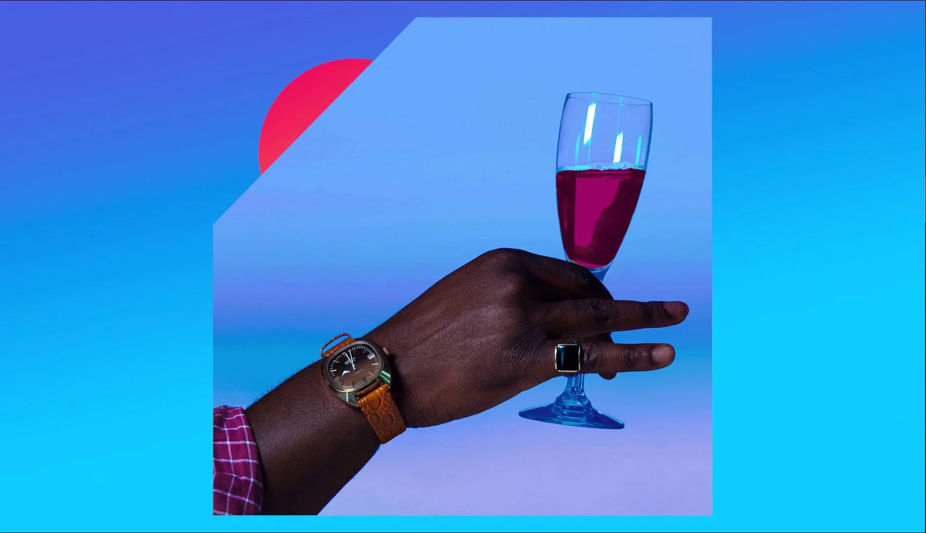
Careers can also blossom prematurely. Corbin (formerly known as Spooky Black) has already developed a large cult following since his breakout single, Without U from the mixtape Black Silk. He has been taking the R&B world by storm and he’s not even 18 yet. His matured vocals juxtapose a youthful face – yet his sincerity always manages to shine through with the tenderness of his subject matter. Girls. Depression. And an all-round feeling of dejectedness.
Corbin has transmogrified R&B and made it his own and into something that is darker, more visceral and original. Those of you who can lend a sympathetic ear to lyrics that discuss the pangs of adolescence and heartbreak, definitely give this boy a listen. Or even listen to his work just because it’s so damn beautiful.
Source: Youtube Screengrab
My aural senses are tingling. Something that sounds like Tame Impala? Check. An artist from New Zealand? Check. Jamiroquoai-esque pop-funk? Check. A contemporary revival of rhythmic 60s soul? Check. LEISURE has all these boxes ticked and more.
Their (or his? Or her? We don’t quite know yet) debut single, Got It Bad, was initially intended to have a couple hundred views on soundcloud. Now it’s on 200,000. There’s no surprise as to why what with that smooth bassline and catchy repetition of “Girl you think you got it bad?” LEISURE’s music is a nod to the early days of funk – nothing too complex, just plain, unparalleled grooviness. Sit back, relax and soak in the song below.
Image via soulculture.com
And last but not least on our list we have Ben Khan. A UK artist reminiscent of a cheerier Jai Paul tinged with nuances of a young Prince. After his first successful EP, 1992 – Khan returns to 2015 with his 1000 EP – a similar yet more evolved sound than his debut work.
Khan’s music resonates with all things synth and all things snare. The blues-sounding guitars compliment the electro-funk feel to his music. Khan is another artist that is boldly experimental yet equally unassuming. To put it plainly, he’s not trying too hard to be alternative and thus always manages to churn out absolute bangers. But the greatest thing? His songs are accessible to all kinds of musical palettes and moods. Bump the track below at a party, a pre-gym pump up, at a picnic on your stereo or even (and especially) in the shower.
Xavier Chassaing’s DRY LIGHTS
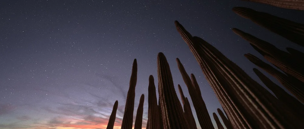
DRY LIGHTS: A new project released by French artist Xavier Chassaing, a member of the Antivj group, is an awe inspiring video piece of pure beauty but much more than that alone.
DRY LIGHTS: A new project released by French artist Xavier Chassaing, a member of the Antivj group, is an awe inspiring video piece of pure beauty but much more than that alone.
The group of European artists known as Antivj focus on lights’ influence on our perception, striving to create experiences, which challenge our senses.
DRY LIGHTS is a fully CG video piece taking us on a journey through a vast landscape of lights, a partly imagined world providing illusions with sharp realism. The film follows an elegantly and meticulously choreographed flow of energy in the form of pulsing and flickering lights through plants on dark waters and misty skies.
The work was inspired in 2013 by light installations at Proyecta Oaxaca Festival at the ethnobotanical garden in Mexico, where an hour long night walk through the gardens allows visitors to be engrossed in the light works. A central theme in Chassaing’s work is meditation and hypnosis, the manifestation and eventual productivity of dreams are elements he confesses to exploring however, the environment provided by these works leaves plenty of room for the audience to create their own narrative. Through the videos’ meditative nature, this narrative has potential to exist as a reflection of each individual viewer, making for a truly stimulating artwork on many complex levels.
Kojey Radical's BAMBU : A masterpiece of progressive Hip-Hop
Kojey Radical, a British-Ghanian, self-styled artist, poet, and artistic director of his own clothing brand rewrites hip-hop and makes it entirely his own with his new single, BAMBU.
Kojey Radical, a British-Ghanian, self-styled artist, poet, and artistic director of his own clothing brand rewrites hip-hop and makes it entirely his own with his new single, BAMBU.
Kojey’s style is forward thinking. In BAMBU we find criticisms of the superficiality within urban society. He metaphorically grabs Hip-Hop by its horns and steers it towards a progressive dimension, where the focus lies mainly in the lyrics themselves rather than (as he puts it): “pussy, weed, money.”
In the single we find a more passionate and personal response to his previous work. BAMBU is a story in itself. Lupus Cain’s minimalist trap production leaves much room for Kojey’s deeply intense and profound lyrics. The beat remains as such and crescendos until the climactic end of the song. The snare drums resonate and bang harder alongside Kojey’s visceral, coarse-grained repetition of the lyrics: “Can’t see the truth when you’re six feet deep.”
And yet the song remains more spoken-word than anything else. Which is why it is unsurprising that he has been likened to Kendrick Lamar. Both artists make use of poetry to make social commentaries. Be they condemning or evaluating, This style of critique within a song is certainly garnering attention. Are we seeing a poetic style of rapping emerging in the UK hip-hop scene? As long as singles like BAMBU exist, we can only hope so.
KOJEY RADICAL - BAMBU
RELEASED JUNE 1st 2015 ON SELF RELEASED
Tour Dates
MAY 20TH 2015 GLASGOW, UK ART SCHOOL
MAY 21ST 2015 NEWCASTLE, UK RIVERSIDE
MAY 22ND 2015 LEEDS, UK BRUDENELL SOCIAL CLUB
MAY 23RD 2015 KNOCKENGORROCH, UK WORLD CEILIDH FESTIVAL
MAY 25TH 2015 MANCHESTER, UK GORILLA
MAY 26TH 2015 NOTTINGHAM, UK RESCUE ROOMS
MAY 27TH 2015 CARDIFF, UK CLWB IFOR BACH
MAY 28TH 2015 LONDON, UK KOKO
MAY 29TH 2015 BRIGHTON, UK THE HAUNT
MAY 31TH 2015 SOUTHAMPTON, UK ENGINE ROOMS
JUN 1ST 2015 GLOUCESTER, UK GUILDHALL
JUN 2ND 2015 OXFORD, UK O2 ACADEMY 2
JUN 3RD 2015 BIRMINGHAM, UK HARE & HOUNDS
JUN 4TH 2015 STOKE-ON-TRENT, UK THE SUGARMILL
JUN 5TH 2015 NORWICH, UK NORWICH ARTS CENTRE
JUN 6TH 2015 SHEFFIELD, UK O2 ACADEMY 2
Pictoplasma Festival 2015 | An interview with cofounder Lars Denicke
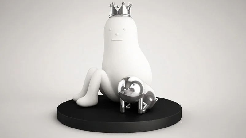
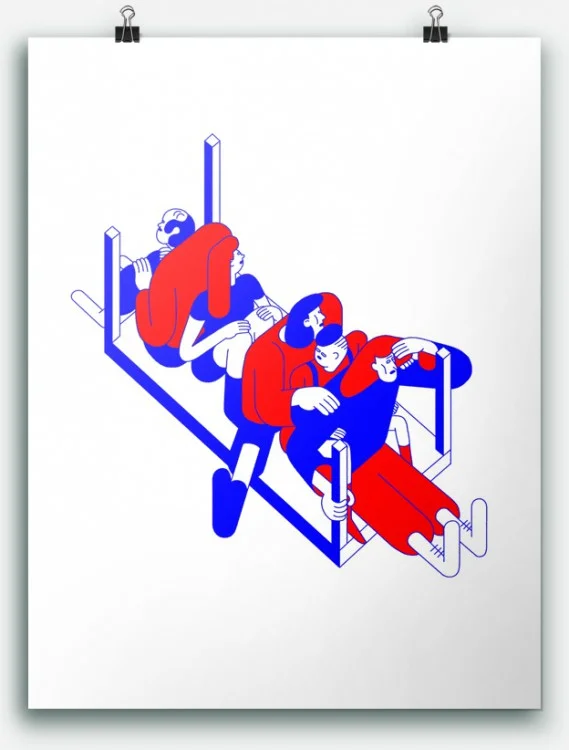
This week the world’s leading and largest Berlin-based conference and festival of contemporary character design reopened its doors for the eleventh year running with a playground of character designs for us to feast our eyes on.
This week the world’s leading and largest Berlin-based conference and festival of contemporary character design reopened its doors for the eleventh year running with a playground of character designs for us to feast our eyes on. Kicking off with a talk by Helsinki based director and animator Lucas Zanotto, the festival showcases a plethora of talks, workshops and exhibitions by a stellar lineup of international artists, animators, graphic designers and more.
I caught up with co-founder Lars Denicke to chat about the festival, its origins and why Pictoplasma is that little bit more special than your average conference.
Pictoplasma and character design seem to embody a huge variety of different mediums, practices and domains, how would you best define the terms?
Characters aim at our empathy and emotional involvement and function around the very essence of what makes something an image: that it gives us ourselves, the feeling of being looked at. They often have an animist quality, as if they were real and alive, or at least create belief in a virtual existence, as a character in a play.
Characters also function on the principles of abstraction and reduction, as if they were typographic characters, taking away all arabesque details and contexts to maximize a common denominator for us to relate to, neglect of cultural difference. A post-digital play with media is a common strategy; artists and creators play with the same character design in different media. Many, for example, have a digital background for creation, and a longing to leave it behind and experiment with more permanent media. Staging the same character over and over again gives it a virtual identity, each single picture adds to depict this virtual character that supposes to exist somewhere else
How can we use character designs as tools to improve our own understanding of the real world?
Firstly, it’s hard to define the real world, but it is true we feel characters play with our understanding of reality in creating the virtual. Given this, they can increase our understanding of realities being relative to others, interdependent, constructed and not solidly defined. In their animist quality, they tickle us to reflect on the essence of what being alive involves.
“They tickle us to reflect on the essence of what being alive involves.”
Tell me about the initial stages of Pictoplasma and then the Festival, how did it develop? You began as an online and print based publication, right?
In1999 Peter started Pictoplasma as a research website, he came from animation and was looking for a new generation of characters that were more appealing, with fewer targeted audiences, less slaves to the ever same narration. This led to publications.
In 2004, coming from cultural studies and inspired by discourses of the iconic or pictorial turn, I joined Peter with the idea to make a conference out of it. We were looking for a way to present the loud, varied and playful aesthetics in a modest setting, so we thought a conference and not a festival or convention would be best. Just 40 minutes for an artist to talk about his/her creation. We managed to stick to this formula, as these talks get very personal – there is always a reason why someone creates these characters, and it gets through in every talk. Gallery exhibitions and animation screenings were part of this event from the very beginning, which made it a festival.
From 2006-2009 we started to produce ourselves, firstly giving characters designed by other artists a corporeality through the hands of costume designers who passed them on to dancers to discover how a character would change personality when having a certain body; then with installations that played with the idea of creating a world for us to get immersed - this culminated in the exhibition Prepare for Pictopia (2009, Haus der Kulturen der Welt, Berlin).
In 2010 we created the Missing Link, a character reflecting on the Yeti myth, and investigated artistic strategies of community, tribes and following in the digital age; this led to the exhibition Post-Digital Monsters (2011, La Gaîté lyrique, Paris). In 2012-13 we focused on characters in visual communication, the terror of photographic realism, and the commercial character as mascot, (White Noise, La Casa Encendida, Madrid 2013).
And then in 2014, the celebration of a decade of the festival was done in correspondence with the time-honoured genre of the portrait gallery, again giving each character that shaped our festival a place in an exhibition that performed the idea of being pre-digital, as in much earlier, or a memory of the digital age, as in much later.
NICOLAS MENARD
What makes Pictoplasma different to other conferences?
Pictoplasma encompasses all design practices – we don’t make a difference as such, we just follow characters, not the artists or concepts. Therefore it is open to all, it is not an elite fine art club as such. The contexts give the creation to the characters and we are accessible to all.
I think this is what is important. Often people are repelled by fine art, it’s an exclusive form of art, which character design tries not to be. Character design is a concept that is open to all and is rooted in the classic conference and exhibition style.
Is there a year that stands out for you?
2006 for me was a good year, the second big edition. It was that moment when you realise you’ve started something new. That feeling of continuity is very exciting. A bit like a puzzle, piecing it all together.
What is the theme for this year’s festival and the inspiration behind it?
Form Follows Empathy goes back to the basics of Pictoplasma and the empathic quality of characters. When everything gets so functional, tech-gadgety, planned characters remind us that we have to like things in order to be ready to interact. Obviously, it breaks with the Modernist credo (Form Follows Function), but not in a strict opposition: the graphic quality of many of the characters featured in the project obviously stand in a Modernist tradition.
German design is very serious and functional, with little space for fun at all. It is important to put a character on these things – it’s not just about pure function, you have to like it. Characters are there to remind us that it is not just about function but also appeal.
(Lars took the example of a mobile phone to demonstrate)
Mobile phones are like big eyes that watch you. They are completely fixed on the eye and the way you perceive things (such as watching, learning, touching). All very perfect. The appeal is neglected here and I think that, in the long run, the appeal has to be in a more comprehensive set up. The phone is now our mobile companion but is it our best companion? They improve function but what about empathy? Is the phone the right device for this? Form Follows Empathy plays with this idea.
A very interesting thought...
How is the digital age impacting contemporary character design today?
We started our project 1999 when the Internet became available for the masses, and implied the promise of a virtual world. In a time where photography was not yet that widespread due to slow data transmission of modems, graphical characters were the inhabitants of this supposed virtual world. At that time, the digital age informed the way characters looked. This is obviously over: we can play with styles and media and diffuse them instantly through digital media, so the digital age now is less about aesthetics and how characters look, but more about distribution and diffusion.
HIKARI SHIMODA
Now, the terror of photographic realism is everywhere - everything is depicted and consumed while we move. There seem to be less room available for characters, and yet the artistic production is blossoming. Maybe they function as an antidote to this photographic realism of today. And then there is the afore mentioned post-digital practice, where digital is just not interesting per se, but part of our reality and characters move from digital to analogue and back, or where everything is both at the same time.
You’ve managed to get some pretty impressive speakers on board – what is your selection process?
Step by step, we build up the line up. Research, chance, recommendations, even artists contacting us – this all leads to a growing watch list. In conversation of the two of us, Peter and I agree on the artists. Somehow, the fact that their characters are appealing to us in a very personal, empathic way is a secret rule. But the real love affair starts after we have met the creators and begin to get to know their characters.
“The real love affair starts after we have met the creators and begin to get to know their characters.”
Every year I worry that I won’t be affected in the same way that I have been before, but it always happens, both in terms of the artists as people, and their creations, the characters.
Special thanks to Lars for taking the time to talk to us
Pictoplasma Festival | April 29 – May 3 2015
HAVING A FACE | An interview with Lucas Zanotto
A project so effortlessly simple yet undeniably fun, Lucas uses painted plates and his camera to transform landscapes into playgrounds of friendly monsters, and boy oh boy, do we love it.
Too often are we met with the inevitable question what is art? and with it, a need to categorise and define; the persistent search for an explanation behind every artistic endeavour that ever graced our planet. But was Van Gogh’s subliminal suicide note really at the heart of his turbulent skies and crossing pathways? Admittedly, it’s an exciting prospect, to unpick the secrets hidden beneath the brush strokes of an artist, or the thoughts deposited into a sculpture prior to its grand creation. We have an underlying urge to find meaning in everything and anything, but what if there was no meaning? Picasso called it the disease of our age, an age of a generation that is anything but practical and yet believes to be more practical than any other age.
So let’s, for a minute, imagine there was no meaning behind the painted canvas that hangs before us. That it was painted for its pure aesthetic value, only. Because it looks nice, and it’s fun?
Richard Long didn’t create his line made by walking to over invest in the idea of art as a form of narrative, nor did he want to attain a grand theory of walking or art making, ‘they just seemed like good ideas at the time’ he said. And ideas that indeed show an appreciation for nature and its fine magnitude of landscapes.
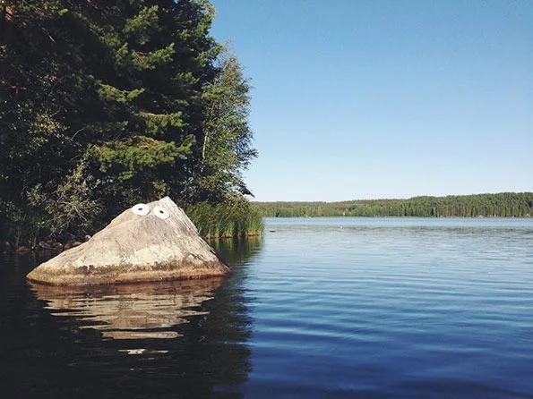
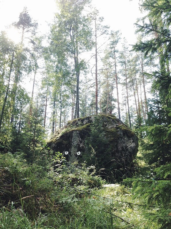
An artist certainly not short of this mentality is Italian born, Helsinki-based director/animator and designer Lucas Zanotto, whose works are a cross between analogue and the digital and stand out for their consciously indomitable, childlike playfulness. Among them is his ongoing photographic series HAVING A FACE. A project so effortlessly simple yet undeniably fun, Lucas uses painted plates and his camera to transform landscapes into playgrounds of friendly monsters, and boy oh boy, do we love it.
I had a quick chat with Lucas who recently opened the Berlin based contemporary character and illustration festival, Pictoplasma, to find out more.
You’ve gone from producing commercials, apps and all things digital, to a series of photographic images. What was the inspiration behind ‘Having a Face’?
The Finnish countryside and having time to play around with things
Talk me through the process, did you go out actively looking for suitable landscapes and formations or was it very much a spur of the moment thing?
In general it is happening on walks and hikes spontaneously. If I know I’m going for a little stroll in nice surroundings, I will keep these paper plates with me. If something pops up I put eyes onto it. For the Pictoplasma Opener, I scouted some locations, as it required more planning.
The series has the potential to be turned in to an ongoing project (in another country, for example). Is this something that would appeal to you?
Yes. It is definitely already an ongoing project and has been for about 2 years now. I have been to so many countries to put eyes onto things. It’s nice as I think this is probably something that will continue and stick with me, for a long period. It is so simple and timeless in a way.
The simplicity of the idea makes it very appealing and accessible to everyone. Who is your target audience?
I don’t think there is any specific target audience.
Your projects always invite us to think outside of the box. Is this an important factor for you?
It is. I think that is important in life in general. Looking a bit further, combining things, improvising, changing viewpoints… this aspect helps a lot.
‘Having a Face’ and previous designs such as your app Drawnimal seem to be encouraging us to move away from the digital screen and embrace analog. Would you agree?
Yes, it feels good to leave the eyes to rest away from the screen every once in a while. I like analogue and tactile experiences, as they are, in a way, not as linear, not as perfect. There are always unexpected elements in it.
Nikita Gale: Archaeology, Anthropology, Advertising and Art
Originally based in Atlanta, Nikita Gale is an artist making a name for herself in America’s burgeoning and increasingly diverse art scenes on both the East and West coasts.
Originally based in Atlanta, Nikita Gale is an artist making a name for herself in America’s burgeoning and increasingly diverse art scenes on both the East and West coasts.
Currently pursuing an MFA in New Genres at UCLA, Gale is trained in archaeology, anthropology and advertising; she consistently utilises elements from her multidisciplinary background in her work as a conceptual artist. Dialoguing frequently with the traditional constructions of consumer and producer, Gale expresses an interest in the way ideologies of history and capitalism are consumed by individuals:
“I have cultivated a practice that explores the relationship between material culture, identity, and language, specifically how identity is mediated through material, sound, desire and language.”
An artist working with photography, text, video, installation, and performance, it is hard to pin down exactly what Gale’s artistic style is – she describes her work as “heuristic, interdisciplinary, and research-based”:
“My practice incorporates elements from my own lived experience with elements culled from varied sources: reality television, queer hip hop, the work of Wittgenstein, hooks, Foucault and Debord, film (especially ‘anti-narrative’ films), and themes surrounding black/queer subjectivity.”
Projects have included ‘Everything & More’, ‘Autographs’ and ‘The Objective Mutability of Certainty’, all utilising language and text to different ends. Gale expresses an interest in language as our primary means of communication in spite of the fact that it is consistently problematic, exploring the link between text and the communication of identity in ‘Autographs’, and the relationship between time and knowledge in ‘The Objective Mutability of Certainty’. ‘Everything & More’ was an early series of large scale photographic sculptures putting together lettering from Times Square signage, effectively highlighting promises commonly used to entice customers through advertising.
Despite a lack of formal art training prior to the MFA she is currently undertaking, Gale has exhibited widely since 2009, and was recently named one of Complex’s young black creatives making waves in the art world – definitely one to watch.


