Abstract Creations: Robert Sosner at John Marchant Gallery
Brighton’s John Marchant Gallery presents Robert Sosner’s new works; entitled SOS, the exhibition is characterised by bold use of colour and bright abstract shapes in the artist’s usual style.
Brighton’s John Marchant Gallery presents Robert Sosner’s new works; entitled SOS, the exhibition is characterised by bold use of colour and bright abstract shapes in the artist’s usual style.
Working with canvas and paper, Sosner paints thoughtful and eye catching compositions, playfully leading the viewer’s eye across his works. His creations are enriched by varying textures sometimes visible beneath the paint, with some works also hinting at the artistic process through the inclusion of alternative colours in the final piece.
Sosner invites viewers to engage and experience his paintings subjectively, aiming to add a little magic to everyday life:
“Overt narrative is avoided and I invite the viewer to find their own way in to each painting to experience something powerful, intangible and at the same time meditative, when looking at the work.”
Born in London, Sosner studied at the Chelsea School of Fine Art attaining a BA Hons in Fine Art – he has since exhibited widely in London, while also working on commission in a variety of private and commercial projects.
Sosner has been the recipient of Pollock Krasner Foundation and Spanish Government scholarships. He currently lives and works in Brighton.
SOS
New paintings by Robert Sosner | John Marchant Gallery | 28th March - 12th April
The Outside In by Director Tristan Shepherd
Tristan Shepherd’s independent short film, The Outside In centred on domestic abuse between a father and his daughter. We had the pleasure to interview the promising director on breaking boundaries in cinema and the magic of shorts.
Last month at the renowned café 1001 in Shoreditch I came across a short film event by Shorts on Tap where I was captivated by Tristan Shepherd’s independent short film, The Outside In centred on domestic abuse between a father and his daughter. Recently, I had the pleasure to chat closely with the promising director himself about his film that is breaking boundaries in cinema and the magic of shorts.
Hello Tristan,
Your film The Outside In deals with the serious topic of domestic abuse, is it something that is personal to you, how did you come to making a film about that issue and what kind of research did you have to undertake before filming?
Thankfully, I have never had a personal experience with domestic abuse and I can never claim to know what victims go through because I made a film about it. This lack of personal experience meant it was essential for me to look very carefully at the subject so I could bring some truth to it.
Of course, it’s impossible to encompass all the details and complexities of a situation like this in a 20-minute film so what Benjamin Noble (screenwriter) and I zeroed in on was the topic of Stockholm syndrome. We were really interested in why a domestic abuse victim doesn’t just leave when the opportunity for escape consistently presents itself? What kind of coping behaviours and relationships develop in order to survive and ultimately what eventually breaks this spell and allows someone to say enough is enough.
The case of Natascha Kampusch was a big influence on the piece.
The film is visually stunning, some can see the broken down walls as a metaphor for the transparent perception of domestic abuse and the fact that it is happening but it is not physically seen. What was your intention of this experimental visual technique?
I really love your interpretation and yes it is certainly one of the ideas I played with, especially during the scene with the policeman. It is also a metaphor for the girl’s mind state; mentally she is imprisoned but psychically she could leave whenever he is not around. The film charts her slowly breaking down the walls in her mind until she realises they don’t exist. However, I must give credit where credit is due. I did not come up with idea of the set, Ben had written into the first draft.
Your style of filmmaking is experimental, what inspires you to create a film in this way?
I love ‘magic realism’. To call this film magic realism slightly misrepresents it but there you go! I like films that are naturalistic in their performances but also step outside the realms of possibility. There are films like Pan’s Labyrinth, Delicatessen or even ones that just have one or two moments that remind you of the infinite possibilities of cinema like the frog rain in Magnolia. I think as soon as you break a rule and do something that in real life would be impossible, you open up a whole new world for yourself as a filmmaker, where you can create your own rules. I think that’s an exciting arena to work in.
It is a short film running for 20 minutes, was that intentional in telling the story effectively and what are your thoughts on short films?
I think it’s really hard to tell a story with a clear beginning, middle and end in short form format. The first cut I had was 25 minutes so I removed a lot of stuff to try and keep the storytelling as efficient as possible. I also wanted to drop the running time to improve its festival chances. It’s difficult for festivals to programme 20-minute shorts, they don’t just slip in neatly; they have no room for them. Eventually, though you get to a point when the story is more important than the length.
The film is heavily symbolic of virginity, childhood, loss, entrapment, there is a specific scene where the father plays with the emotion of his daughter and in a horrific attack shoots her pet guinea pig which was about the only essence in her life that brought her a small sense of happiness. The scene is really hard to watch as it is dealing with strong powerful imagery, I remember even shying away from the direct blow of the bullet; did you want to create a film that made audiences uncomfortable?
Yes I think so. The subject matter is inherently uncomfortable anyway but I wanted the audience to share in our protagonist’s discomfort and helplessness. The film has elements of the thriller genre and I wanted to slowly build the tension throughout and bring it to its peak during the guinea pig murder scene. I figured if I can get a vocal reaction like a gasp from the audience at this moment then I am doing my job.
It’s a key moment in the film because it’s also where the tension breaks and her psychological imprisonment is broken. It’s only when she sees his cruelty directed at something else other than herself she realises how monstrous he really is.
The actors in the film are brilliant and compelling to watch, can you tell me more about how you came to casting them and their backgrounds particularly the young girl?
I got really lucky with Alana. You hear stories of people auditioning 300 kids just to get the right one. Alana was the second person I saw for the role. She’s fantastic young actress who was only 16 at the time of filming. The fact she was home-schooled also gave us more flexibility with our shooting schedule as she has incredibly supportive parents who back her career 100%.
Originally, when casting the man, who may or may not be her father, we were thinking of casting someone a lot older. In the end, we thought if we cast someone who walked the line between being older enough to father but also younger enough be a very inappropriate lover it would leave a fouler taste. Also, because Michael (Stevenson) is so attractive I think people have a harder time tearing down their preconceptions. It’s easy to hate a dirty old man.
As an independent filmmaker what was the process in making this film a reality in terms of budget, money, and support?
The money was raised as part of three-film project on Indie GoGo. I work with a collective of filmmakers called Take Cover Films, where we rotate the role of director, producer and actor. Everyone wanted a go at directing so we put a big campaign together and raised the money for all three films at once by reaching out to friends, family and people interested in supporting up and coming film talent. Our first film, A Thousand Empty Glasses, had a good run of success at film festivals so I think it gave people the confidence to back us on such an ambitious project.
Finally, I cannot praise this film enough and I am eager to watch your next film, what projects have you got lined up in the near future?
I shot another short film last year called Among Sweet Flowers and Shades, which I have been re-cutting and re-cutting. It should be realised some time this year. It’s a very different to, The Outside In. It explores lose of innocence, entitlement and fame obsession amongst generation Y.
I have a few other new ideas for shorts I’m toying with but ultimately I’m really keen to make a feature film as soon as possible.
What films are you excited to see, any independent films or art house cinemas you think our readers would enjoy?
Werner Herzog has a new film coming out called Queen of the Desert. I’m always interested to see what he’s up to. Malick and Tarantino also have new films this year, they usually cause some controversy and give us something to talk about.
If you’re looking for a straight up recommendation of something I have already seen then I would say the debut film of the Wolfe Brothers, Catch Me Daddy. It’s an excellent piece of refined storytelling, which pretty much side steps any expositional writing altogether. Great performances too.
Thank you very much.
Pleasure.
Yener Torun uncovers Istanbul, one Instagram at a time
Yener Torun has made quite a name for himself on Instagram. His colourful profile is simplistically beautiful, showcasing an alternative view of the traditional Turkish city, Istanbul.
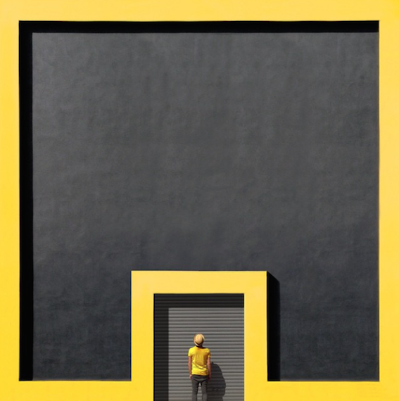
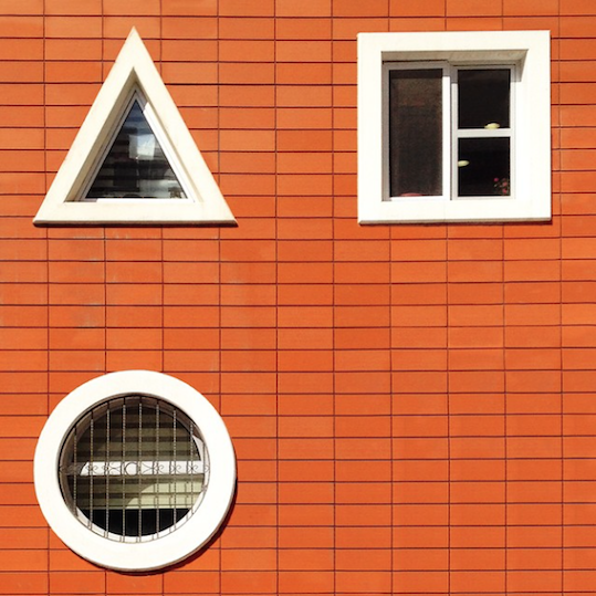
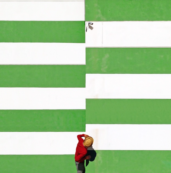
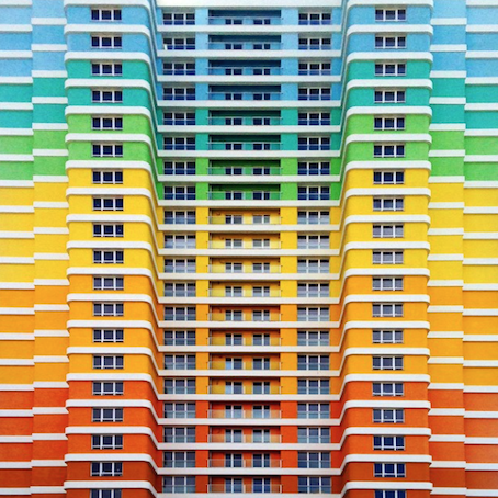
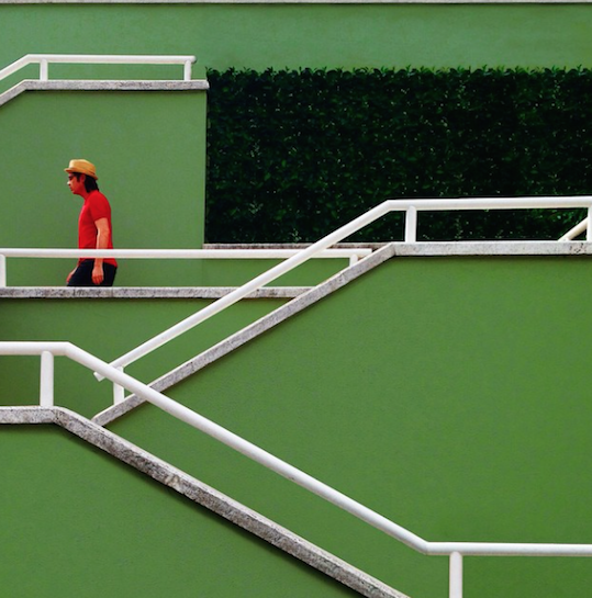
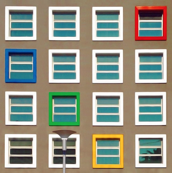
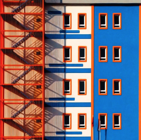
Yener Torun has made quite a name for himself on Instagram. His colourful profile is simplistically beautiful, showcasing an alternative view of the traditional Turkish city, Istanbul.
With a following of over 40,000 thousand on the photographic platform, 32-year-old Torun’s passion for buildings stemmed from his architectural background. His imagery captures a side to Istanbul even long term residents are unaware of, the brightly coloured buildings and geometric shapes tucked away beneath the layer of traditional.
Torun’s quest to hunt out architectural treasures began after he noticed how proficient Instagram was at bringing these rainbow buildings to life. He was able to give these hidden buildings, walls and geometric shapes new meaning, all with the help of his trusty iPhone. By escaping the one-dimensional, conventional side to Istanbul he believes he is able to provide a better understanding of the city, for his viewers, and himself.
His work displays his preference for modernist architecture, choosing to stay clear of the ancient scene most would associate with Istanbul. Favoring to photographing the business districts of Kavacik, Merter and Cevizlibag, his work also often taking him to other cities, such as Izmir, Bursa and Mugla.
Having lived in the city for 14 years, he has openly admitted that he does not consider himself to be an ‘architectural photographer’, and finding locations can sometimes be a challenging, mental exercise. One he is willing to participate in, as the city still manages to surprise him and reveal spots that are worth sharing with his 40,000 thousand followers.
Offering an alternative view of the historic Turkish city, Torun’s work not only captivates his viewers with bold colours, but also gives them an insight to a new realm of Istanbul. Tourists, and even residents, associate the city with mosques, old streets and traditional life, Torun’s photography demonstrations that there is more than meets the eye.
His attention to detail is understatedly clever, he coordination the colours of the walls, to the individuals that happen to be passing by. Reflecting both the energy of the architecture, and giving his human subjects a story by contrasting their clothing to the paint pallet like walls. Blending the buildings and the people brings the images to life; the elements juxtapose effortlessly.
It’s hard to ever imagine Torun’s Instagram profile as anything but a kaleidoscopic of vivid colours, but he began photographing like most. It wasn’t till he discovered the minimalistic beauty that Istanbul had kept a secret that he began letting his followers in on it too.
His profile not only stands out in the overwhelming amount of people using the platform today, it begs you to scroll further down, eyes glued to the colour that jumps out of the phone. Like an addiction, he’s hooked anyone who happen to stumble across his page, the images could be pages in a book, and deserve to be for that matter – perhaps a new project is on the horizon.
Hayden Kays on The Top Ten
Hayden is a visual artist who splices together witty wordplay with carefully chosen found photographs, often subverting the meaning of both.
Hayden is a visual artist who splices together witty wordplay with carefully chosen found photographs, often subverting the meaning of both. Not one to be tied to just one medium, Hayden also works with sculpture, drawing, and printmaking.
His new show ‘The Top Ten’ at Cob Galley Camden, is a collection of the ten most popular artworks from his successful typewriter series, and will tour around the world this summer.
BM – Why did you decide to re-curate the typewriter series into this new show?
HK – I was getting loads of enquiries about the same works again and again in ‘The Hot One Hundred’ and not wanting to keep producing the A4 versions it seemed logical to produce larger print editions of the most popular and some of my personal favorites.
BM – Your work masks a poignant message under a veil of comedy. Why do you think this contrast is necessary to deliver your message?
HK – I don’t think it’s crucial. I just fucking love laughing. I have an extreme sense of humour; it’s virtually a disability. I find EVERYTHING funny. I wish I had control over it, I’m envious of people who can control laughter but I think they are few and far between, this is another reason I love to use humour in my work – laughter is convulsive, you don’t decide what to laugh at. You laugh, then you worry about whether or not you should have later.
BM – You identify yourself as a ‘Pop Artist’, when most pop art is vacuous. You seem to have a deeper ideology than just making money. Why do you identify with Pop Art so much?
HK – I think I’m becoming more and more of a ‘Pop Artist’ in the sense that my work is becoming more and more popular. Popularity is important to me. I want my work to be liked. Find me an artist that doesn’t and I’ll show you a liar.
BM – Do you believe in a high art/ low art distinction, and where would you place yourself?
HK – I believe it’s either Art or it isn’t Art, and unfortunately I see ‘it isn’t Art’ by far too many people that call themselves artists.
BM – Why do you think that you often get grouped amongst the ‘street artists’, despite doing very little work outside?
HK – Because people don’t know where to put me. We are all obsessed with compartmentalising everything, everyone, it helps us attempt to understand these terrifying surroundings.
BM – As a lot of your work is humorous, does that mean that it is fun to make, or can it be stressful at times?
HK – There is a common misconception that artists are just having a great time splashing paint around a lofty studio, smoking roll-ups and shagging loads of girls. I just smoke the roll-ups.
BM – How much of what you do is hyperbole?
HK – You can take my work however you like, just as long as you take it.
BM – Sometimes it’s hard to tell who it is you’re making fun of in your work, the subject of the piece or the viewer, or even society as a whole, is this intentional?
HK – I don’t want to make work that's instantly or easily resolved. Questions that you answer, you tend to move on and away from. I want you to keep coming back to me.
BM – A lot of your work is text and found imagery based, how do you collate your ideas. Do you sketch or is your sketchbook full of lists?
HK – I have piles and piles of sketchbooks full of ideas. I hope when I’m dead they’ll slowly all come to life as I’ll never find the time to make them all exist in my lifetime.
BM – Do you believe an artist should have to explain their work, or is it the public’s role to decipher it?
HK- I don’t think art should have to be explained. It should be simple. Ask yourself do I like this? If you do, you do, if you don’t you don’t. You shouldn’t make it much harder.
The Top Ten opens on the 2nd of April 2015 at Cob Gallery Camden | Hayden Kays
Heated Words: Initial Research of a forgotten typeface
Heated Words presents, Initial Research private view, an exhibition documenting the journey of a forgotten typeface across the subcultural movement.


Heated Words presents, Initial Research private view, an exhibition documenting the journey of a forgotten typeface across the subcultural movement.
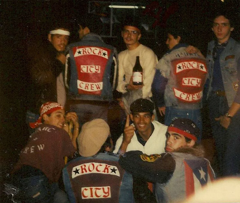
The exhibition, which will display photography and ephemera, is solely focused on a specific, unidentified typeface that exclusively existed as iron-on flock lettering.
The typeface has made predominant appearances within the documentation of subcultures between the early 70s to late 80s, appearing on items of D.I.Y clothing and used by: Little League teams, Street gangs, B-Boys, Punks, Pop artists, Pop stars, Disco dancers and the entire squadrons of the Double Dutch skipping troupes.
Heated Words aims to illustrate an ongoing investigation to uncover the true identity of a folk-lore typeface that never made it to the post analogue era. The discovery of this typeface involves some of pop cultures most influential individuals, locations, brands and central moments in history.
The Clash, Biz Markie, Ramellzee, Big Audio Dynamite, Rock City Crew, Furious Rockers and the Ebonettes all have a connection with this typeface, and make an appearance within Heated Words.
Located at multi use creative space, House of Vans, in the heart of one of the world’s most creative cities, London. The 3,000sqm space is devoted to encouraging evolving talent, across cinematic, artistic and musical areas. The creative space is free, and open to all who wish to attend.
Heated Words: Initial Research | March 27th to April 10th, House of Vans, London.
Private view - Thursday 26th April 2015 | 7 – 11pm
Kent Baker and Futurecity present Inferno: Alexander McQueen
Striking Images taken from Kent Baker’s new book, Inferno: Alexander McQueen, will be shown for the first time at the Gallery at Foyles till 3 May 2015.


Striking Images taken from Kent Baker’s new book, Inferno: Alexander McQueen, will be shown for the first time at the Gallery at Foyles from 20 March till 3 May 2015.
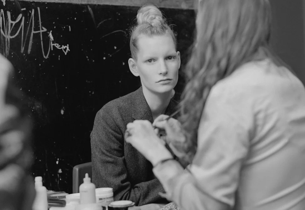
As another tribute to the McQueen season, the up and coming Futurecity show will display a selection of previously unseen, backstage photographs, taken by Kent Baker during the seminal show, Dante, in 1996.
Alexander McQueen, who applied to Central St. Martin’s School of Art and Design in 1994, was persuaded by Bobby Hilson – the Head of the Masters course to apply. The exhibition will inhabit the Foyles Bookstore building, which Central Saint Martins once notably occupied.
McQueen showcased his early collection, Dante, in 1996 at Nicholas Hawksmoor’s architectural masterpiece Christchurch in Spitalfields. In true McQueen style, the audiences were treated to a theatrical spectacle. Photographer, Kent Baker, who was lucky enough to be in McQueen’s intimate circle of friends, was able to capture this iconic moment in contemporary fashion.
His backstage photography not only captures the excitement and dramatics of the evening, but the distinct moment in which this creative force was born. Displaying just how much McQueen’s vision was destined to challenge and fundamentally alter notions of beauty, bookmarking an unforgettable moment in British fashion history.
Olly Walker curator of the ‘Inferno’ exhibition
Introducing TOPS : Pop made in Montreal
TOPS are a four-piece band from Montreal, Jane Penny (vocals, keyboard), David Carriere (guitar), Riley Fleck (drums) and Madeline Glowicki (bass). We chat with Jane ahead of their European tour in May 2015.
TOPS are a four-piece band from Montreal, Jane Penny (vocals, keyboard), David Carriere (guitar), Riley Fleck (drums) and Madeline Glowicki (bass). We chat with Jane ahead of their European tour in May 2015.

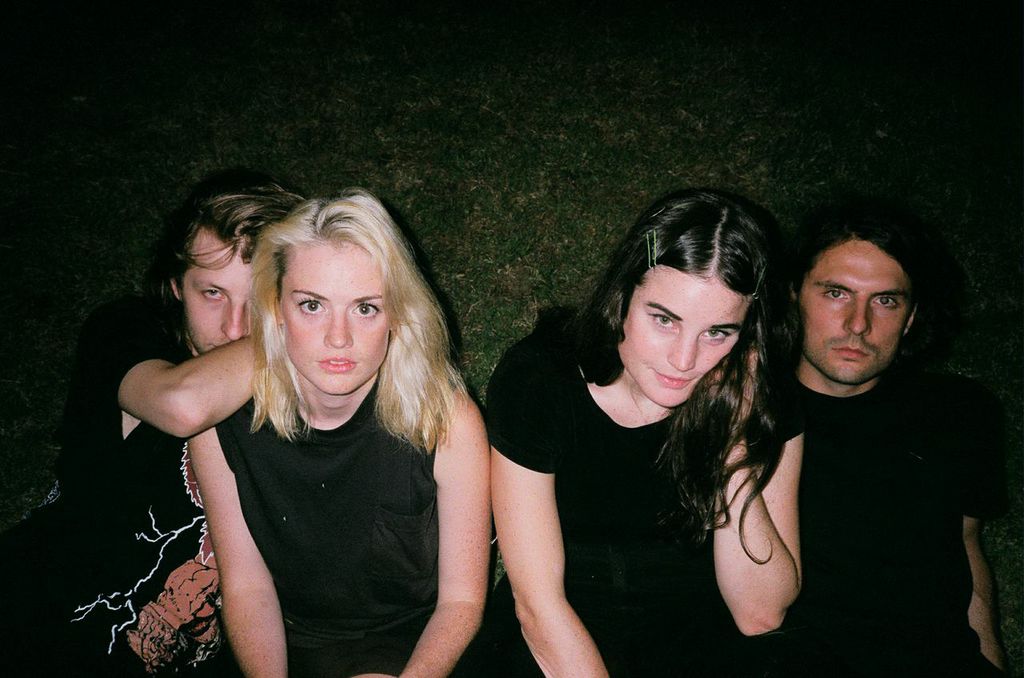
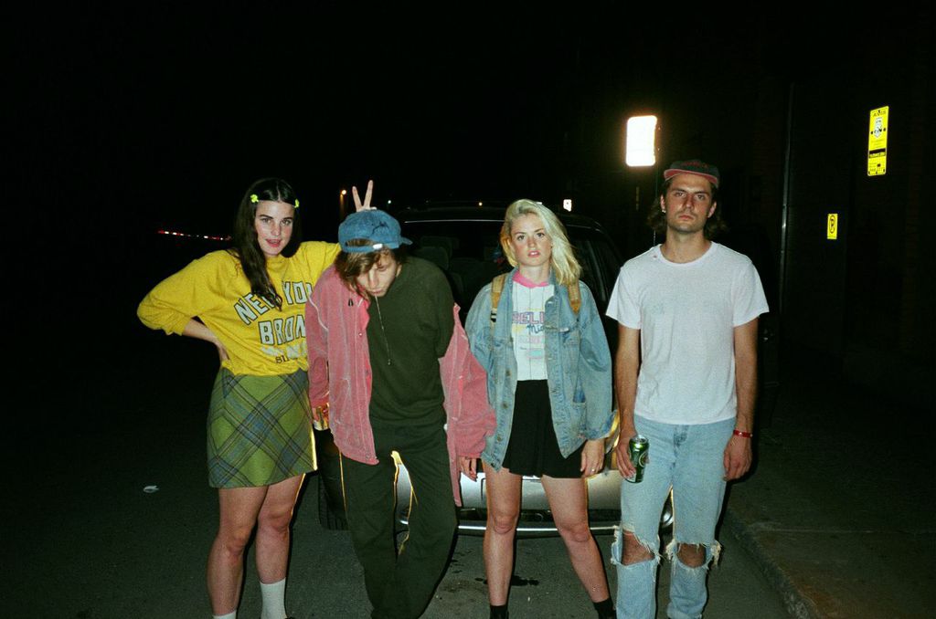
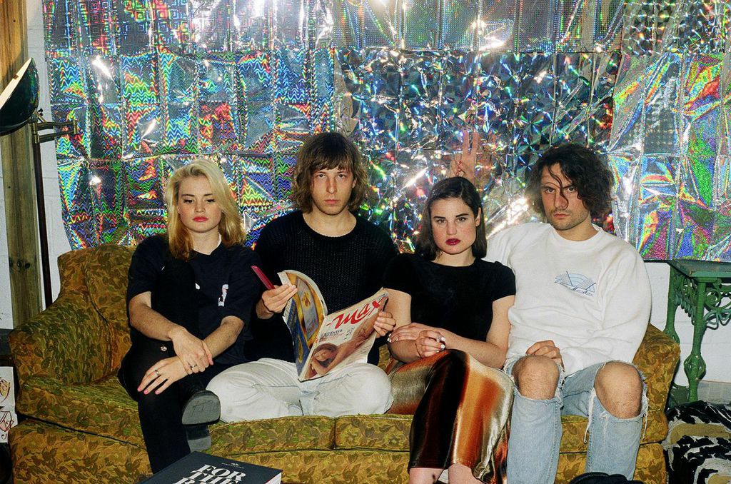
We started TOPS in the Spring of 2011
David and I had already been playing music for a couple years but it was mostly just fucking around, we would make songs in his room on a computer. I'd just started to get really into synthesizers and David has always played a guitar, we wanted to be in a proper band with instruments instead of computer music so we asked Riley to try jamming with us. He would practice at this loft space we all used like everyday for hours by himself so we figured he'd be pretty good, and we were right! He's great.
A lot of nights we'll be at the studio really late
we've got a little recording and rehearsal room set up at the Arbutus Records Office. Sometimes we'll be walking back down Parc Avenue and I'll have the song we were working on in my head, when it's sounding real good and your excited about the beginning of a new track and it's circling around in your brain, those are a lot of the best moments. That and there have been a lot of really great times at shows.
The first songs I learned
were songs that David wrote with our friend Sean Nicholas Savage. They convinced me to start singing because they'd written a bunch of songs for a girl to sing. Before that, when I was a teenager I got really into playing flute, specifically playing Charlie Parker solos, that was the first music that I really loved playing.
I admire musicians who have a unique voice
and an intellectual inner life that guides the art they make, like Joni Mitchell. I also really like musicians that make really satisfying music to listen to, like J Dilla or Chic or Art of Noise. Sorry I'm not very good at explaining my taste, I just like what I like.
I've been listening to Jessica Pratt and Kendrick Lamar lately, their new records are both very inspiring to me. The Doldrums record too, it's coming out soon.
My first instrument
It was a cheap flute, probably cost my parents like 200$ at the local music store. There was a piano at my house growing up but I didn't get into playing piano until much later so even though I play it a lot now I would consider my flute my first instrument. I left it on the bus once growing up, I was freaking out but the bus driver picked it up so it was all good.
It just happens
The bigger struggle is doing the normal everyday shit properly so my life can keep going, like getting groceries and replying to emails. That other stuff is constantly in the way of time I would like to spend by myself working on music but you have to handle your shit if you want to live off music. I'm hoping that at some point in the summer I can take a few weeks to just work on new songs.
A day in the studio
It depends on what we're up to, but usually I wake up at home and make coffee, then play my synth at home for a while. David usually heads to the studio early and he'll start doing stuff on the computer or playing guitar and I usually show up around 2. We'll work on stuff, record or whatever and then Riley will come by the evening and we'll practice for like 4 hours.
Music
It's really everything to me. It helps me get through life, but it also is my life in the sense that I define my success on this earth by how much time I devote to it and my progression musically, playing instruments or just improving my musical consciousness.
Jane Penny from TOPS | TOPS Tour Dates
Beauty in Desolation: Photographer Florian Ruiz
French photographer Florian Ruiz captures life at its most remote, his subject matter strikingly distant from society as we are accustomed to seeing it in the Western world.
From a harrowing exploration of prostitute’s rooms in the series Two star hotel to a study of Japan’s abandoned radioactive roads in Lost Highway through Google Earth, French photographer Florian Ruiz captures life at its most remote, his subject matter strikingly distant from society as we are accustomed to seeing it in the Western world.
Aiming to express the atmosphere, feelings, and sensations of desolate locations, Ruiz demonstrates a propensity for locating people and places with backstories just as interesting as the pictures that result from his studies:
“I try to capture the in-between, life at the margins, and borderlines of lives and places.”
Ruiz’s portfolio has a distinct Eastern flavour, with galleries compiled in China, Mongolia, Pakistan and various locations in Japan available to view on his website.
Fukushima, Invisible Pain, a series of photographs which took second place at the Sony World Photography Awards 2013 (professional conceptual category) visually communicates the stillness and ghostly tension that surrounded the eponymous prefecture after the 2011 nuclear disaster; moving comfortably across a variety of photographic styles, Ruiz demonstrates the creative use of a pin hole camera on long exposure in this particular series, making for evocative, eerily distorted compositions.


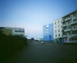
Exploring similar themes to those found in his Fukushima studies, Brezhnev’s Gift is an insight into the lives of Mongolia’s Erdenet inhabitants, their existence poised between dreams of a better life and the reality of the unsustainable mining activity the town they choose to inhabit was built upon in the 70s. Ruiz’s images hint at the futility of everyday life, a poignant lethargic stasis looming over every shot; the viewer is left unsure whether to admire or weep for the resilience of humanity.
Ruiz’s most recent study tells of the lives of those dwelling on the borders of China’s major cities, a collection of images as colourful and eclectic as the subjects they present; entitled Borderlands, the series juxtaposes scenic panoramas with a mix of intimate and action-filled portraits, paralleling life and the landscapes on which it transpires.
Ruiz has been published and exhibited widely since 2005, regularly popping up in photography magazines and journals, including a spot in the 2010 British Journal of Photography; he currently lives and works in Tokyo.
SXSW Music: five good reasons to be excited
SXSW, a multi-genre culturefest conference taking place in Austin, Texas, has arrived this March; and we have five very good reasons to be excited.
SXSW, a multi-genre culturefest conference taking place in Austin, Texas, has arrived this March; and we have five very good reasons to be excited.
From March the 17th to the 22nd, South by Southwest (SXSW) will platform hundreds of talented musicians of varying levels of fame to exhibit their new work. This is really a show with no limits in terms of genre, ingenuity and creativity; consider this a supermarket for your next favourite bands. Whether you are an electronica, classical, blues or R&B fan, this is a great opportunity to hear the voices of tomorrow and find your next musical crush.
To give you a flavour of just how much talent is on offer, here are a few of our favourites:
Benn Ottewell | Genre: Rock
This guy has the most delicious voice I’ve heard in ages: it’s not aggressive or too pitch-perfect; just filled with passion and an impressive range from emotional high notes to guttural rock bass.
He plays the guitar with no limited ability to make the simplest of riffs sound exquisitely flawless. His lyrics are beautiful, taking a nice cross over from country to form a gentle simplicity with rock’s hard emotion. If you haven’t googled him yet, get a move on.
Carolyn Wonderland | Genre: Blues
Compared to Janis for her voice- and it is easy to see why. She has a touch of gospel about her and there is a really sweet sadness in her voice; she goes from roaring euphoric passion to a heartbreaking mellowness in a few minutes and it’s just so lovely to listen to. It’s also fantastic to see people coming to the more side-lined genres to re-create them and capture what worked.The electric guitar adds a modern update to the genre and the whole thing comes off as very theatrical. This woman is the Meryl Streep of music.
Mother Falcon | Genre: Classical
If you think classical music is outmoded, acoustic and dull, think again.This band bring an almost orchestral approach to music where the lyrics, however beautiful, play second fiddle to the incredible intricacy of the melodies. It is like watching Vivaldi coming out a time machine to perform his new single inspired by Daughter. This is a developing field and I for one will be fascinated to see how it develops.
THE NIGHTOWLS | Genre: R&B
Yes, no spaces, I checked. This is a pretty large band, and I think this actually works for the sound they are creating; they are not selling themselves as packages but the music and interpretation they create. They go back to the roots of R&B, there are traces of soul still in the seams of the melody and I really like the return to a toned down backing to focus on the power of the vocals. Definitely worth checking out if you don’t like the sliding merger to hip-hop.
Bronze Whale | Genre: Electronic
Other that a seriously cool name, this duo has a terrific amount of creativity. Sentences don’t end unless these Texan maestros permit it to, the beat and melody are carefully cut apart and rearranged in something more outrageous, thought provoking and new. This is a really great place to start if you are an alternative music novice; they cross over modern and synth hip hop with inventive keyboarding and simplistic electronica. They are the bridge between the two realms; a bridge you won’t regret crossing.
Leon Golub Retrospective – Bite your Tongue review
The oppressively large, looming portrayals of war and suffering that adorn the walls of The Serpentine gallery create a cinematic panorama of disaster, which both entices and repels the viewer
The oppressively large, looming portrayals of war and suffering that adorn the walls of The Serpentine gallery create a cinematic panorama of disaster, which both entices and repels the viewer.
Born in Chicago in 1922, Leon Golub had an early interest in the visual arts, stating once that seeing Picasso’s famous anti-war painting Guernica at age eleven, was the most profound art experience of his life.
Golub first studied art history, before joining the U.S. Army as a cartographer, and it was during this time that he developed his hatred of war. After he left the army he returned to art school to complete a Masters Degree in Fine Art, during which he met fellow artist and his future wife Nancy Spero.
Golub’s larger-than-life characters commit atrocities that we are unable to look away from, as the floor-to-ceiling paintings fill the entirety of the space and tower over all that enter. The characters stand on almost-blank backgrounds, asserting that they are the only things we should be focusing on, and giving our eyes no avenue of escape.
In one particular painting, an unidentifiable assailant is putting someone in the boot of his car, as he looks straight out of the painting at the viewer. This sinister eye contact and the way the perspective makes the victim below eye-level, forces us to be accessories to the crime.
Golub describes his work as crude and vulgar, something that is necessary to accurately depict the horrific things his work is commenting on. The works honest depiction of violence is a salient factor in Golub’s long-standing anti-war discourse, and something that he never shied away from.
In this retrospective spanning over fifty years, many different eras and conflicts are represented, from Vietnam, Latin America, and beyond. This resonates with the way in which Golub would collect and combine different source materials from which to paint, often combining into one painting images from many different conflicts and settings. These fragmented characters in his paintings are depicted as of one era, but are timeless, and because of this convey a broader and more encompassing critique of the ‘Misuse Of Power’ as a whole.
Golub’s work forces its message upon the viewer in both its size and subject matter. This harsh exposition of violence compels us to accept responsibility for our complicit violence through inaction. Golub is pointing out our moral responsibilities through his portrayal of the most horrific and difficult to look at subject matter.
With the current climate of war and terror, his is even more of a poignant message today. His indulgence in his subject matter has created a harsh and undiluted statement of intent; by keeping silent we are allowing this to happen, and we must never bite our tongues.
I for one, long for a world where the work of Leon Golub is no longer necessary or relevant, and I’m sure Leon would feel the same.
*Images via Serpentine Gallery
Showing at The Serpentine Gallery London
Art Paris Art Fair 2015: ROOMS Five Favourites
In the spirit of ‘discovery’ and ‘exploration’, the bywords chosen to define this year’s fair by director Guillaume Piens, we have selected five of our favourite galleries in attendance, each one innovating in different fields across the art world
As it does every spring, the Art Paris Art fair will be taking over Paris’ prestigious Grand Palais from the 26th to 29th of March: inviting 145 galleries from all over the world to showcase their best and brightest contemporary and modern works, this year’s fair has placed a strong emphasis on giving exposure to regions of the art world ‘off the beaten track’. In the spirit of ‘discovery’ and ‘exploration’, the bywords chosen to define this year’s fair by director Guillaume Piens, we have selected five of our favourite galleries in attendance, each one innovating in different fields across the art world.
Flatland Gallery | Amsterdam
Focusing on photography, film and video, Flatland Gallery is a well-established Dutch contemporary art gallery. Attributing its success since its founding in 1984 to a cosmopolitan outlook and independent standpoint, the gallery is known for championing the works of unknown artists and photographers alongside those of their more established counterparts.
Artists to be exhibited at their stall this year include Erwin Olaf, featuring some works from his breathtakingly subtle photograph and video installation 2014 series ‘Waiting’.
Podbielski Contemporary | Berlin
Podbielski Contemporary is one of the 12 galleries under five years old chosen to exhibit in the fair’s Promises section, dedicated to the discovery and promotion of new international talents. The gallery is uniquely aimed toward the representation of artists who narrate the geopolitics of the Balkans, the Middle East, Italy and Germany through transcultural perspectives; artists featuring include Ohad Matalon and Leonora Hamill, whose striking, sun-drenched compositions will bring a flash of Mediterranean flavour to the proceedings.
Galerie Pascaline Mulliez | Paris
With their exhibition space located a short distance from the Grand Palais, Pascaline Mulliez Gallery will be right at home at the fair; returning with a strong portfolio of mixed media artists, we are drawn to this particular gallery for the diverse blend of works set to be exhibited. Highlights include Jean Noël’s eye-popping, colourful sculptures that seem to transcend the conventions of 2D and 3D, sure to contrast nicely with Estonian born Katrin Koskaru’s minimalistic compositions.
Un-Spaced | Paris
Established in 2013, Un-Spaced gallery has quickly made a name for itself – dedicated to working with artists who challenge the boundaries of visual art, the gallery’s portfolio includes both French and international artists, primarily at emerging and mid-career stages.
For the fair, Un-Spaced have prepared a body of work from artists Pierre Labat, Sebastian Wickeroth, Paul Lahana, and Cecile Dupaquier, the pieces juxtaposed with the intention of drawing a critical discourse on form opposing approach.
Galerie Ziegler | Zurich
Last but definitely not least is Zurich’s Ziegler Gallery: established in 1959, the gallery boasts a strong tradition of exhibiting works by world renowned artists including Alberto Giacometti and Pablo Picasso. The gallery will feature some of Swiss artist Ruedi Bechtler’s recent installations, sure to draw attention with their unusual and etherial qualities.
London based abstract photographer Katie Bret-Day sheds light on her work
Katie Bret-Day is a London based photographer bridging the gap between digital and analogue in creating abstract work based on the human form.
Katie Bret-Day is a London based photographer bridging the gap between digital and analogue in creating abstract work based on the human form. Her Facets exhibition has recently been displayed at the Brighton Photo Fringe and she is currently working on its follow up, a selection of work perfecting a previously unused technique.
When did you first become aware of photography?
My Dad gave me my first camera when I was about ten. It’s a Canon F10 that I still use today. I can remember using it in my parent’s house in Normandy. The house has been in our family for generations and is full of weird history. During the Second World War it was used as a rest point for a group of Nazi’s. After Normandy was liberated Neme, my grandma, hid one of them in the attic and he became a gardener after the war. I think I managed to capture some of the bizarreness of the house but in all honesty, I mostly turned my camera towards my sister and the dog.
When did you make the move away from classic realism towards the work you do now?
My perspective on photography changed when I was introduced to the dark room at school. It was so small, not much more than a cupboard and nothing really worked properly. There were no timers on the enlargers and you always bumped your head on the shelves. I am hesitant to connect the two, but there does seem to be a vague correlation between my current exploration into the darker facets of the human form and one particularly sharp knock to my head in the dark room.
What form does this exploration take in your most recent exhibition?
My most recent project revolved around Dissociative Identity Disorder, more commonly known as Multiple Personality Disorder. In short, the condition is characterised by a person having multiple selves that are distinct from one another and I looked to capture this in photographic form. This had me playing around with form, nudes and portraits, and disrupting what would be perceived as the bodily norm.
Practically, how did you achieve this?
Primarily through shapes and mirror. I was printing into mirror and setting myla into resin.
What effect would you like this to have on the viewer?
My work is often abstract and is therefore left open to a fair degree of interpretation. However, I would like people to question themselves when they look at my work. To be forced to really look at themselves and ask how the body is different from the being. This has been a long held objective in my work. In my previous exhibition Amalgam, named after a chemical dentists use to repair teeth, I looked to reflect the narrative of contemporary medicine in its improvement of the human form and the integration of synthetic materials into our body. Our contemporary physiology no longer has a fixed, un-malleable architecture and I think this is a poignant theme in a medium associated with the realist capture of the natural body.
Can you explain the technique you’re currently looking to perfect and how it relates to the thematic focus of your work?
I have been advised not to talk about it too much until I perfect it, because, as far as I’m aware, I’m the only person in the world to be making prints this way.
I first started doing it as a money thing because of the cost of film. It’s fundamentally a way to manipulate an image without doing it digitally. But it’s more than that. It completely disrupts the essence of the image. I pick up and play with the pigments of a piece, shifting them about whilst attempting to retain a certain quality of the original image. I’ve always seen photography as a building block, a starting point upon which I can intervene. I use it to tell a narrative whilst exploring the realities of a photograph.
I want people to realise digital imagery is fragile like analogue. It can be too disposable. I think there’s a precious and transient quality to photography that has gone now. My technique is a way of saying that digital imagery is fragile, it is beautiful. By integrating contemporary means with digital it makes the process necessary. Perhaps there is some irony in the fact that I have to shackle myself to do my most able work.
What’re you planning on doing next?
I’ve just started forming a collection that I’m hoping will pick up the work done in Facets and move it on. So far I’m toying with the idea of mirrors and the split sense of identity that they can bring about. There is a symbiosis between the two identities people perceive, loosely the body and the mind. I want to take that idea and then make the dualist gap wider, more distinct, and disconnect the two. Photographically at least.
David Bray’s Right Wrong Turn
David Bray is an illustrator and designer whose works are a glimpse into another world, a surreal landscape of cartoon characters and pin-up girls. His surreal new show Wrong Turn is open now at Stolenspace Gallery
David Bray is an illustrator and designer whose works are a glimpse into another world, a surreal landscape of cartoon characters and pin-up girls. His surreal new show Wrong Turn is open now at Stolenspace Gallery.
BM -Text is almost always present in your drawings, but often it seems to have little connection with the drawing itself, what is the relation between the two elements?
DB - In my mind there is a connection, two separate elements from the same story. I try and invoke the drawings with a narrative. Maybe this gets lost as the drawings develop but the text remains - like a chapter title or a header. There is a hint of misdirection with the text.
BM – You often draw onto unorthodox papers, e.g. lined paper, hotel paper, postcards etc. This gives the work a spontaneous and haphazard quality, which contrasts nicely with the exquisitely drawn forms. Is this an intentional thing or do you just draw on whatever you have to hand?
DB - I'd like to say it was intentional and could claim a more intelligent reasoning! I draw on whatever is to hand, there’s no reason to not draw just because you don't have the posh paper. I'm glad that you see the spontaneous nature - it very much is to get the drawing down as soon as the idea comes, so it is using what is to hand. No point in waiting to get to the art shop to get material. No point in procrastination. Not all the drawings come out right, and not all the ideas are particularly smart - but the itch needs to be scratched.
BM – I have noticed that you seem to sketch a drawing first before you draw it, and then exhibit the sketches as well as the more polished drawing. How important is this process of sketching and then exhibiting both?
DB - The quick sketch is to get the idea on paper before distractions fritter it away. Old brain needs cue cards. I never use to show these naive little sketches, but they have their own charm and thought, and they add another to dimension to the whole.
BM – What relevance have the cartoon characters which you often parody, to the artworks that you juxtapose them into?
DB – I was obsessed with cartoons as a child and would copy them repeatedly. Maybe something about this repetition was comforting against the chaos of the outside world. I'm dragging back the comfort of childhood and soothing my fevered brow as the bills stack up and real life comes calling.
BM – In the press release I noticed that some of your influences are very sexual, (Eric Stanton, Nobuyoshi Araki) and oddly perverse (Eric Gill). Why do you think that sexuality is such a great source of inspiration for a lot of artists?
DB – We are all perverts. I see a similar influences in your work Mr. Murphy.
BM – Did you really meet the Yossarian character or is that a reference to Catch-22, and if so can you please tell me a little more about the encounter?
DB – I went with Georg Lubitzer to the States because he wanted to make field recordings of soil for a project he is working on. I don't ask why, but always glad to be on board. Unfortunately we are very poor at orientation and took a few wrong turns. One in particular that led us up a mountain to a small encampment/community. At first there was a bit of suspicion with a hint of hostility but I think when they realised we were not C.I.A. and just a couple of European idiots it became an interesting week.
They introduced me to the Illuminatus Trilogy amongst other things and when we left they handed us a list that we needed to use in our next respective projects. I've stayed true to the promise I rashly made.
The main man up the mountain was calling himself Yossarian, and he was the most 'alive' person I have ever met. He seemed genuinely interested in the things we were up to in our everyday lives. I'm not sure he thought too much about a lot of what I'd been up to, and said he would create a list of elements that I had to use to 'open the gate that I found myself barred by'. He was very insistent. I was drawn in and fell right in line, which is why the show looks like it does. Each piece has what looks like randomly placed elements, but these are actually placed specifically to map star constellations. These constellations contain a message from the Earth to the Universe (so I’m told, and who am I to argue? I’m not going to argue with the Universe, I’m from Bromley) there are many other codas that I barely understand / understood but visually they work and make a cohesive show, so I think I followed the right path.
Everything is painted on found boards and framed in reclaimed timber. The paint used was found while clearing my Father's garage - the same with the brushes. On the list that Yos wrote, the first 3 lines were 'find wood', 'find paint', and 'find brushes'. Within a week of returning home all this stuff had appeared, previously hidden but now ready and available. It made me feel quite weird to be honest.
For every influence I told him I was currently into he wrote a 'counterpoint', with versus against it. So if I said 'Eric Stanton' he wrote 'versus Eric Gill' and so on. The drawings became a blend of these elements and subjects.
BM – The title Wrong Turn suggests that you are taking a different route with your artwork, or that you regret what has gone before. Is this the case, and if not what does the title mean to you?
DB – the show is called Wrong Turn...without the error in direction none of this would have happened. But this also reflects that the new body of work is a swerve to a different route, a different way of presenting my ramblings.
I don't regret anything that has gone before, I’m just looking for new ways to test myself and keep myself interested. If you stick on the same path, the familiar route then you create a rut - there is safety in the security of repeating yourself but sometimes you have to climb out of the ditch and try run up the hill. You might not make it to the top but at least you gave it a go. For me to talk about running up hills is actually quite wrong. A better analogy would be shuffling to the pub but ordering a gin and tonic rather than the usual.
David’s show is on at Stolenspace gallery until the 12th of April.
Concept and Design: Creative Retail Therapy
Taking shopping from being a mere activity to a full-on experience is exactly what concept and design stores are all about – and with a whole lot of them popping up all over Europe’s major cities, there has never been a better time to treat yourself to a little creative retail therapy.
Taking shopping from being a mere activity to a full-on experience is exactly what concept and design stores are all about – and with a whole lot of them popping up all over Europe’s major cities, there has never been a better time to treat yourself to a little creative retail therapy.
With everything from shoes and chandeliers to fashion, furniture, and books, we have compiled a list of eight European concept design stores that are definitely worth visiting; even if you find yourself with a little less cash to splash, you can be sure that window shopping just became a whole lot more fun!
United Nude | Amsterdam
Successfully showcasing an eclectic range of footwear for both men and women, United Nude is a store with locations all over the world; however, set apart from all the rest is their flagship in Amsterdam which offers a unique shopping experience. Featuring the Wall of Light™, the store utilises LED technology to section their products into geometrically framed works of art.
Rooted in conceptual design and innovation, the store was founded by architect Rem D Koolhaas and Galahad JD Clark in 2003.
Uniforms for the Dedicated | Stockholm
With a strong focus on brand sustainability, Uniforms for the Dedicated are a clothing concept that combine playful design with environmental awareness. The brand was established in 2007 by a group of friends, taking inspiration from landscapes encountered in their various travels:
“For even though we often dream of the Colorado mountains we once hiked, we also hail from the minimalist mindset of Scandinavia”
Think rugged, wild, and well-worn interior decoration – the perfect backdrop for the brand’s minimalistic chic clothing.
Milk Concept Boutique | London
Based in Shoreditch, Milk is a concept boutique offering works by internationally recognised designers as well as presenting new collections from emerging talents. From furniture to fashion, Milk showcases a wide selection from brands based all over the world.
Milk also features a comprehensive blog on their website, keeping track of all things new and unique in the design world!
Droog | Amsterdam
Offering more than your average range of home accessories and furniture, Droog is a design store creating cutting edge products and collaborating with clients on projects and events all over the world. Co-founded and directed by curator and author Renny Ramakers, the Droog studio is rooted in the key principles of beauty and playfulness.
Droog also features a concept hotel in the heart of Amsterdam, where customers are invited to eat, drink, view exhibitions, and stroll in the ground’s eclectic garden, with the option of staying over after a long day of visual and mental stimulation!
Do You Read Me?! | Berlin
One for all you bibliophiles out there:
Do You Read Me?! is an independent book store offering a wide range of reading material sourced all over the world, from magazines to journals covering art, culture, music, fashion, photography and lots more in Berlin’s city centre. With a name like that, it’s definitely worth a visit!
The Tea House | London
A paradise for any tea lover, The Tea House is a beautiful independent store in London’s Covent Garden, offering a wide selection of tea leaves from all over the world.
The store’s display window warmly welcomes in passers-by all year round, showcasing some of the tea related accessories and products the store offers.
Studiostore | Barcelona
Promoting design and creativity, Studiostore provides a platform for young designers from Barcelona and all over the world to showcase their products – the space also hosts exhibitions and conferences. And their website is pretty cool too!
Studiostore is the creation of architect and designer Lafede (Federica Sandretti), specialized in retail and lighting design.
Hoxton Street Monster Supplies | London
Offering ‘Bespoke and Everyday Items for the Living, Dead and Undead’, Hoxton Street Monster Supplies is the place to go for all those hard to find essentials (like Cubed Earwax and Zombie Fresh Mints!) Located a short walk away from Hoxton Overground station, Hoxton Street Monster Supplies guarantees fun for all the family (and service with a snarl).
Welcome to the digital revolution
Print has had a major revamp, with digitally manipulated prints giving textiles a new lease of life. Thanks to new digital technologies, designers have been able to modernise the ancient print art form
The print method, which dates back as far back as the 4th and 5th centuries B.C., initially started as block printing. Often referred to as relief painting, this technique used carved material and dye to imprint simple designs onto fabric.
Fast-forward to today and traditional limitations are a thing of the past. Designers are now able to use computer-controlled lasers and high-pressure jets to inject ink directly onto the fabric, producing detailed, graphical designs.
We at ROOMS wanted to give you an insight into this pioneering print era. The use of digital textiles is thriving in the industry today, so we’ve selected three designers who are at the centre of this thriving print industry.
Digital print queen, Mary Katrantzou, is widely known to have initiated the print revolution. She launched her first ready-to-wear collection, autumn/winter at London Fashion Week in 2008.
Originally studying architecture at Rhode Island School of Design, Greek born Katrantzou transferred to Central Saint Martins to complete a BA in textile design. Her computer graphic prints have become iconic in the fashion world, and she has gone on to collaborate with prestigious names such as, Topshop and Addidas.
Currently based in London, Katrantzou’s work focuses on perception and perspective, with the use of digital print to create her own distinguished world. Her garments have fluidity to them, regardless of their contrasting nature. They effortlessly combine juxtaposing prints, textures and elaborate shapes. New technologies have allowed her to explore print in ways dated methods would fail, creating a distinctive universe of digitally enhanced garments.
Peter Pilotto, the design duo of Peter Pilotto and Christopher De Vos, launched their first label in 2007. Pilotto was no stranger to fashion, having grown up with shop owner parents in Austria. Libyan born De Vos, however, travelled the world with his oil industry parents, before meeting Pilotto at the Royal Academy of Fine Arts, in Antwerp in 2000.
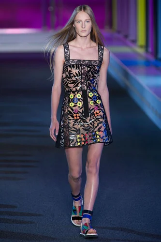
Originally founded by Pilotto, the brand is sold in over 49 countries, and stocked by luxury retailers, such as Net a Porter, Liberty and Saks Fifth Avenue. The design team adds new energy to their collections; they’ve taken the concept of digital printing one step further. Combining prints with neon brights, stain-glass window effects and Perspex, as used in their Spring/summer 2015 ready-to-wear collection.
In 2004, digital fanatics, Basso and Brook, made pattern history with their designs. Their revolutionary 100% digitally printed collection saw them take home the respected Fashion Fringe Award, and earned them a place in Vogue’s annual ‘Vogue list’.
Creative pair, Bruno Basso and Christopher Brooke, both bring their own inventive elements to the table, with Basso creating the gravity styled patterns, and Brooke formulating the intricate graphics.
Brazilian born, Basso and British Brook first met in 2001, and have gone on to be one of the first UK designers to dress the first lady, Michelle Obama, while she gave a speech at the Whitehouse in 2009.
Not for the shy, or faint hearted, their prints are epically flamboyant and playful, with Tim Banks of Style.com fittingly naming them the ‘Pixar of Fashion’. They are defined by bold characteristic prints, that just keep on getting better, and louder.
With digitally enhanced clothing taking a giant leap into modern times, there is undoubtedly room for fashion graduates and textile designers to explore this exciting, technical method to take their collections on a futuristic ride. We at ROOMS are completely print-obsessed.
Pictoplasma Festival 2015 | Berlin
The world’s largest Conference and Festival of contemporary character culture is back and bigger than ever, with an exciting line-up of interdisciplinary artists ready to whet your appetite and get those juices flowing
A celebration of international design and art with loads of character
Last year, Berlin’s Pictoplasma Festival celebrated its tenth anniversary with a series of remarkable exhibitions, live talks, workshops, presentations, screenings and performances that shaped the five-day festival of contemporary illustration and character design. This year it’s back, bigger than ever and with an exciting line-up of interdisciplinary artists ready to whet your appetite and get those juices flowing.
Since its launch in 2004, the Berlin festival has been identified as the the world’s leading international conference and festival for uniting visual like-minded creators and producers and has since developed a second annual conference in New York. It is also a very accessible festival that gives you the chance to hear some of todays most innovative and inspiring artists working with a range of mediums using art and the digital.
Confirmed speakers for this year include Joan Cornellà, Sticky Monster Lab, Andy Ristaino, Animalitol and, Birdo, Lucas Zanatto, Yomsnil, Hikari Shimoda, Mr Kat, Brosmind, Loup Blaster, Stefano Colferai, TAFO and the super talented, award winning mixed media storyteller Yves Geleyn.
Also on show will be an exciting display of art works by young, emerging and established artists. Recent graduates from the newly established, annual master classes at Pictoplasma’s Academy are also set to show case their works at Friedrichshain’s popular Urban Spree Galerie.
Babylon will also be bringing some new characters to the foreground in a series of four feature film length animation programs for you to feast your eyes on. Expect motion graphics, experimental animations and a bit of everything in between. Not to be missed are Encyclopedia Pictura (former creators of music videos for Bjork and Grizzly Bear).
And if that wasn’t enough, the Festival will culminate with a final blowout, not to be missed Pictoplasma party that will be held on Saturday 2 May. Details of the line-up to be revealed on their website soon.
April 29 – May 3 2015 | Pictoplasma Festival
More Art-House Films Please | What to watch this spring
Catch Me Daddy, The Tribe, White God, The Salt of Earth, Beyond Clueless
Outside the birds are chirping, so that must only mean one thing...spring is here! And what better way to celebrate the end of our long winter hibernation than to get out and catch some new fantastic art-house films.
Not only do art-house cinemas support independent artist but they’re a great way of catching a film that you might never have come across yourself. Think Ukrainian film made entirely in sign language! And that’s just one of the selection in our list of 5 cool art-house films you need to check out this spring.
Catch Me Daddy
An immensely cinematic film by Daniel and Matthew Wolfe, with visually engaging cinematography of expressionist images uplifts this film into something more than social realism. The narrative follows the story of a young Pakistani girl who runs away with her white boyfriend and her father who sends mercenaries in pursuit to find her. The film is set in the Yorkshire Moors which adds to the harrowing bleakness of the story. Non-actors elevate the unique quality of this film. One of the most powerful films to come out of British cinema this year
In UK cinemas 27 February
The Tribe
A film which literally needs no translation, The Tribe is a Ukrainian film shot entirely using sign language and no subtitles- a technique which heightens the emotion and adds power to this film. The narrative takes place in a boarding school for deaf children which are run by students like a crime syndicate. This gripping film loses nothing where language is absent and breaks conventions and boundaries in cinema proving dialogue is not everything.
In UK cinemas 15 May 2015
White God
This Cannes winner Hungarian masterpiece emphasising the revolution that comes from a suppressed society embodied in the form of dogs in this political parody by Kornel Mundruczo. The story centres on 13year old Lili whose father abandons her beloved dog Hagen on the streets where he must fend for himself and learns quickly the brutality of the harsh streets, exploited by thugs and wanted by dog catchers, he turns to be as violent as the streets he now has to survive in.
In UK cinemas 26 February 2015
The Salt of Earth
A visually stunning documentary following the Brazilian photographer Sebastiao Salgado’s lens, which captures the subjects of his black and white images and photography projects which took him to the world’s most hostile conflict zones from the gold mines, through the Sahel and the Gulf war oil fires. In this documentary film we learn of the way Salgado is able to capture his unique shots and the befriending nature of the photographer to connect with all of his subjects in order to capture something more captivating. This documentary is as much for the naturist as it is for photography and film buff.
In UK cinemas 3 July 2015
Beyond Clueless
Charlie Lynne takes us back on a journey into the mind, body and soul of teen movies using clips compiled from 200 classic films in this nostalgia trip back to the 90’s where we are reminded of the those teen movies which framed our twenties and re shaped the formula of teen movies in the present... it also presents itself as a bit of a game where you will be working out which young teen star is that A-list actor.
In UK Cinemas 23 January 2015
The Parasol unit presents: Los Carpinteros, the multidisciplinary duo
The Cuban art collective, Los Carpinteros, will be holding their first major show in the popular Parasol Unit Foundation for contemporary art, in London. The duo will exhibit their large-scale sculptures and installations
The Cuban art collective, Los Carpinteros, will be holding their first major show in the popular Parasol unit Foundation for contemporary art, in London. The duo will exhibit their large-scale sculptures and installations.
Made up of artist collective Marco Castillo and Dagoberto Rodriquez, Los Carpinteros have been working together since the early 1990s. They live and work between Madrid, Spain, Havana and Cuba, and have showcased their work all over the world. Focusing on the intersection between art and society, the group unites architecture, design and sculpture in comical, surprising and inventive ways.
Drawing on personal experiences, their work is often described as ‘interrogative art’. They chose to examine the relationships between art and society, form and function, practicality and frivolousness.
The Parasol unit will include the duo’s installations, sculptures, watercolour drawings and film screenings. The ground floor will be devoted to their larger works, such as the installation Tomates 2013, in which 200 real tomatoes will be splattered against the gallery walls. The piece aims to evoke feelings of compassion and sensitivity surrounding the topic of a political revolution.
The exhibition, curated by Ziba Ardalan, founder and director of the Parasol unit, will also include a series of watercolour drawings and small-scale prototype models. The watercolours bid to display the prosperity of possibilities. These paintings are a crucial aspect of how Los Carpinteros work, and act as a pivotal discussion between the two artists.
The gallery’s intention is to offer a fertile space for artists, so audiences can explore and question contemporary art and the way in which the chosen artists work creatively. The Parasol unit encourages interactivity, asking their audiences to push the boundaries of art, and support artists throughout the exhibitions.
Los Carpinteros will be exhibiting at the Parasol unit from March 25th, until May 24th 2015.
Food for thought | Europe’s best designed restaurants
Here is a list of six brilliantly designed and accessible restaurants within Europe that have perfected their menus and design principles and will certainly have you coming back for more
When it comes to dining, in a continent surrounded by some of the most exciting culinary landscapes in the world, the well-versed foodie is definitely spoilt for choice. But it doesn’t take much to realise that the design of a restaurant will often have a far bigger impact on your dining experience than the food itself. Many foodies I know will deny the importance of ambience for their satisfaction, but décor for the restaurateur is quickly becoming a number one priority, and a priority that’s showing how we don’t always have to go for the often over priced, is-that-even-a-portion-sized restaurant, to fine, dine and wine. Here is a list of six brilliantly designed and accessible restaurants within Europe that have perfected their menus and design principles and will certainly have you coming back for more.
Short days, long winters, cold nights... The Danes know how to combat Denmark’s seasonal gloom with the art of hygge and its much talked about New Nordic cuisine, but it all comes at a price, and a price that’ll have you reaching deep into the pockets of your feather down jacket to foot the bill. But not at Höst.
Founded by the restaurant group Cofoco together with the local architecture and design duo Menu and Norm Architects, Höst is a traditional new Nordic restaurant, located in the heart of Copenhagen in the neighbourhood of Nansensgade with a modern twist. The restaurant has already won three international design awards including the World’s Best-Designed Restaurant and Best European Restaurant at London’s Restaurant & Design Awards.
Decked with its bare wooden furniture, subtle grey walls and soft lighting, Höst strips everything back to basics to complement the simple delights of Nordic cooking with a touch of modernism, resulting in something aesthetically and mouth wateringly delicious. Their menu includes dishes such asSmoked Trout with cauliflower-puré and pickled mushrooms with truffle and Norwegian lobster, juniper-pickled carrots, sea.buckthorn, juniper cream, hazelnuts and browned butter.
De Kas | Amsterdam
Adopting an environmentally friendly lifestyle whilst eating out might be easier than you imagined. In 2001, chef Gert Jan Hageman converted an eight-meter high greenhouse and former 1920s Municipal Nursery into a self-sufficient restaurant, which has been the source of inspiration to all grow-your-own-foodies since.
De Kas restaurant sources all of its own ingredients in the restaurant’s surrounding gardens and farmland nearby. With produce picked only hours before it is served, the restaurant has a three-course, Nordic inspired, fixed menu that changes according to the season and its availability to ensure that you are graced with a meal that promises to be fresher than fresh.
Kamerlingh Onneslaan 3, 1097 DE | +31204624562 | info@restaurantdekas.nl
Dishoom - King’s Cross | London
One day, an eccentric old Irani Café (born circa 1930, Bombay) made a long trip from Bombay in 1970 to London in 2010… Three years down the line and Dishoom have opened its third restaurant in King’s Cross, with an even better Bombay inspired design. Formally a railway transit shed dating back to the 1850s, the restaurant pays homeage to Bombay’s Irani cafes and is reminiscent of Mumbai’s Victoria Terminus that once passed between Britain and the Empire (London and Bombay).
Owned by cousins Shamil and Kavi Thakrar, Dishoom re-invents this period of Indian history in a beautifully designed space sprawling across four floors, furnished with colonial-style bentwood chairs, ornate tiles, ceiling fans and colonial styled décor. The restaurant has a reception and bar on the ground floor, a basement bar, a first floor dining room decked with curved seating overlooking a private dining area, and a chef’s open kitchen on the second floor where you can watch your food being prepared.
Chicken thigh meat steeped overnight in garlic and ginger, a vegetarian Paneer tikka marinated and gently charred with red and green capsicums or the Irani cafe favourite, Lamb keema and peas are just a few of the fine dishes Dishoom has to offer.
020 7420 9321 | 5 Stable Street, London N1C 4AB
Fame/Katerschmaus – Kater holzig | Berlin
Set in an old soap factory on the upper floor of the graffiti covered, art infused KaterHolzig complex, Katerschmaus is an open kitchen-restaurant turfing out great German inspired cuisine, boasting impressive views of the Spree right on the water and better still, with its own rooftop bar. With a menu that changes weekly, expect Argentinian steaks, abruzzo truffles and a culminating sugar boost that will settle your taste buds and have you ready to re-enter the revelry downstairs.
Oh, and no photos allowed, you’re cooler than that.
Holzmarktstraße 2510243 | fame@katerschmaus.de | +49 30 510 521 34
Kronenhalle | Zurich
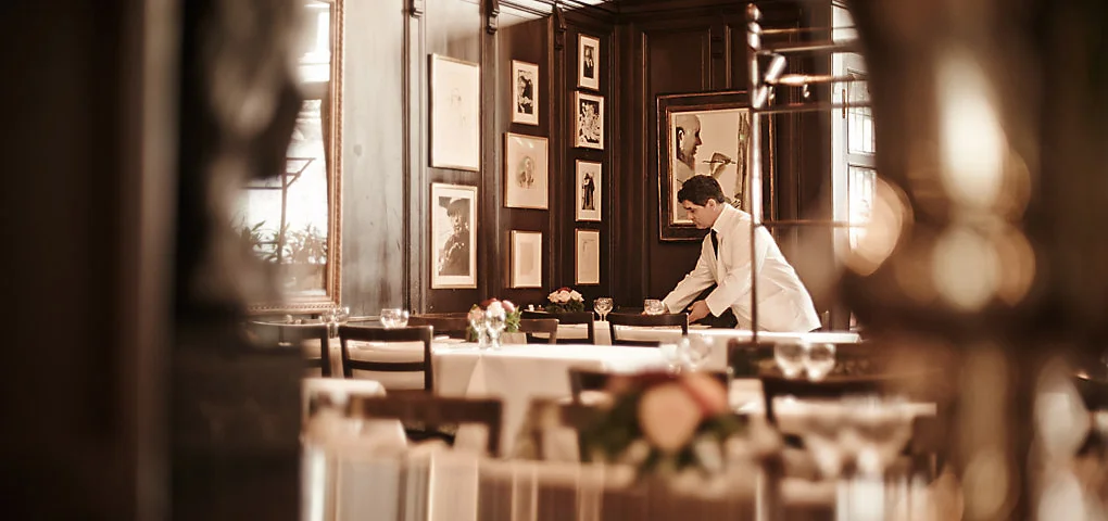
A haven of art and comfort, Zurich’s Kronenhalle is a restaurant and bar with an astonishing display of 20thcentury art by the likes of Chagall, Mirò, Picasso, Braque and Matisse, that all belonged to one man, silk magnate Gustav Zumsteg. Since its opening in 1924, the restaurant has always been a refuge for art and allegedly a haven for figures such as Coco Chanel, Yves Saint Laurent, Pablo Picasso and Alberto Giacometti. Today its elegant menu complements the restaurant’s interior; minced veal ‘kronenhalle’ style, Chateaubriand and mousse au Chocolat to name a few.
The restaurant continues to attract an eclectic mix of people and is quickly becoming a hip hangout for Zurich’s students and its creative elite.
Rämistrasse 4, 8001 | +41 44 262 99 00
Nose2tail | Copenhagen
Valkendorfsgade 22, 1151 København K
Introducing, ‘Copenhagen’s first sustainable gastro pub’, a cosy, candlelit haven for all meat lover’s, set within the Kødbyen area of Vesterbro in Copenhagen –the ‘Meat Packing District’ - and in what was a former butcher’s house.
Inspired by the British phenomenon River Cottage, the restaurant prides itself for using locally sourced produce and evolves around sustainability, using every part of the slaughtered animal (hence its name, nose to tail) to minimise waste. The menu is divided into three sections, the fish, entrails and the animal. No hidden agendas just honest, tasty, eco friendly food that gives a modern twist to the pub classics. Organic free range pulled pork, organic burgers made from free range beef, deviled organic free range eggs, to name a few. And if that wasn’t enough, the restaurant houses a great selection of local, Danish beers too.
Valkendorfsgade 22, 1151 København K | +45 33 93 50 45
Ben Oakley Gallery to exhibit at the London Affordable Art Fair
The Ben Oakley Gallery is showing off its artists at the London Affordable Art Fair. The gallery, which specialises in unique, one off contemporary art works, limited edition prints and fine art, will be showcasing its carefully selected pieces at the fair in Battersea this March.
The Ben Oakley Gallery is showing off its artists at the London Affordable Art Fair. The gallery, which specialises in unique, one off contemporary art works, limited edition prints and fine art, will be showcasing its carefully selected pieces at the fair in Battersea this March.
The team will be taking some of their Ben Oakley charm to the show space by installing a replica of the gallery to the project space in front of the venue. They promise 1940s wallpaper, a large collection of curiosities and a selection of paintings by artists such as, John McCarthy, David Bray, Matteo Giuntini Bobby Tonge, Jo Peel, Ray Richardson and, of course, Ben Oakley.
Originally opened in 1999 by Will Ramasay, The London Affordable Art Fair aims to make art as fun, accessible and affordable as possible. With 112 galleries showcasing an array of unique artworks from over 1,100 artists this year, there will be something for everyone.
With work from the much-anticipated Project Space Collective, Ben Oakley Gallery and the Come Fly With Me exhibition, the fair is set to be both interactive and inventive. A creative hub for creative minds, they invite visitors to fall in love with art and most importantly, become an art collector.
What started as one venue and 10,000 visitors has now evolved into an international phenomenon, the Affordable Art Fair now runs in cities such as Amsterdam, New York and Milan, to name a few. With over 1.6 million people walking through the fair’s doors, it has undoubtedly made its stamp on the art world.
The Ben Oakley team will be at the fair from the 11th till the 15th of March


