An interview with illustrator Davide Bart Salvemini
Italian artist Davide Bart Salvemini lets us in to his weird and wonderful world of illustration. Keep your eyes peeled and your screen brightness dimmed.
Italian artist Davide Bart Salvemini lets us in to his weird and wonderful world of illustration. Keep your eyes peeled and your screen brightness dimmed.
There’s an almost childlike fantasy about his work. His illustrations are at times, surrealist, comical and touching. But they are always vivid, and moving in their own flamboyant way. He’s more than an illustrator and an animator. He’s a holistic artist, taking on inspiration from all forms – and utilising that to create his own magical pieces. And magical they are.
Maybe it’s the subject matter or maybe it’s the bright use of colour, but I always feel somewhat regressive when I see his work. The inner child in me is enchanted, whilst the adult in me is intrigued. And such intrigue is terribly insatiable. So I whipped up a few questions, and served them to the man himself.
Could you tell us a bit about your past? How did your upbringing lead you to become an artist?
It all started with a white paper and some colours. Afterwards I understood that I would never be a crazy scientist (I dislike chemistry) or an airplane pilot (I’m very tall). I thought that it would be great to make a living out of my art and on my schedules (very long nights).
In the first period [of my life] I had unrelated jobs like volleyball player, shoes seller, barman and photographer, and also a diploma in electronics and a first year in a criminology university. Then I took a master’s degree in Illustration and I realized that was my path.
Your art really reminds me of Jim Woodring’s work. Jim has previously stated that his surreal pieces are inspired by hallucinations that he experiences. Do you also have similar inspirations or is your creative process entirely different?
I’m honoured by your words, because I love Jim Woodring and his Frank!
I like to think that my mind is like a sponge, it absorbs everything that it sees from books, films, games, toys and also daily events. I note everything, building a visual atlas. Then, unconsciously linking the pieces of my atlas, I find a message and the future drawing.
Who are your favourite contemporary artists?
Observing the art in all forms, I love Simone Pellegrini’s paintings, illustrations by Sarah Mazzetti, Laurent Impeduglia, Henning Wagenbreth, Moebius, comics by Jim Woodring, Charles Burns, Cocco Bill, movies by Cronenberg, Tarantino, Lynch, Lars Von Trier, Zack Snyder, Jim Jarmusch, Guy Ritchie, and William Eggleston’s photos.
There are also three up-and-coming artists that I follow and I would like introduce: Caterina Morigi link, Alice Socal link and Nadia Pillon link.
I think that it’s very essential to have many “heroes” from whom to “steal”!
Francis Bacon once said the job of the artist is always to deepen the mystery. How do you feel about this as an illustrator?
I think that the creative artefact is more powerful when the observer is thoughtful in their mind, as if he had the last piece of puzzle. In an illustration it’s more important. When you illustrate an article, a book or simply thinking, you shouldn’t be descriptive, because the illustration must only help the text, and not suppress it.
In an interview you’ve previously said that Dante’s Inferno is a big inspiration for you. Could you tell us more about that?
Between the Dante’s circles, the hell is the most fantastic and contemporary. There are more signs and beautiful character that inspired me this project: link. I love monsters and ferocious scenarios. Dante’s hell is my heaven.
If you could work with any other media, what would it be?
In this period I would like to have more time to do animation, because I think that is like to see the magical growth of an organism. But just like Nature, you need a lot of time to develop a motion. I have some experiments in this link. I hope they are interesting for you.
And finally, do you have any future projects lined up you can tell us about?
I’m working on two private commission, one for an independent illustration children’s book and the other for a series of five illustrations for a family portrait. You will see the results by the end of the year. Also I have an idea for a crazy script, but I still don’t know if it will be a comic or a children’s illustration book. We’ll see.
instagram.com/davidebartsalvemini
cargocollective.com/davidebartsalvemini
davidebartsalvemini.tumblr.com
behance.net/davidebartsalvemini
David Bray’s Right Wrong Turn
David Bray is an illustrator and designer whose works are a glimpse into another world, a surreal landscape of cartoon characters and pin-up girls. His surreal new show Wrong Turn is open now at Stolenspace Gallery
David Bray is an illustrator and designer whose works are a glimpse into another world, a surreal landscape of cartoon characters and pin-up girls. His surreal new show Wrong Turn is open now at Stolenspace Gallery.
BM -Text is almost always present in your drawings, but often it seems to have little connection with the drawing itself, what is the relation between the two elements?
DB - In my mind there is a connection, two separate elements from the same story. I try and invoke the drawings with a narrative. Maybe this gets lost as the drawings develop but the text remains - like a chapter title or a header. There is a hint of misdirection with the text.
BM – You often draw onto unorthodox papers, e.g. lined paper, hotel paper, postcards etc. This gives the work a spontaneous and haphazard quality, which contrasts nicely with the exquisitely drawn forms. Is this an intentional thing or do you just draw on whatever you have to hand?
DB - I'd like to say it was intentional and could claim a more intelligent reasoning! I draw on whatever is to hand, there’s no reason to not draw just because you don't have the posh paper. I'm glad that you see the spontaneous nature - it very much is to get the drawing down as soon as the idea comes, so it is using what is to hand. No point in waiting to get to the art shop to get material. No point in procrastination. Not all the drawings come out right, and not all the ideas are particularly smart - but the itch needs to be scratched.
BM – I have noticed that you seem to sketch a drawing first before you draw it, and then exhibit the sketches as well as the more polished drawing. How important is this process of sketching and then exhibiting both?
DB - The quick sketch is to get the idea on paper before distractions fritter it away. Old brain needs cue cards. I never use to show these naive little sketches, but they have their own charm and thought, and they add another to dimension to the whole.
BM – What relevance have the cartoon characters which you often parody, to the artworks that you juxtapose them into?
DB – I was obsessed with cartoons as a child and would copy them repeatedly. Maybe something about this repetition was comforting against the chaos of the outside world. I'm dragging back the comfort of childhood and soothing my fevered brow as the bills stack up and real life comes calling.
BM – In the press release I noticed that some of your influences are very sexual, (Eric Stanton, Nobuyoshi Araki) and oddly perverse (Eric Gill). Why do you think that sexuality is such a great source of inspiration for a lot of artists?
DB – We are all perverts. I see a similar influences in your work Mr. Murphy.
BM – Did you really meet the Yossarian character or is that a reference to Catch-22, and if so can you please tell me a little more about the encounter?
DB – I went with Georg Lubitzer to the States because he wanted to make field recordings of soil for a project he is working on. I don't ask why, but always glad to be on board. Unfortunately we are very poor at orientation and took a few wrong turns. One in particular that led us up a mountain to a small encampment/community. At first there was a bit of suspicion with a hint of hostility but I think when they realised we were not C.I.A. and just a couple of European idiots it became an interesting week.
They introduced me to the Illuminatus Trilogy amongst other things and when we left they handed us a list that we needed to use in our next respective projects. I've stayed true to the promise I rashly made.
The main man up the mountain was calling himself Yossarian, and he was the most 'alive' person I have ever met. He seemed genuinely interested in the things we were up to in our everyday lives. I'm not sure he thought too much about a lot of what I'd been up to, and said he would create a list of elements that I had to use to 'open the gate that I found myself barred by'. He was very insistent. I was drawn in and fell right in line, which is why the show looks like it does. Each piece has what looks like randomly placed elements, but these are actually placed specifically to map star constellations. These constellations contain a message from the Earth to the Universe (so I’m told, and who am I to argue? I’m not going to argue with the Universe, I’m from Bromley) there are many other codas that I barely understand / understood but visually they work and make a cohesive show, so I think I followed the right path.
Everything is painted on found boards and framed in reclaimed timber. The paint used was found while clearing my Father's garage - the same with the brushes. On the list that Yos wrote, the first 3 lines were 'find wood', 'find paint', and 'find brushes'. Within a week of returning home all this stuff had appeared, previously hidden but now ready and available. It made me feel quite weird to be honest.
For every influence I told him I was currently into he wrote a 'counterpoint', with versus against it. So if I said 'Eric Stanton' he wrote 'versus Eric Gill' and so on. The drawings became a blend of these elements and subjects.
BM – The title Wrong Turn suggests that you are taking a different route with your artwork, or that you regret what has gone before. Is this the case, and if not what does the title mean to you?
DB – the show is called Wrong Turn...without the error in direction none of this would have happened. But this also reflects that the new body of work is a swerve to a different route, a different way of presenting my ramblings.
I don't regret anything that has gone before, I’m just looking for new ways to test myself and keep myself interested. If you stick on the same path, the familiar route then you create a rut - there is safety in the security of repeating yourself but sometimes you have to climb out of the ditch and try run up the hill. You might not make it to the top but at least you gave it a go. For me to talk about running up hills is actually quite wrong. A better analogy would be shuffling to the pub but ordering a gin and tonic rather than the usual.
David’s show is on at Stolenspace gallery until the 12th of April.
Life, Love and the Galaxies: Colouring with Natalie Foss
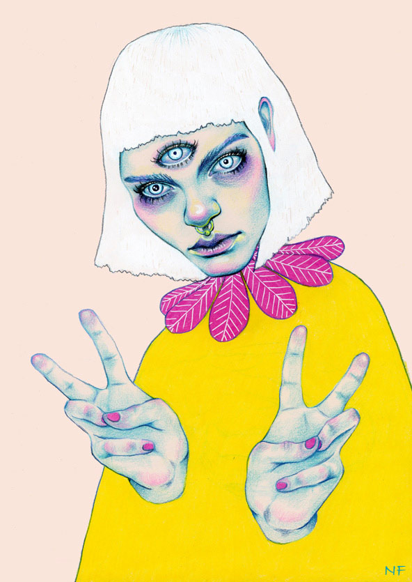
Norwegian illustrator Natalie Foss’ out-of-this- world portraits and pictures are an exploration of the delicate intricacies of life, love and the galaxies in which all of these beautiful things transpire
Perfecting an aesthetic that successfully communicates feeling and expression through coloured pencil on paper, Norwegian illustrator Natalie Foss’ out-of-this- world portraits and pictures are an exploration of the delicate intricacies of life, love, and the galaxies in which all of these beautiful things transpire.
Frequently juxtaposing bright, contrasting colours with brooding and turbulent subtexts in her work, Foss skilfully creates images that linger long after they have been viewed. From an exploration of the life of an animal outsider in The Urban Shadow to Addiction, an allegorical work depicting the similarities between love and drug addiction, Natalie’s work exhibits an urban edge and youthful cool, no doubt attributable to the various subcultures from which she derives inspiration.
After completing two years of study at Norway’s Strykejernet School of Art, Natalie went on to achieve a BA in Illustration at London’s Kingston University. Although currently based in her hometown of Oslo, prints of Natalie’s work are available for sale on her website; she is also an artist featured on Print All Over Me, an independent website dedicated to the production of original clothing items that ships all over the world.
Working on commission, one of Natalie’s recent projects includes a poster and t-shirt design for New York five-piece pop band Lucius, an undertaking which exemplifies the illustrator’s ability to seamlessly lend her style to a wide variety of subject matter.
Natalie Foss’ name can proudly be included alongside the likes of Hattie Stewart and Lizzie Stewart (no relation!) on the growing list of outstanding talent in the contemporary global art and illustration scene.
Natalie Foss
Everyday Illustration: Paola Saliby
I'm a Brazilian illustrator based in Sao Paulo. I've been illustrating for three years in publishing and advertising. I also work on my personal projects, create portraits and custom wedding invitations. My dream is to do a master degree in Europe, expand my work worldwide and have my own illustrated book published.
My ideas come from simple things, like people on the streets, some experiences I have during my day, a book or a movie I saw. In my illustrations I like to explore prints and patterns, creating interesting and exciting textures and I also like childlike themes very much.
I love working with analogical tools like gouache and watercolour.
Creativity is a very complete subject. It's about using perception, logic and sensibility in order to analyse things from a different point of view. It’s something that with dedication everybody can develop throughout life.
Paola Saliby


SS15 Illustrated: Our favourite fashion illustrators
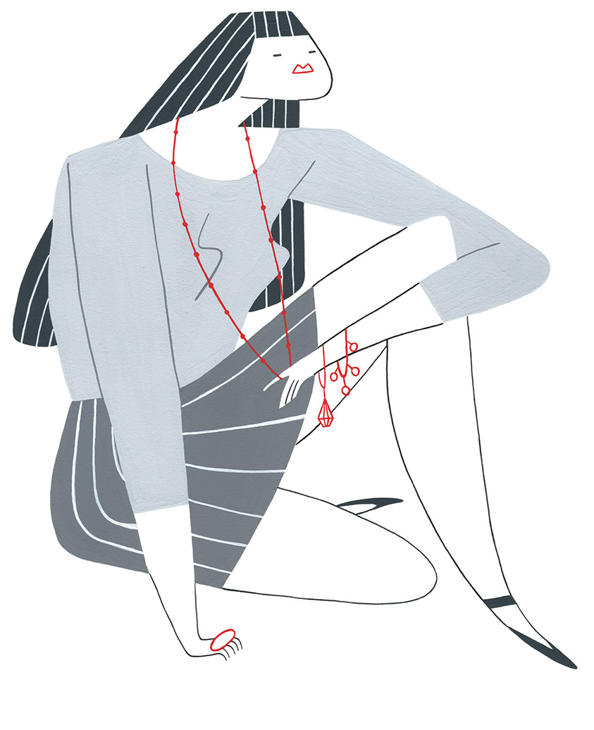
Though fashion illustration has slowly been on the decline since the late 1930’s with the emergence of photography, nothing can replace the ethereal and timeless beauty of a detailed hand sketch, which has the power to utterly bring a design to life.
Admired as an art form, there is something so incredibly charming about a detailed reportage illustration, which translates an artists unique interpretation and impression.
Whilst only playing a small role to the contribution of magazines and advertising, there is still a role for the craft in the industry. Stylish sketches are particularly illustrious in the blogosphere, esteemed by fashion power houses, and regarded as collectable pieces of art.
From minimalistic pencil sketches, to bold, striking shapes which play with form and proportion - fashion illustrators have the freedom to pour their artistic style into the essence of their work and to inspire us with their distinctive visions.
For each of the fashion capitals, resident illustrators are commissioned by SHOWstudio to create a series of original sketches. Some elegant, some playful, some focusing on one detail in particular and others balancing light and dark, but all strikingly unique with their signature styles.
Among my favourite fashion illustrators is London and LA based Velwyn Yossy. Distinctively associated with elegance and style, as SHOWstudio's resident London Fashion Week S/S15 illustrator, Yossy has produced a series of original artworks inspired by womenswear collections including Burberry, J. JS Lee, and Issa. Using a mix of clean lines and bold colours the artist pushed the boundaries conceptually with her unique interpretations.
Working in paint, noted for her bold striking splashes of colour, Australian contemporary figurative painter Abbey McCulloch, named as one of ‘Australia’s 50 Most Collectable Artists’ by Australian Art Collector in 2009, illustrated the many runway styles from Paris Fashion Week. McCulloch depicted looks for Louis Vuitton, Viktor and Rolf, Alexander McQueen, Stella McCartney, Balmain, Givenchy and Sonia Rykiel to name a few.
In complete style contrast NYFW was documented in the simplistic and fragile signature style of Victoria Kim, the New York born and raised artist who has worked for publications such as Visionaire and V Magazine. Kim depicted the key runway looks from shows including Marc Jacobs, Calvin Klein, Alexander Wang and Gareth Pugh.
The bold graphic work of Damien Florébert Cuypers is also especially recognised. Capturing New York Fashion Week with “impressionistic portraits of the fashion set” as noted by The New York Times, his colourful sketches in his signature crayon style which jump from the page give evidence to why this exquisite art should always have a place in the fashion industry.
From haute couture to street wear, to depicting runway styles and fashion personalities, there will always be a space for the art form of impression drawings in the industry, no matter how advanced technology becomes. Illustration will continue to thrive with the help of these talented artists.
BRIAN CALVIN: The Physiognomy of Comfortable Lethargy
As the decade of “status updates” and “selfies” passes in the name of social-media’s ebullient narcissism, Brian Calvin’s works accentuate the perturbing boredom of a population affected by endemic self-awareness.
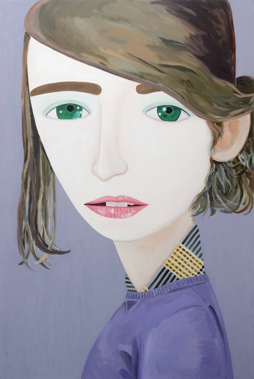
Born and raised in California, Calvin is a master of mischievous “pausing-as-an-activity” portraits, his work becoming synonymous with the sun-drenched sands and relaxed lifestyle of Los Angeles. Hyper-exposed, bleary-eyed youths with glossy lips and crooked teeth pose for an unseen observer against the backdrop of what Calvin describes as “generalized glimpses of the California coast”.
Mastering a unique proficiency of composition in his portraits, Calvin assembles scenery, features, and expressions to loiter indecisively between states of abstraction and figuration. Thus, the characters of Calvin’s colourful eye-candy portraiture manage to all but evade narrative traits. What remains, captures centre stage nameless, story-less characters with provocatively parted lips and “dents du Bonheur”, suggestive of playful lasciviousness. Conjuring up images of Brigitte Bardot and Sophia Loren there is something profound and subtly charged about the spirit of melancholia, which permeates the seemingly vain and conceited faces of Calvin’s portraits. Simultaneously an intense sense of innocence and an aura of present-mindedness coat the colourful imagery.
Despite the chronicler’s manifestation in modernist figurative painting, which some might be excused for considering a cynical distortion in the name of narrative content, Calvin’s quietly disconcerting style has a more sincere quality. Rather than a caricature of form and figure, Calvin’s work muses the conundrum of a society, in which, consciously or not, we endeavour to influence the perceptions of others. Whether “stoic or stoned” Calvin’s aloof and emotionally cool characters imply a rampant monotony of selfie-culture and the increasing lack of human relations within it. Yet Calvin’s choice of colour and form covers the gloomy message of his subjects in an icing so delicious, the spectator is at risk of missing it entirely. And despite little or no sign of communication in his portraits, the close-ups display a sense of relaxed comfort within their environment and the unidentified spectator. Despite the grip of a “selfie-self-love-culture”, there is something decidedly comforting, uplifting even, about Brian Calvin’s enchantingly self-aware young subjects.
Illustrating the human condition: BORIS PELCER



Illustrating the human condition: Boris Pelcer
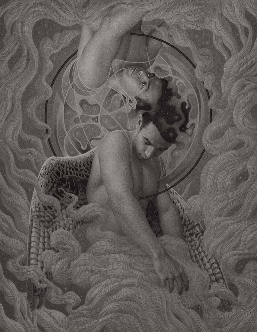
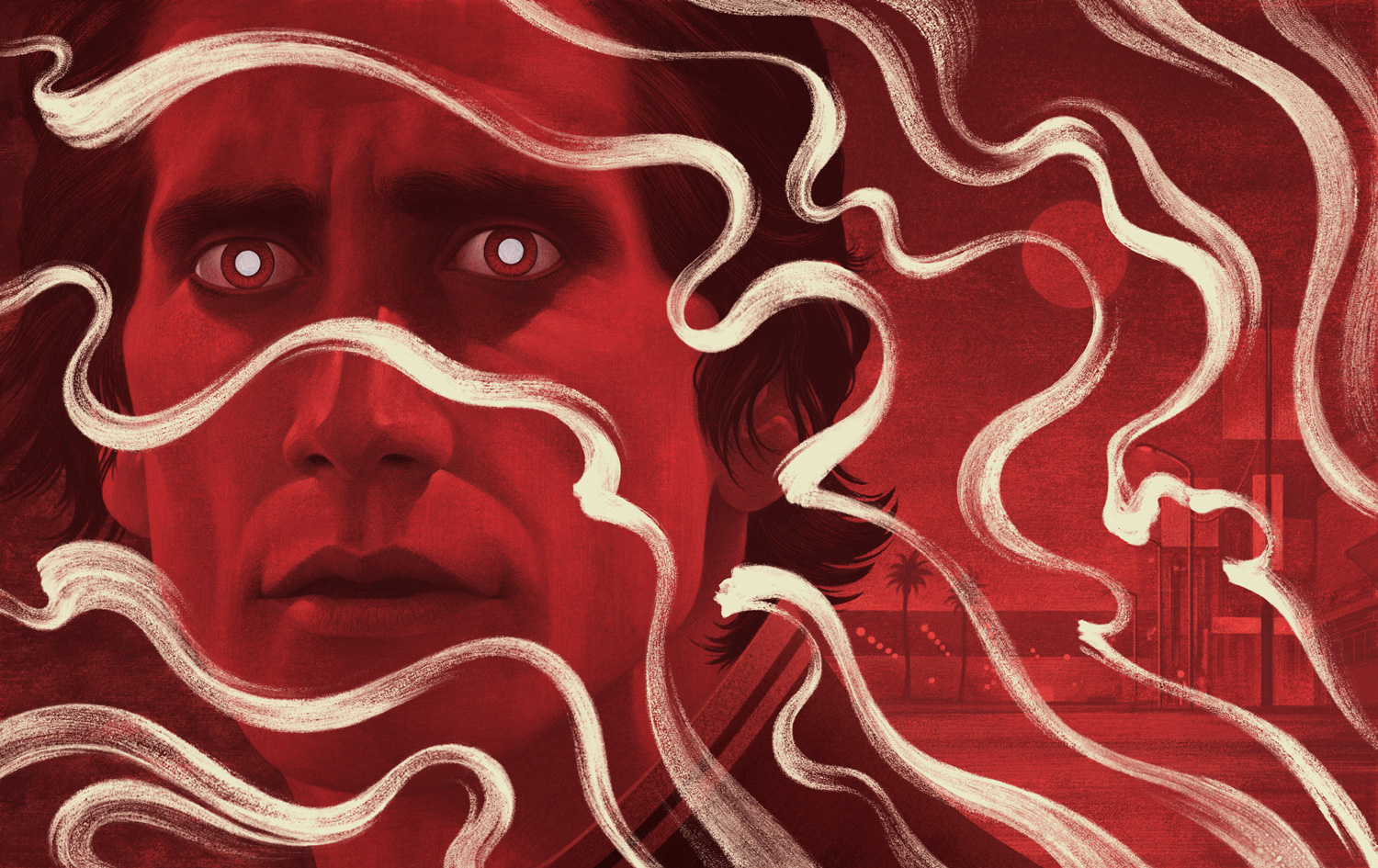
The first step of creating a body of work is the formation of an idea behind the work. That includes researching, reading, self-reflecting and writing about a particular concept. If the work is for a client the main idea is given to me by the client. If the work is personal it requires a good deal of self-reflection, which can take time. I try not to define my concept to the degree which restricts my work from evolving into something unexpected. Once the overall idea is set, then I start collecting reference, sketching compositions and thinking about medium and colour use. As far as medium is concerned, I prefer graphite and acrylic. Such mediums often produce unexpected textures and compositional elements, which in my personal opinion improves the overall mood of my work.
Creativity is quite important to me. It is one of the main ways that I contemplate and attempt to better understand the enigmatic aspects of the human psyche and the human condition. Thus, my personal work is a visual record of my thoughts, moods and philosophical contemplations.
Boris Pelcer , Milwaukee, WI, USA
Charles Richardson: Rehearsal After Dark
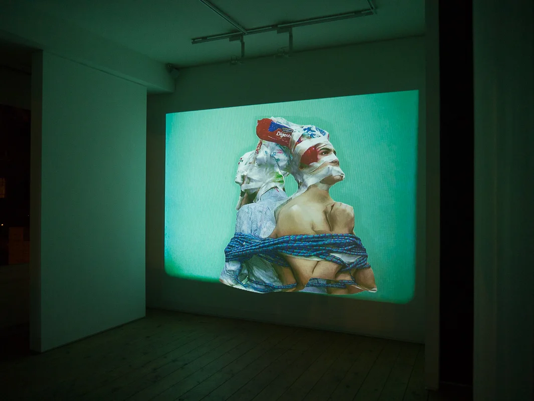
Visual artist Charles Richardson’s latest work is a continuation of his video installation Rehearsal that won the 2014 New Sensations Prize by Saatchi. Richardson has been hailed as one of the UK’s most talented new artists.
Rehearsal After Dark uses a 16mm projection showing the 3D torsos of two figures. The images, distorted and blurred, are layered with bright plastics and other objects. The work flickers on a bright background creating a virtual space. Richardson says he finds ‘the realm of real taken into a virtual space a very interesting proposition’ rather than limiting to solely the virtual and vice versa. The videos are accompanied by eerie piano music that twists the view of the images, creating an audio/visual, surrealist heaven. His work is a good reflection of the current wave of ‘post-internet’ art, highlighting what you can create with modern technology with messages showcased through light creative pieces. As a movement, there always feels like a certain level of irony accompanying it, with a mockery of the digital age. Youthful artists are targeting what they know and the use of video art is ever growing, as shown here, making unique and interesting work with the programs available now, Richardson’s work is a prime example of this.
Rehearsal After Dark will be showing 5pm-12am at Cabin Gallery, until 30th January
subtitleddreams.tumblr.com/
MINNI HAVAS:The Photorealistic Helsinki Fashion Illustrator
Minni Havas’s illustration career begun evolving since she was a young teen, and later by attending the University of Art and Design in Helsinki. Known for her photorealistic aesthetic, not long after that she was signed by Pekka in 2008.


“I began illustrating already as a teen but more professionally all started after I was signed to Agent Pekka 2008. They contacted me and asked me to join after one of my friends showed them my illustrations. It was when I joined my current agency Pekka they made a selection of my work that defined my style more clearly.”
The main stimulus behind Havas’s work is fashion. “I would say my main inspiration behind my artwork is fashion... But it is more like the things i pick up from the stream (life, internet, friends, random stuff) and I want to make something original out of it. I would describe my art aesthetic in a pop, fashion, detailed, airbrush, playful style.”
Throughout her career, Minni was involved with clients such as Citroën, Diesel and BBH New York. However, currently she is focusing on working with smaller companies where she is able to have more creative freedom. “At the moment I work with small clothing companies that make mostly children's clothing. They give me a lot of freedom with the designs and its creatively a good challenge. Many ideas come from nature and pop culture phenomenons... Colors come naturally and I tend to have certain colors that I use like pastels.”
We asked Minni to describe one ordinary day at work: “Lets say I have to make a pattern design for my clients clothing collection. I usually have many ideas written down in my sketchbook and I try out some of them and send sketches to the client. They choose whats most relevant and interesting and I continue to make the finished piece from that. I draw elements like animals and scan them and continue on computer to make the pattern. One pattern takes about three days to make and I usually give some color options to the client.”
A lot of people in the art industry appreciate Minni’s sense for detail and colours. She has had many good responses from clients and completed interesting projects. What keeps her going is true passion, and love for what she does. “I started illustration quite young like 15 or something. I made some illustrations for magazines and books. Art has been part of my life since I remember. I have challenged my self over and over again to achieve the goals that i've set for myself.. Its a life long process.”
At the moment Minni lives in Berlin but says she’s absolutely in love with London. “I love how London is so versatile. Many interesting creative spaces. Helsinki is always my home but it was time to leave for new ideas and stepping out of my comfort zone. Helsinki feels too small sometimes and i like to be surrounded by life and space so in that sense Berlin is similar to London.”
Stella McCartney is Minni’s true fashion inspiration, and if she could be another artist it would be Jesse Auersalo. “In the future I would love to see myself working with maybe Stella McCartney because I love her design aesthetics. And now that I have done mostly pattern design id love to work with someone like her. If I could be another artist it would have to be Jesse Auersalo, I really admire his style and ideas... and I always wonder how he creates his work. Also, lately I have been really into rugs and textile design and I have many ideas concerning that. I would like to develop my skills further and continue to make the things I love. I’d like to work more and more with pattern design for interior and fashion design.”
JAVIER MEDELLIN PUYOU A.K.A JILIPOLLO
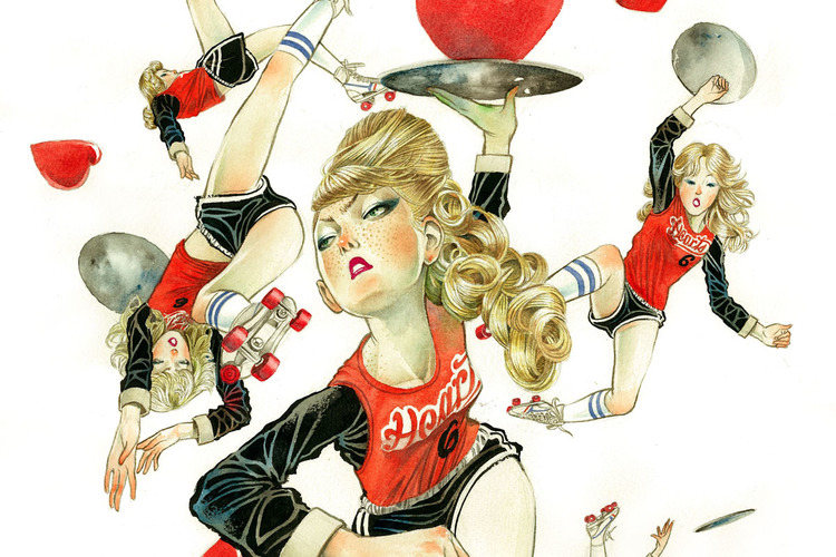
Javier Medellin Puyou a.k.a Jilipollo is an illustrator based in Mexico. His style is somewhat reminiscent of 50s pop art; infusing bright and contrasting colours into his work and taking inspiration from contemporary society but Jilipollo’s illustrations take on a much more distinctive vintage hue…
Jilipollo has worked under many aliases in his life, including ‘Big Polla’ and ‘Pimp Pollo’ when he used to DJ. Now he goes by the name Jilipollo and although he is a trained architect, it is the path of illustration that has captured the artist.
His work draws from Japanese and Mexican pop culture and also 70s vintage stylings. It is this fusion of inspirations which gives his illustrations such an individual look and feel. Predominantly utilising watercolour and ink, his art mostly revolves around women as their central subject, looking at their different moods and expressions. His pieces range in theme from fashion to the excess use of social media in society and he has even designed illustrations based upon the newest film of The Great Gatsby.
Creating illustrations for clients in advertising (like Coca-Cola), editorial and fashion, Jilipollo has experimented with diverse mediums, now selling not only prints of his illustrations but t-shirts, duvets and iPhone cases displaying his characteristic work.
Drawing from contemporary subjects, Jilipollo’s creations are vibrant, intriguing and hopefully he will continue to develop these subjects into these visual masterpieces.
jilipollo
All images © Javier Medellin Puyou a.k.a. Jilipollo


