

Life, Love and the Galaxies: Colouring with Natalie Foss
Norwegian illustrator Natalie Foss’ out-of-this- world portraits and pictures are an exploration of the delicate intricacies of life, love and the galaxies in which all of these beautiful things transpire


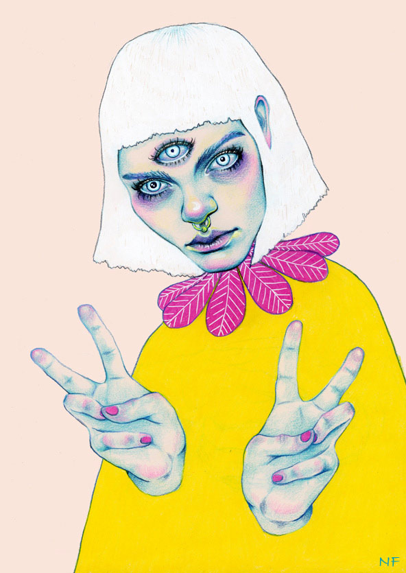


Perfecting an aesthetic that successfully communicates feeling and expression through coloured pencil on paper, Norwegian illustrator Natalie Foss’ out-of-this- world portraits and pictures are an exploration of the delicate intricacies of life, love, and the galaxies in which all of these beautiful things transpire.
Frequently juxtaposing bright, contrasting colours with brooding and turbulent subtexts in her work, Foss skilfully creates images that linger long after they have been viewed. From an exploration of the life of an animal outsider in The Urban Shadow to Addiction, an allegorical work depicting the similarities between love and drug addiction, Natalie’s work exhibits an urban edge and youthful cool, no doubt attributable to the various subcultures from which she derives inspiration.
After completing two years of study at Norway’s Strykejernet School of Art, Natalie went on to achieve a BA in Illustration at London’s Kingston University. Although currently based in her hometown of Oslo, prints of Natalie’s work are available for sale on her website; she is also an artist featured on Print All Over Me, an independent website dedicated to the production of original clothing items that ships all over the world.
Working on commission, one of Natalie’s recent projects includes a poster and t-shirt design for New York five-piece pop band Lucius, an undertaking which exemplifies the illustrator’s ability to seamlessly lend her style to a wide variety of subject matter.
Natalie Foss’ name can proudly be included alongside the likes of Hattie Stewart and Lizzie Stewart (no relation!) on the growing list of outstanding talent in the contemporary global art and illustration scene.
Natalie Foss

Joanna Piotrowska’s Other Family Albums
Polish photographer Joanna Piotrowska creates intriguing staged images, deeply embedded with meaning
Winner of the MACK First Book Award in 2014, and among one of three winners for the first Jerwood/Photoworks Awards this year for FROWST - the unsettling and uncomfortable familial inspired album - Polish photographer Joanna Piotrowska creates intriguing staged images, deeply embedded with meaning.


“Interested in psychotherapies within the family structure, particularly focusing on the inequalities of power between individuals,” the London based artist who achieves her shots through experimentation, explored the oppressive and sinister side of family life in her thought-proving body of work, which was inspired by dance and performance and the German therapist Bert Hellinger, who is best known for his theory and practice of Family Constellation therapy.
FROWST captured intimate family scenes, including two adult brothers lying together on a Persia carpet wearing only white briefs, and black-clothing bodies of two embracing women, which as Mack write suggest the “atavistic overlap of mother and daughter.”
Working in black and white, as in her words it is related to the act of documentation, the photography is intentionally nostalgic for lost moment of happiness. The artist also often uses flash as she notes it “flattens the image, merges bodies with domestic interiors, objectifying them.”
Other projects using the medium include the honest series of portraits “Never is a long time” which featured in the winter 2014 issue of Dazed, capturing the “controlled chaos” and “defiant optimism of a Latvian rehab centre.”
Piotrowska’s works have been internationally exhibited in Ireland, Spain, Poland, Russia, France, Latvia and in the UK. The artist began her photography education in Warsaw in 2004 and graduated from the Royal College of Art in 2013.
This march she will be exhibiting at the photography and art gallery on the second floor of the Science Museum, London.


Fahamu Pecou: Challenging Masculinity in the Media
With his painting All Dat Glitters Ain’t Goals recently featured alongside those by the likes of Gustav Klimt and Jean-Michel Basquiat on the fictional set of new American TV show ‘Empire’, Fahamu Pecou is an artist well on his way to achieving similar status in the real art world
With his painting All Dat Glitters Ain’t Goals recently featured alongside those by the likes of Gustav Klimt and Jean-Michel Basquiat on the fictional set of new American TV show ‘Empire’, Fahamu Pecou is an artist well on his way to achieving similar status in the real art world.


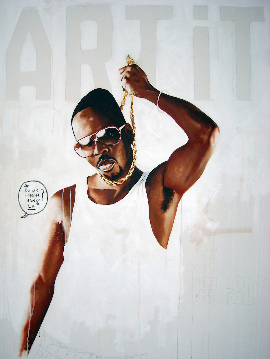


Working primarily through the medium of paint, Pecou utilises his own image as a black male to comment on contemporary representations of black masculinity as it is commonly depicted in hip-hop music and entertainment, satirising the over-inflated egos, explicit wealth, and bravado in his work:
“I appear in my work not in an autobiographical sense, but as an allegory. My character “Fahamu Pecou is The Shit!” embodies the traits typically associated with black men in hip-hop and juxtaposes them within a fine art context. This character becomes a stand-in to represent the ideals and ideas of black masculinity and both the realities and fantasies projected from and onto black male bodies.”
Exploring this territory breeds questions of what happiness and fulfilment actually are, skilfully tackled in recent exhibition ‘Pursuit of Happiness’ in New York’s Lyons Wier Gallery:
Pecou’s work asks “Who are we minus the labels and attachments of popular culture? What does "happy" actually look, and feel, like?”
The artist’s most recent solo show was at the Museum of Contemporary art of Georgia, a series of studies exploring the ability of black males to succeed in modern society; entitled ‘GRAV•I•TY’, the paintings used the fashion trend of ‘saggin’’ as an allegory to comment on contradictions of mobility, access and agency for young black men.
Other notable projects by the artist include a series of conversations that took place in the spring last year; entitled interSessions, Pecou invited figures from the hip-hop community to dialogue with figures from the art world on issues on a range of subjects related to the arts and entertainment, and their impact on popular culture and society.
Also working as a performance artist, writer, and scholar, Pecou is currently pursuing a Ph.D. at the Institute of Liberal Arts Emory University in Atlanta.
Fahamu Pecou Art

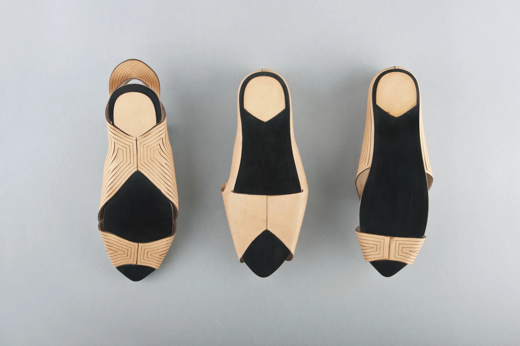
ArtEZ Academy of the Arts presents: Tessa Groenewoud
Tessa Groenewoud graduated from ArtEZ Academy of the Arts, Arnhem, specialising in footwear design
Tessa Groenewoud graduated from ArtEZ Academy of the Arts, Arnhem, specialising in footwear design. She has a strong interest in product design, material manipulation and attentions to detail, and is currently interning at United Nude, in China.


What inspired you to become a footwear designer?
Initially, I was interested in product design. I really like the aesthetics of product design, and then during my time at school I started becoming interested in shoes, and their functional properties.
What techniques do you prefer to use when designing?
I think the appeal of my shoes comes from the techniques I use, and the practicality of the piece. I have a fascination with form transformation, when something changes when you touch it or turn it inside out. It’s very important that it is not merely about the aesthetics – they come from the functionality.
What makes your work unique?
I think my work is minimalistic; I use a lot of graphic lines and industrial details, I feel this style makes me stand out.


You have worked with a variety of materials, one of them being leather. What was it about this material that attracted you to it?
For my ‘Craft the Leather’ project I used vegetable tanned leather, I used this material because it had the capability to be manipulated when wet. I folded the material into shapes, and because of the thickness of the material it held this particular shape, which worked extremely well for this project.
For your ‘Assemble’ project each shoe represents a technique based on the principle of connection, shape memory or compression – how did you incorporate these elements into your designs?
The shoe is about the connection between industrial parts, I thought I could use this to combine the shoe with the wedged heel. I really like the traditional leather, combined with a high-tech plastic material. This project was really about the construction of the shoe.
What techniques/styles would you like to explore next?
I’m really interested in injection molding and silicon printing. I think in the future I would really like to develop my own collection, and it would be interesting to develop these techniques.
What motivates you to design?
Nowadays, shoes are not only about the look of the shoe, it’s about different forms of producing shoes and how practical they are. It’s really motivational for me, as I am so interested in the practicality of shoes.


Daniel Keller : An omnipresence of the digital in our daily lives
Berlin-based American artist Daniel Keller creates spatial and sound installations that fuse art and technology to speak to the visibly forming prognosis of a culture where technology replaces manpower
At a time when technology seems to be filling the minds of a generation that has become so accustomed to being constantly connected, Berlin-based American artist Daniel Keller creates spatial and sound installations that fuse art and technology to speak to the visibly forming prognosis of a culture where technology replaces manpower. Mixing the urban city with the suburban landscape, Keller also uses the internet as a platform to display his performances and interventions.
Central to the work of Keller is the concept of the ‘prosumer, an idea put forward by Alvin Toffler who in examining the progression of new pioneering technologies, recognised the increasing similarities between the roles and objectives of the producer and consumer. These ideas of progress and technological disruption sit at the forefront of Keller’s most recent works and successfully consider the views of the ‘prosumer’ artist.
I was drawn to Keller’s Freedom Club Figure (2013), the elegantly poised figure of a female mannequin and hand-made rucksack of technophobic mail bomber Theodore Kaczynski. Serving as a visual representation and exploration into the seminal essay published by Sun Microsystems founder Bill Joy on, ‘Why the Future Doesn’t Need Us’ (2000), Keller skillfully merged natural forms with man-made materials to highlight the opposing values of a mass producing, consumer driven society and a non-materialistic, nature-fixated self-consciousness.
Personally, I think that Keller’s overlaying of a rucksack onto the female body could also reference nature’s undervalued contributions to the dynamics of modernity. These spaces for technologies derived from nature’s landscapes, after all.
Keller’s juxtaposing of natural forms and technology is also evident in his mixed media, sculptural installation for the ongoing project Absolute Vitality Inc. Created by the Aids-3D duo Daniel Keller and fellow artist Nik Kosmas, the project provided a series of pioneering initiatives that challenged man’s relationship with nature and his surroundings. The result was a scintillating display of LED back-lit chrome lettering planted in a growing wall of shrubberies, analogous to the man-made structures that delineate the spaces of our otherwise natural landscapes.


Daniel Keller is currently exhibiting his new series of works titled The Future of Memory at the Kunthalle Wien in Austria. The exhibition explores the omnipresence of digital media in our lives and draws upon the modern methods of communication that are increasingly becoming shaped by the virtualisation of our interactions.
Exhibition February 4 – March 29
Nikita Gale: Archaeology, Anthropology, Advertising and Art
Originally based in Atlanta, Nikita Gale is an artist making a name for herself in America’s burgeoning and increasingly diverse art scenes on both the East and West coasts.
Originally based in Atlanta, Nikita Gale is an artist making a name for herself in America’s burgeoning and increasingly diverse art scenes on both the East and West coasts.
Currently pursuing an MFA in New Genres at UCLA, Gale is trained in archaeology, anthropology and advertising; she consistently utilises elements from her multidisciplinary background in her work as a conceptual artist. Dialoguing frequently with the traditional constructions of consumer and producer, Gale expresses an interest in the way ideologies of history and capitalism are consumed by individuals:
“I have cultivated a practice that explores the relationship between material culture, identity, and language, specifically how identity is mediated through material, sound, desire and language.”
An artist working with photography, text, video, installation, and performance, it is hard to pin down exactly what Gale’s artistic style is – she describes her work as “heuristic, interdisciplinary, and research-based”:
“My practice incorporates elements from my own lived experience with elements culled from varied sources: reality television, queer hip hop, the work of Wittgenstein, hooks, Foucault and Debord, film (especially ‘anti-narrative’ films), and themes surrounding black/queer subjectivity.”
Projects have included ‘Everything & More’, ‘Autographs’ and ‘The Objective Mutability of Certainty’, all utilising language and text to different ends. Gale expresses an interest in language as our primary means of communication in spite of the fact that it is consistently problematic, exploring the link between text and the communication of identity in ‘Autographs’, and the relationship between time and knowledge in ‘The Objective Mutability of Certainty’. ‘Everything & More’ was an early series of large scale photographic sculptures putting together lettering from Times Square signage, effectively highlighting promises commonly used to entice customers through advertising.
Despite a lack of formal art training prior to the MFA she is currently undertaking, Gale has exhibited widely since 2009, and was recently named one of Complex’s young black creatives making waves in the art world – definitely one to watch.

PACO POMET’s Surrealist Visual Games
Playing with vibrant colour, absurd details and shifts in perspective, Paco Pomet is an artist that demonstrates a propensity for surrealism, successfully converging fiction and reality in his oil paintings.
Pomet’s interests lie in exploring the grey area between the commonplace and the absurd –subverted landscapes and portraits borrow from sepia-toned vintage photographs resembling historical documents, the degree of manipulation of these sources varying from subtle to explicit and unrestrained.
Previous exhibitions include Shipwrecks, shown in Copenhagen’s Bendixen Contemporary Art gallery with works showcasing Pomet’s playful and oneiric style:
“Paco Pomet's paintings are visual games. At first sight they show a recognisable environment, but before long, the imitation of reality tips over into an illogical narrative that draws on the symbolic language of Magic Realism…. The author, as he has always done, invites the spectator to enter an exercise of interpretation where the constructive elements of the images are divested of all conventionality.”
Unambiguously titled Obra Reciente (‘recent work’), Pomet’s most recent exhibition in Madrid’s My Name’s Lolita Art gallery sees the artist tackling industrial progress as it took place early in the twentieth century.
Modifying source material from American municipal files, Pomet comments on civilizational regression, evident in the wounds inflicted to the landscapes portrayed – ‘Rojo’ (‘red’) depicts felled trees with their insides exposed and the workmen responsible flecked with a red element suggestive of blood. ‘Fin de siècle’ shows prospectors basking in the golden glow of the new century’s roman numerals, those of the last eerily looming over them in the background wooden and grayscale; the images are tainted with proleptic irony, the onslaught on the environment that would take place over the next century evident to all but those portrayed.
Completing a Fine Arts Degree at the University of Granada in Spain, Pomet went on to study at the School of Visual Arts in New York; He currently lives and works in Granada.
Paco Pomet


‘One Glance Backwards’: CHRISTINA PETTERSSON and the Modern Myth
With a diverse body of work and a penchant for bygone art, Miami-based artist Christina Petterssonlooks back in order to look forward.
With a diverse body of work and a penchant for bygone art, Miami-based artist Christina Petterssonlooks back in order to look forward.
While successful as a performance, video, and installation artist, Pettersson is most renowned for her monumental drawings. With a tendency to reference classical mythology and themes of tragic demise, her drawings are compared to history painting of the past. Portrayals of twisted tree-filled forests, ominous animals, and mysterious figures comprise her drawn oeuvre, which is rendered in graphite and done in scrupulous detail.
In addition to otherworldly themes, her drawings also frequently include self-portraits, a tradition heavily rooted in the time-honoured history of art. Whether nude, positioned as a lounging goddess, or actively interacting with her folkloric surroundings, each likeness alludes to the classical artistic genres that first inspired her.


While self-portraiture is a recurring and key theme in her work, Pettersson does not seek to become the focal point of her drawings. Her intent, rather, rests in narrative:
"I want to restore that epic and mythological dimension, a sense of awe and reverence for the world. The fact is they are not much about my personality. I want to be a storyteller. I want to believe that life is still wild."
This fascination with untamed nature is prevalent in Pettersson’s entire portfolio – namely, The Last Look, a video and installation piece. Inspired by the myth of Persephone, this work is comprised of a short film, projected onto a screen positioned above a three-dimensional scene of wild earth.
Still, even with The Last Look, Pettersson conveys her inherent interest in the past:
“Persephone was allowed to leave the underworld every year, yet every year she had to return. She sees the first sign of light at the end of the tunnel, yet already knows its limits. The darkness will drag her down again. Maybe just one glance backwards. History is full of last looks, stories of people who couldn't help themselves, even when instructed not to turn around. It is so uniquely human to crave that finality. But for someone with such power as Persephone? The opening to the underworld is crystallized by her very breath.”
Ultimately, through her drawings, video art, and installations, Pettersson successfully conjures contemporary pieces that, through past traditions and historical inspirations, “embody a restless spirit, a longing for the unbounded and indefinable, and fervent emotion as the truest source of visual experience.”


BRIAN CALVIN: The Physiognomy of Comfortable Lethargy
As the decade of “status updates” and “selfies” passes in the name of social-media’s ebullient narcissism, Brian Calvin’s works accentuate the perturbing boredom of a population affected by endemic self-awareness.


Born and raised in California, Calvin is a master of mischievous “pausing-as-an-activity” portraits, his work becoming synonymous with the sun-drenched sands and relaxed lifestyle of Los Angeles. Hyper-exposed, bleary-eyed youths with glossy lips and crooked teeth pose for an unseen observer against the backdrop of what Calvin describes as “generalized glimpses of the California coast”.
Mastering a unique proficiency of composition in his portraits, Calvin assembles scenery, features, and expressions to loiter indecisively between states of abstraction and figuration. Thus, the characters of Calvin’s colourful eye-candy portraiture manage to all but evade narrative traits. What remains, captures centre stage nameless, story-less characters with provocatively parted lips and “dents du Bonheur”, suggestive of playful lasciviousness. Conjuring up images of Brigitte Bardot and Sophia Loren there is something profound and subtly charged about the spirit of melancholia, which permeates the seemingly vain and conceited faces of Calvin’s portraits. Simultaneously an intense sense of innocence and an aura of present-mindedness coat the colourful imagery.
Despite the chronicler’s manifestation in modernist figurative painting, which some might be excused for considering a cynical distortion in the name of narrative content, Calvin’s quietly disconcerting style has a more sincere quality. Rather than a caricature of form and figure, Calvin’s work muses the conundrum of a society, in which, consciously or not, we endeavour to influence the perceptions of others. Whether “stoic or stoned” Calvin’s aloof and emotionally cool characters imply a rampant monotony of selfie-culture and the increasing lack of human relations within it. Yet Calvin’s choice of colour and form covers the gloomy message of his subjects in an icing so delicious, the spectator is at risk of missing it entirely. And despite little or no sign of communication in his portraits, the close-ups display a sense of relaxed comfort within their environment and the unidentified spectator. Despite the grip of a “selfie-self-love-culture”, there is something decidedly comforting, uplifting even, about Brian Calvin’s enchantingly self-aware young subjects.
In Contemporary Conversation with ALICE WOODS
With a portfolio that is both aesthetically alluring and rooted heavily in social consciousness, it’s no secret that London-based artist Alice Woods does not shy away from bold materials, messages, and mediums. Hoping to “address our economic knowledge deficit and elucidate the relationships between economic decision making, cultural preferences and political transitions”, Alice uses in-depth research and meticulous metaphors to illustrate contemporary – and often controversial – issues. We chatted with the artist to find out more about her social stance, artistic process, and exciting plans.


Your body of work is clearly very diverse, spanning 3D sculpture, installation, video, and conceptual pieces. What is your artistic background?
My background is actually in music, and before art school I attended a music school for 5 years as part of my secondary education. This was an incredible experience, and one that taught me a lot about working under pressure and how to learn your craft. Although music will always be a massive part of my life, the particular nuances of the type of classical music I was studying are quite narrow and demand near perfection from the performer. In the end I think I turned to art as a sort of antidote to this way of working, and somewhere I could be much freer with my ideas and interpretations.
How did you come to work with so many different mediums?
I think it began right from my first experiences in art education. I was enrolled in the foundation course at Central Saint Martins and there I specialized in ‘Contextual Practice’ which focused on research led enquires. Because of this, the idea always came first and medium was determined by whatever was a natural fit. I have always continued this approach and try to not pigeon hole myself within any particular medium as a way of keeping my thoughts as free as possible, and to ensure I don’t place any preconceived limitations on my practice.
You note that, as an artist, you explore “the implications of financial & economic power structures”. With motifs spanning government surveillance, corruption within the stock market, and the proliferation of technology, this focus is extremely apparent in your work. What sparked this interest?
A desire to understand and reveal the workings of the financial sector was sparked by the onset of the 2008 global financial crisis, and through my experiences of growing up in North East England where the effects of the recession have been felt in full force. Amidst the rise of the Occupy Movement I spent time down at the encampment by St Paul’s and this solidified my interest in the implications of extreme income inequalities and how neoliberal policies filter down to the public whose interests are often in a very different arena from those in Westminster.
Did you explore these themes in your early work, too?
My early work was more concerned with value and worth, and then when the recession hit and Occupy gathered pace, these initial themes started to focus more on the nitty gritty of what we ascribe worth to in Western society and the implications that our particular form of capitalism has on communities and individuals.
While such concepts are rooted heavily in issues related to society as a whole, you also comment on the role of the individual with pieces like Sally (The Watcher) and the Al Capone experiment from your Google Trends series. I find your exploration of the relationship between society and the individuals that comprise it so fascinating. Can you touch on it a bit further?
I suppose I am interested in people’s perceptions of society vs. the individual. It is often quipped that we live in a very individualistic society, a sort of dog-eat-dog world where everyone is out for their own gains. But if you look around I don’t think this is actually the case; things like Occupy couldn’t happen if community and safeguarding opportunities for future generations didn’t matter to people. Maybe I’m just an optimist but I believe the ordinary person on the street will do the right thing if they have time to stop and think, often though modern life puts us under so many pressures (namely paying off debt of one form or another) that there isn’t time to really pause and take a moment to breathe.
Similarly, on your blog, you reference the relationship between the “powerful and the powerless.” Who do you see as powerful, and who do you see as powerless, and how is this conveyed in your work?
Within my work I try to take an objective outlook so I don’t explicitly acknowledge my personal opinions on who I think is powerful or not, but try to let the audience make up their own minds by introducing these forces within the fabric of the work. As much as I am interested in when power goes wrong I am also interested in when it works for the good of humanity. So exploring when power is used for inspirational leadership, for example, is as important to me as exposing elites who manipulate the system for their own gains.
Although the themes you explore are clearly quite grave, on the surface, your work appears jovial, as you often use bright colours and designate each piece with a tongue-in-cheek title. Can you explain this tendency toward juxtaposition?
This was something that organically progressed over the last few years. I have always had a leaning towards quite seductive materials, i.e. ones that make you want to touch or have a particularly alluring finish, and this has developed into using their particularly enticing qualities as a visual trick to encourage engagement. So initially someone might be attracted inside an installation because of the materiality, but then upon entering, can hopefully begin to unpick what is going on beneath the surface.
How did you get involved with London-based gallery Light Eye Mind?
It was a happy coincidence! I had a grant to continue some work I had started on a residency in Berlin, which was looking at how the arts can be used as a tool to examine economic power structures, and had it in the back of my mind that I wanted to partner with a space to present the culmination of the work. Johnny Costi, a former Saint Martins student had put the word about that he was looking for socially engaged projects to host at Light Eye Mind, a space he co-runs with Goldsmith's graduate Alex Jeronymides-Norie and so the partnership was born. It was an absolutely brilliant experience working with them; there is a great team at the gallery, all of whom have a very positive ethos, and made the whole experience smooth and very rewarding.
And, lastly, what do you have in store for the future?
I am finishing off my final year at Saint Martins at the moment so beyond the degree show, I am working on a project funded by O2 looking at how social art practice can help address our economic knowledge deficit. I am also joining the team at Light Eye Mind gallery in North London where I had my first solo show. So watch this space for forthcoming exhibitions and events!
@alicejanewoods
Technology is driving the future of fashion
How the fashion industry implements technology and functional design into their accessories, plus a list of cutting edge accessories.


How the fashion industry implements technology and functional design into their accessories, plus a list of cutting edge accessories.
Wearable technology is not a new phenomenon, nor is it a fad, and it isn’t just happening in the tech-hub of Silicon Valley. It is a global trend on the rise which is actively being adopted by leading fashion brands who are paving the future of fashion with avant-garde designs, which merge style with functionality.
Arguably the meeting of fashion and technology was only a matter of time. Wearable technology is projected to become a consumer norm in the not so distant future. According to a report from The Business of Fashion, the current market of $3 to $5 billion is predicted to skyrocket to $10 billion by 2016. A further report carried out by Credit Suisse estimates in the next two to three years the industry could skyrocket to $30 to $50 billion.
We are increasingly seeing designers using technology either as a source of inspiration for their collections and concepts, or physically in their design and production processes.
From heat sensitive materials and radio frequency shielding fabrics, to 3D-printed garments and accessories grown with magnets and bracelets which connect to your phone via Bluetooth, there is no denying that the fashion industry is greatly influenced by developments and innovations from the tech world.
In order for the collaboration of the industries to succeed and flourish, designs must not sacrifice fashion for function, they must boast a stylish aesthetic with a visual appeal for the tech savvy. The key component in the image driven fashion industry is to design with an eye for style, whilst finding new ways of adding utility to what we wear.
The fitness industry was to first to adopt wearable technology with the Nike+iPod Sports Kit in 2006 pioneering the tech revolution as one of the earliest products on the market. The future of the tech industry is now in the hands of fashion, and designers are working to creating products tasteful and versatile enough to wear every day.
Exploring the potential of 3D printing to create clothes and accessories, innovative Dutch fashion designer Iris Van Herpen is recognised as one of the first fashion designers to establish wearable technology as a reality. Using 3D printing, her 2010 Crystallisation collection featured dramatic printed items resembling body armour whilst her recent SS15 fused nature and technology, further pushing the boundaries with the garments “grown” with magnets which explored the interplay of magnetic forces.
Rising star in Japan Kunihiko Morinaga (Anrealage) is also noted for creating revolutionary garments. His forward-thinking fashion concept “Focus: Life Gear by Trident” is a futuristic collection which exhibits the scope of combining technology with everyday wear. Pioneering the tech-sphere, his 12-piece collection is made of radio frequency shielding fabrics that block mobile connectivity when the phone is placed in the garment’s pocket. The collection has been developed to protect you from the virtual world, so you can “keep your life in focus.” The collection is a similar concept to “Stealth Wear” designed by New York designer Adam Harvey who has created a range of anti-drone clothing to hide the wearer from heat detection technologies with metallic fibres that reflect heat, masking the wearer's thermal signature and rendering them undetectable.
The influence of high-tech fabrics on fashion is huge. Ralph Lauren has also introduced high end wearable tech, claiming to be the first luxury lifestyle brand to offer apparel that tracks and streams real-time workout data directly to your smartphone or tablet. The fashion house has created “The Polo Tech shirt”, an innovative new product that merges biometrics into active lifestyle apparel, featuring sensors knitted into the core of the product to read biological and physiological information.
Collaborations are booming between tech giants and fashion designers, putting aesthetics first to produce desirable every day wear for the fashion conscious. From Diane von Fursenberg’s stylish take on google’s smart eyewear - “Made for Glass”, to Opening Ceremony’s “MICA” bracelet, not much more sophisticated to the Apple Watch but much more attractive - groundbreaking wearable technology is all around us.
The influence of technology on the fashion industry could not be more prevalent, technology truly is driving the future of fashion.
Here are some of the world’s most cutting edge accessories to date:
emPOWERED - Patented phone-charging luxury leather bags
Charge on the go. “A forward-thinking leather goods and accessories brand for the modern woman.” Made from luxe leather with a sleek and minimalistic design, emPOWERED bags is the latest to fuse fashion and technology, creating a chic clutch that can bring your iPhone from zero to 100 per cent with battery to spare.
The Bags That Talk: O2 Upcycle
Part of an O2 campaign which will be able to highlight the possibilities of gadget recycling instead of merely throwing away old handsets. O2 recently unveiled a series of designer handbags that double as phones as part of a project that illustrates the possibilities of gadget recycling.
The inventions, dubbed the “Bags That Talk” are created by combining iconic designer handbags including a vintage Celine box handbag, a Chloe shoulder bag and an Alexander McQueen clutch bag, with old Nokia and LG handsets sent in by O2 Recycle customers who no longer had a use for them.
Strvct Shoes - Continuum Fashion
Using medical grade Nylon, the founders of Continuum Fashion 3D print shoes that are the next big thing in fashion tech innovation. The 3D printing process means that the shoes are intricately built layer-by-layer and all in one piece of nylon. From a digital model, the product is built additively instead of the traditional manufacturing process that removes material by drilling and cutting. The 3D-printed shoe collection,"strvct", uses innovative materials to create fantasy-inspired designs.
Erogear - The Tweeting Shoe
A black high-heeled shoe that not only lights up pink, but can stream live Twitter feeds, came out at CES. Designed by Erogear, the shoe has LED lights build into its ankle strap, which gives it a low-resolution screen that will light up even in the darkest of nightclubs.
Mezzi: Handbag
The future of luxury. Each MEZZI product has an integrated Bluetooth beacon, allowing wireless connectivity between your bag and smartphone, plus further functionality that can be levered through the MEZZI application. The first technology they launched was a unique crowd-sourced GPS tracker, which ensures peace of mind against loss and theft. This smart technology allows you to track your bag from your smart phone – at any time – if you’ve misplaced it.
Adidas have created Real-Time Tweet Shoes, using a pair of their red adiPower Barricade shoes complete with a mini LED screen and processor so athletes can receive tweets of support straight into their shoes. Adidas claims the social sneakers are “the future of athlete connectivity.”
Ducere: Lechal Shoes
Shoes made for innovation. Indian startup Ducere Technologies Pvt has developed shoes that will sync up “with a smartphone that uses Google Maps and vibrate to tell users when and where to turn to reach their destination.” This company makes inner soles and shoes that link up to a smartphone and vibrate under your feet to provide notifications.
The shoes themselves might need some style direction, but it’s a fantastic idea. Ducere Technologies focuses on creating intuitive, unobtrusive and user-friendly wearable technology innovations. Ducere is expected to start selling its Bluetooth-enabled Lechal shoes for more than $100 a pair in September. The company already has orders for 25,000 pairs and expects to sell 100,000 by March. Ducere initially developed the shoes to help the blind who rely on walking canes.
Richard Nicoll and Vodaphone: Re-charging tote bag
For Autumn/Winter 2012, designer Richard Nicoll took a more practical approach, partnering with Vodafone to develop a tote bag that can recharge a mobile phone and features a Bluetooth-enabled charm that alerts users to incoming calls or texts and displays remaining battery life.
The exclusive re-charging tote bag was developed in partnership with Vodafone’s innovation team and merges practicality with beautiful design. Charged magnetically by induction, the battery powered bag holds enough charge to power the most demanding smartphone for a couple of days.
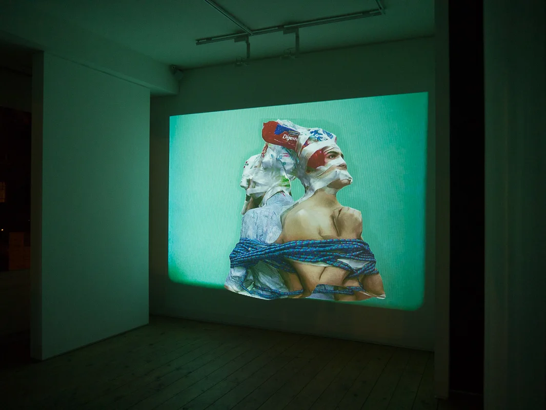
Charles Richardson: Rehearsal After Dark


Visual artist Charles Richardson’s latest work is a continuation of his video installation Rehearsal that won the 2014 New Sensations Prize by Saatchi. Richardson has been hailed as one of the UK’s most talented new artists.
Rehearsal After Dark uses a 16mm projection showing the 3D torsos of two figures. The images, distorted and blurred, are layered with bright plastics and other objects. The work flickers on a bright background creating a virtual space. Richardson says he finds ‘the realm of real taken into a virtual space a very interesting proposition’ rather than limiting to solely the virtual and vice versa. The videos are accompanied by eerie piano music that twists the view of the images, creating an audio/visual, surrealist heaven. His work is a good reflection of the current wave of ‘post-internet’ art, highlighting what you can create with modern technology with messages showcased through light creative pieces. As a movement, there always feels like a certain level of irony accompanying it, with a mockery of the digital age. Youthful artists are targeting what they know and the use of video art is ever growing, as shown here, making unique and interesting work with the programs available now, Richardson’s work is a prime example of this.
Rehearsal After Dark will be showing 5pm-12am at Cabin Gallery, until 30th January
subtitleddreams.tumblr.com/

ANNA POGOSSOVA-Playful Master of modern still life
Moscow-born Anna Pogossova studied Fine Arts in Sydney. With a major in Photomedia and a flair for the waggish, Anna explores the dialogue between old and new, between still life and fashion.


Would you say your art is provocative?
Not intentionally no; my objective is more playful than provocative. The erotic collages for example, were made up of many fairly mundane landscape images and household fixtures. None of these are provocative in nature, whatsoever, until they are layered in a particular way to suggest bodies. Suddenly they become something of a more pornographic nature. I think that kind of thing is quite funny.
What is the common denominator of your work? Your concept, so to speak?
There is one underlying idea across my art practice, which is concerned with the experience of familiarity in fiction. This is something I observe closely throughout the process of creating an image, or while reading fictional works. I am always thinking about how it’s communicated and read in a way, which makes sense and triggers recognition, regardless of how fantastical the content might be. This is so, whether it can be attributed to the artist’s fluency in sign and symbol, which is learned and handed down, or if there are truly archetypal forms, which are created and understood, time and time again, intuitively.
And how does this manifest in your work?
Each body of work, so far, has focused on a particular iconography, where cultural snippets were abstracted and regrouped to create an identifiable narrative. I approach every series as a kind of experiment, hoping to reveal something about the nature of our collective imagination.
Could you talk a little bit about a recent piece and the inspiration, creative processes, material etc. behind it?
I had a very clear narrative and tone in mind for the H series images, which would borrow heavily from film, particularly science fiction. I imagined a fully realised world, with very specific scenarios and locations, which I wanted to execute (the shipping container in the middle of the road, the cinema, and the billboards), in which the identities of seemingly autonomous objects are embodied, to convey aspects of the human condition from multiple heterogeneous perspectives.
Most of the works needed to be constructed as small-scale sets, which were photographed in a studio setting, and later digitally composited with real-life landscape images collected during my trips overseas. I’ve built up a library of images of various landscapes and skies, which I often pull from to construct my fictional environments. I would generally shoot two versions of everything, one on medium format film and the other on a DSLR, depending on what kind of quality I am after.
Does your work have any connection with renaissance artists?
I identify myself as someone who only works with still life, but I’m always looking for loopholes within that genre, often asking myself questions like: “how can I make the body still life? What can I get away with?” There are some elements of my images, particularly in the Empires II series, which appear to be similar in composition to that of some renaissance artists. I was thinking about Old Masters paintings at the time, and was pulling out specific forms to include, which triggered associations with classical antiquity; the columns, clouds, statues and the shell vase, pictured in Venus, which instantly reminded me of Botticelli’s The Birth of Venus. As I moved further along in the process, it became more intuitive and less directly referential to any particular era or style. I was more interested in the types of imagery that I instantly responded to as having seen or experienced before without being able to pinpoint where.
And finally, what is the muse of it all?
The Moon.

MINNI HAVAS:The Photorealistic Helsinki Fashion Illustrator
Minni Havas’s illustration career begun evolving since she was a young teen, and later by attending the University of Art and Design in Helsinki. Known for her photorealistic aesthetic, not long after that she was signed by Pekka in 2008.


“I began illustrating already as a teen but more professionally all started after I was signed to Agent Pekka 2008. They contacted me and asked me to join after one of my friends showed them my illustrations. It was when I joined my current agency Pekka they made a selection of my work that defined my style more clearly.”
The main stimulus behind Havas’s work is fashion. “I would say my main inspiration behind my artwork is fashion... But it is more like the things i pick up from the stream (life, internet, friends, random stuff) and I want to make something original out of it. I would describe my art aesthetic in a pop, fashion, detailed, airbrush, playful style.”
Throughout her career, Minni was involved with clients such as Citroën, Diesel and BBH New York. However, currently she is focusing on working with smaller companies where she is able to have more creative freedom. “At the moment I work with small clothing companies that make mostly children's clothing. They give me a lot of freedom with the designs and its creatively a good challenge. Many ideas come from nature and pop culture phenomenons... Colors come naturally and I tend to have certain colors that I use like pastels.”
We asked Minni to describe one ordinary day at work: “Lets say I have to make a pattern design for my clients clothing collection. I usually have many ideas written down in my sketchbook and I try out some of them and send sketches to the client. They choose whats most relevant and interesting and I continue to make the finished piece from that. I draw elements like animals and scan them and continue on computer to make the pattern. One pattern takes about three days to make and I usually give some color options to the client.”
A lot of people in the art industry appreciate Minni’s sense for detail and colours. She has had many good responses from clients and completed interesting projects. What keeps her going is true passion, and love for what she does. “I started illustration quite young like 15 or something. I made some illustrations for magazines and books. Art has been part of my life since I remember. I have challenged my self over and over again to achieve the goals that i've set for myself.. Its a life long process.”
At the moment Minni lives in Berlin but says she’s absolutely in love with London. “I love how London is so versatile. Many interesting creative spaces. Helsinki is always my home but it was time to leave for new ideas and stepping out of my comfort zone. Helsinki feels too small sometimes and i like to be surrounded by life and space so in that sense Berlin is similar to London.”
Stella McCartney is Minni’s true fashion inspiration, and if she could be another artist it would be Jesse Auersalo. “In the future I would love to see myself working with maybe Stella McCartney because I love her design aesthetics. And now that I have done mostly pattern design id love to work with someone like her. If I could be another artist it would have to be Jesse Auersalo, I really admire his style and ideas... and I always wonder how he creates his work. Also, lately I have been really into rugs and textile design and I have many ideas concerning that. I would like to develop my skills further and continue to make the things I love. I’d like to work more and more with pattern design for interior and fashion design.”
I am Dora x LSFF: ‘Is it Peculiar That She Twerk In The Mirror?’
I am Dora is a curatorial initiative exploring how women interact and identify with one another through film


I am Dora is a curatorial initiative exploring how women interact and identify with one another through film. As a part of London Short Film Festival, Jemma Desai, founder of I am Dora held a panel discussion with Aimee Cliff (freelance music and culture journalist), Emma Dabri (writer and PhD researcher, exploring how mixedness has come to be gendered) and Grace Ladoja (photographer and filmmaker, including work with FKA Twigs) on how women portray themselves through music videos.
The discussion raised important questions about women and the current wave of feminism. With stars such as Beyonce promoting feminism, are young people being introduced to a watered down version of the issues women are fighting against or is the promotion a helpful push to reveal the problem? The complexity of modern feminism makes it harder to define, with some believing anything a woman does as a feminist act. However, any woman having to change herself to please someone or any woman attacking another, for expressing her own identity, is surely anti-feminist.
A large debate throughout was the sexual representation of women and if the sexuality a woman shows is powerful or submissive. An audience member noted that you can sell music and still be remembered without sexualising it. Legendary artists such as Annie Lennox are still remembered and applauded without having to conform to the music industry image expectations. However, nudity and sex can be used as a representation of their art, enhancing their work.
Nudity should be optional but not used as a selling point. Many young artists are being sexualised for record sales, with many people putting their image before their art. Sia’s recent decision, to not show her face and let dancers such as Maddie Ziegler express her identity, is a radical choice within the music industry, taking the focus away from image and truly showing her artistic ability. Her personal choice is bold and powerful and this anonymity being a popular choice for many wanting to avoid fame and be appreciated for their work. FKA Twigs was originally rarely pictured, with her first video Hide showing nude hips with a ‘boy flower’ covering her. Many people originally thought this was a male body and the nudity is used artistically, the image, as expressed by Ladoja, is not sexy, despite being sexual. Her confidence has grown across her career and she represents herself as being in control, always the focus of her own videos, such as Papi Pacify, the sexuality isn’t as highlighted as Twigs herself. There is a feeling of confidence and ownership when artists choose themselves as the focus. Aimee Cliff chose to show Nicki Minaj’s Lookin Ass music video, which she stated shows her ‘shooting an AK-47 at the male gaze’. Minaj’s general distaste towards the camera and self-love is emancipating , and women acting proudly showing off for themselves is empowering for any self-conscious woman to see.
The panel discussion took many turns and through watching the videos many issues of gender, race and feminism came up. I feel it would have been interesting to include male music videos and explore the comparison to see if it’s the industry sexualisation or the treatment of women encouraging this conversation. The discussion will be an ongoing one and will sprout many more topics and issues, however, it’s hard to judge a woman through her music videos. Self-expression is personal but how much control do you have when becoming successful?
Check out I am Dora for information on future film screenings

Conflict and Social Fracture: An Interview With Paul Seawright
Renowned for his astute aesthetic and known for capturing riveting scenes of conflict and war, Irish photographer Paul Seawright boasts an internationally acclaimed body of work

Renowned for his astute aesthetic and known for capturing riveting scenes of conflict and war, Irish photographer Paul Seawright boasts an internationally acclaimed body of work. Represented by Kerlin Gallery, Paul regards Dublin as his home base, though his work has also been featured in esteemed sites around the world. While his last solo show in Ireland was the celebrated ‘Volunteer’ exhibition in 2011, Kerlin Gallery is proud to present ‘‘The List’’, a series of new work by the artist. In anticipation of this exciting event, we sat down with Paul to discuss the background, process, and motivation behind this remarkable project.
In ‘The List’, your upcoming solo exhibition at Kerlin Gallery, you photograph neglected, abandoned, and overgrown locations across America. What inspired this choice in subject matter?
The locations photographed are drawn from the public list of convicted sex offenders after their release from prison. The laws on registration in the USA prohibit ex-offenders from living close to certain types of buildings – churches, schools, public parks, bus stops etc. Their address must be registered and made public on an online database – ‘The List’. These restrictions make finding a home in major cities difficult and unintended clusters of ex-offenders have emerged in the post industrial and rural towns of America’s rust belt. The locations in the photographs are a glimpse into that world.
‘The List’ is the third in a series of works produced in the USA. Can you briefly describe the first two, and, additionally, the relationship between the three?
My work has been for some years concerned with conflict and social fracture. For several years I worked on a series titled ‘Volunteer’, landscape photographs made at the locations of army recruiting stations all over the USA. They attempt to reveal how the wars in Iraq and Afghanistan are made visible in the States, particularly in those states in the south where the majority of recruits are enlisted. These are often the poorest parts of the country, with high unemployment and immigration. They are also the states with the highest number of fatalities in the war. The second project was also an examination of how America has represented and engaged with those wars in a domestic context. ‘Things Left Unsaid’ is a series of photographic works produced in television news stations across the USA. The technology of the TV news studio is presented as an allegory of modern warfare and develops Virilios writing around war, technology and mass communication.
So all three are connected by my interest in how these global issues are largely invisible in society, kept in a sort of half light, things we wish to forget about or distance ourselves from. The photographs prick the surface of that normality and open up a dialogue about those things that we find difficult to discuss or acknowledge.
Furthermore, as an Irish artist, what has attracted you to America?
I only intended making one body of work in America. I had made work in Afghanistan (Imperial War Museum commission in 2002) and wanted to make more work about the conflict without actually going back there. Also the involvement since 2001 of the USA in global politics has grown to enormous proportions and more than ever, decisions made in DC affect us all. After spending so long there producing work, other ideas and concerns presented themselves and the other series just evolved.
How long did ‘The List’ take to complete? What was the most memorable experience or location throughout the process of the project?
‘The List’ took 3 and a half years to complete – going for a month at a time twice a year. Some of the interactions with both ex-offenders and indeed those living next door to them were memorable. The work doesn’t take a position and the longer I worked on it the more blurred this became. At times I agreed with tight restrictions and am horrified at what I have discovered and at times I felt great sympathy for men who were trying to move on and rebuild their lives in circumstances that are almost impossible. More than once I would arrive at an address on ‘The List’ and the house would be burn’t to a blackened shell or windows would be broken or boarded up.
In 2011, you had another solo exhibition, ‘Volunteer’, also at Kerlin. How did you begin working with the gallery? How have your two experiences with the site compared with one another?
I’ve been working with the Kerlin for 20 years. They saw my work in a show in Paris in 1995 and offered me an exhibition.
In your work, you tend to focus on scenery and setting rather than on the people that would inhabit such space. Has this always been a preference of yours?
People are absent in almost all of my work. I’m essentially a social landscape photographer. Therefore the photographs are always about people without ever needing to see them.
In this exhibition, you additionally depict details of the various landscapes’ features, such as “plants, fences and water damaged walls.” Did the series’ subject matter inspire this decision?
The black and white detail images are from the gardens in many of the locations. I started experimenting with ways in which I could expand the narrative. The locations and landscapes of these dispossessed individuals were powerful and evocative places and I felt that when I was there working, but I still felt I needed something to represent the darkness of the subject. So literally I returned at night and made these images that could be seen as metaphors for the absent victims in the project.
And, lastly, in what ways do you hope ‘The List’ resonates with its viewers?
The whole idea of the work is to present a kind of surface normality, with a slight sense that there is something wrong about the place photographed. That was often the case in the early landscapes I made in Belfast, normal on the surface with a sense that there is something enormous and significant hidden beneath. I’d hope the viewer gets that in the pictures and that it helps question how we look at the places we inhabit. I also hope it creates some debate about the impossibility of redemption in contemporary society and the acceleration of unlawful behaviour in an electronic age.
‘The List’ is on view at Kerlin Gallery, Dublin, from 30 January through 21 March 2015, with an exciting opening reception on Thursday 29 January from 6-8pm!
LAW Studio takes over the creative direction of Brutus Trimfit
The Lives and Works (LAW) London based bi-annual Magazine established in 2011, has now been appointed as the new Creative Director for Brutus Trimfit.
Over the years, LAW has established a strong wordily self-reputation for their edgy aesthetic visuals and delivering a powerful brand message.
For the 50th Anniversary of Brutus, both of the companies will be working towards expanding the existing clothing range as well as developing a new SS16 collection which will mostly feature classic and statement pieces and include a limited edition collection to mark this special event.


Keith Freedman, the son of Brutus founder, explains why he’s excited for the collaboration: “LAW is a groundbreaking, multidisciplinary agency and a platform for some of Britain’s most creative youth. We have a shared vision of what constitutes British style and it is therefore extremely exciting to be working together with LAW.”

The 27th Annual London Art Fair
This week, the UK once again welcomes it largest contemporary art exposition, the London Art Fair, in Islington’s impressive Business Design Centre


This week, the UK once again welcomes it largest contemporary art exposition, the London Art Fair, in Islington’s impressive Business Design Centre. Featuring British art of the 20th Century, well-known work from established contemporary artists, and pieces by promising up-and-comers, this year’s fair is sure to offer an exciting look into the modern art world.
And, if the fair’s incredible art and buzzing atmosphere aren’t enough, this year, we here at ROOMS Magazine are excited to have our own booth – so be sure to stop by and even grab a free copy of ROOMS!
The 27th edition of London Art Fair takes place from 21-25 January 2015, at the Business Design Centre in Islington.

Hayden Kays & Benjamin Murphy: FREE ART
Benjamin Murphy will attempt to make this year’s Blue Monday a little less glum with a gift exhibition to be hosted at East London’s Lollipop Gallery.
On January the 19th, artists Hayden Kays and Benjamin Murphy will attempt to make this year’s Blue Monday a little less glum with a gift exhibition to be hosted at East London’s Lollipop Gallery.
Aptly entitled ‘EVERYTHING MUST GO’, the exhibition will feature a free raffle to decide which of the lucky attendees get to walk away with unique signed A4 illustrations by either of the two upcoming artists. Kays and Murphy conceived the exhibition as a means to thank their supporters while also directing a subversive gesture towards the money obsessed art world; they will be contributing 50 pieces each to the event at no cost.
Some guests expected to be in attendance include Matt Smith, The Kooks frontman Luke Pritchard, and Madness member Chas Smash.


Pop artist Hayden Kays is currently represented by Brighton based independent gallery No Walls and Cotswolds based Stow on the Wold gallery; some of his work also currently appears in Shoreditch’s Cock ‘n’ Bull gallery.
Benjamin Murphy is an artist who works primarily with electrical tape, and was featured at the Moniker Art Fair last October. A selection of his screen prints are set to be available soon through Shoreditch gallery Jealous.

JAVIER MEDELLIN PUYOU A.K.A JILIPOLLO
Javier Medellin Puyou a.k.a Jilipollo is an illustrator based in Mexico. His style is somewhat reminiscent of 50s pop art; infusing bright and contrasting colours into his work and taking inspiration from contemporary society but Jilipollo’s illustrations take on a much more distinctive vintage hue…
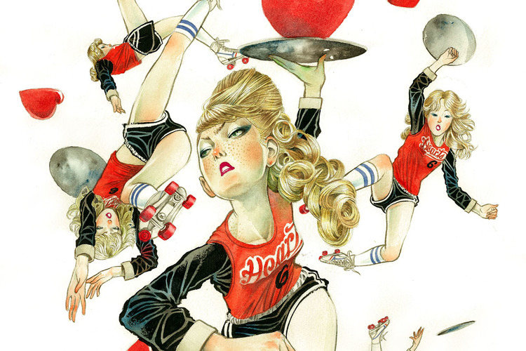


Jilipollo has worked under many aliases in his life, including ‘Big Polla’ and ‘Pimp Pollo’ when he used to DJ. Now he goes by the name Jilipollo and although he is a trained architect, it is the path of illustration that has captured the artist.
His work draws from Japanese and Mexican pop culture and also 70s vintage stylings. It is this fusion of inspirations which gives his illustrations such an individual look and feel. Predominantly utilising watercolour and ink, his art mostly revolves around women as their central subject, looking at their different moods and expressions. His pieces range in theme from fashion to the excess use of social media in society and he has even designed illustrations based upon the newest film of The Great Gatsby.
Creating illustrations for clients in advertising (like Coca-Cola), editorial and fashion, Jilipollo has experimented with diverse mediums, now selling not only prints of his illustrations but t-shirts, duvets and iPhone cases displaying his characteristic work.
Drawing from contemporary subjects, Jilipollo’s creations are vibrant, intriguing and hopefully he will continue to develop these subjects into these visual masterpieces.
jilipollo
All images © Javier Medellin Puyou a.k.a. Jilipollo