Five Outstanding Composers To Watch
The past year of cinema has been accompanied by some magnificent film scores, with the composers perfectly shaping the unforgettable images of 2014.
The past year of cinema has been accompanied by some magnificent film scores, with the composers perfectly shaping the unforgettable images of 2014 .
1. Alex Ebert
Lead singer and songwriter of Ima Robot and Edward Sharpe and the Magentic Zeros, Alex Ebert, won the 2014 Golden Globe for Best Original Score for his work on J.C. Chandor’s film All is Lost. Ebert has reunited with Chandor to work on A Most Violent Year. The stand out original track America For Me shows Eberts anger towards what is to be a good citizen while you also support negatives by being this. It’s interesting to see this personal song within the soundtrack for a film on corruption. The whole soundtrack is influenced by America in the 1980’s and is a character study of the lead Abel, creating a calming yet powerful outcome.
2. Mica Levi
The lead singer from Micachu and The Shapes this year stepped into film composing. She created A beautiful soundtrack for Under The Skin perfectly enhancing Scarlett Johansson’s seductive performance whilst also creating an unsettling feeling throughout. The track ‘Love’ is the perfect example of this, the slow paced beauty being contrasted by seemingly tense chords pulls together the desired image of the unusual.
Levi said of her own work that 'it's not necessarily going to sound very nice. It's supposed to be physical, alarming, hot.' This is definitely achieved through the use of the viola being able to contour the flow of the film. I would be interested in following Levi through her work if she did any further composing.
3. Justin Hurwitz
Hurwitz is a long time friend of Whiplash director Damien Chazelle, so it was no surprise for him to be asked to help create the soundtrack for the Oscar nominated film. The duo have previously collaborated on what started as a student film 'Guy and Madeline on a Park Bench'. From there their collaborative friendship has bloomed and Hurwitz is expected on Chazelle's next Singing In The Rain style feature. Hurwitz says planning for the soundtrack of Whiplash began even before filming which is unusual in film production. Hurwitz got to improvise and play his own music with fantastic big band pieces. The music is the glue to the film, without the perfect soundtrack it wouldn't be what it is.
A whole film score composed of a drum beat is an unusual route to go down, but for the Alejandro González Iñárritu masterpiece Birdman Sánchez has completed this major task. The constant drumming helps you see the theatre style of the film and confuses the line between reality and fantasy. Michael Keaton's performance is amplified by the beat following him round, showing his mental instability and the pressure he faces. Birdman was nominated for Best Original Score, but has now been disqualified due to the ratio of classical music to original score.
5. Jonny Greenwood
Radiohead lead guitarist, computer programmer, composer. Johnny Greenwood has an impressive resume behind him. His first work as a composer was on the documentary Bodysong, showing the story of human life through found footage. He's gone onto score many films thereafter. His most recent work is on Paul Thomas Anderson's Inherent Vice. This is the third time he has scored one of Anderson's films. The score was recorded with the Royal Philharmonic Orchestra and the soundtrack includes an unreleased Radiohead song. There are elements of the score which are dreamlike and subtle but the soundtrack itself contrasts this with funky beats. Greenwoods work is forever developing as he makes his mark as one of the greatest modern musicians.
A conversation with KAREN MARGOLIS from Rooms 16: Superluminal
Obsessively crafted circles are the central motif to Karen Margolis’ work. The circle, sacred to many, is riddled with symbolic meaning
Obsessively crafted circles are the central motif to Karen Margolis’ work. The circle, sacred to many, is riddled with symbolic meaning. In Chinese gai tain cosmology, the circle is noted as the most perfect geometric shape and, accordingly, represents the heavens above the square earth. In Native American tradition, the medicine wheel is a symbol of life, perfection, and infinites. Even hip-hop super-group Wu-Tang Clan, 5 Percenters, praise the purity of the circle. “As God Cypher Divine, all minds one, no question,” Masta Killa recites in Visionz. In hip-hop culture, the cypher refers to freestyle rap, where interrupting another man will break the cycle. According to the 5 Percenters and their supreme mathematics, zero (or the cipher) is the completion of a circle: 360 degrees of knowledge, wisdom, and understanding.


It’s easy to see how Margolis finds boundless inspiration and energy from the round wonder. Margolis repetitively creates the shape to map out the inner dialogues of the mind. Influenced by her psychology background, she is determined to show audiences how our minds work with her art.
Rooms: Would you mind telling us a bit about yourself?
What drives me as an artist is trying to find out who I am. I feel like I exist in a fluid state within the world around me, absorbing certainties of others with no absolutes of my own. I spend a lot of time studying people's behavior and writing about it. I'm influenced by Diane Arbus' observation of "the gap between what you want people to know about you and what you can't help people knowing about you". Her work made me hyper-aware of the unconscious signals we all send out and compelled me to look below the surfaces of others as well as myself, to see the reality; so, I am focused on trying to reconcile the inner and outer me.
Rooms: Your original field of study was in psychology. Does this come to play in your artwork?
Very much so. As a child I had a lot of phobias and had become somewhat obsessed with the idea that there is another sort of energy inside of me that I could not articulate. I had seen a movie called "Forbidden Planet" that featured invisible creatures from the id and that really got my attention. After that, I found some books in the library on the inner workings of the mind and psychology became a lifelong fascination for me. In college, I focused on the brain and Experimental Psychology, which dealt with processes that underlie behavior. I didn't know what I wanted to do with psychology and ultimately dropped out of Grad School. My route has been rather circuitous, but as an artist, I wanted my work to be about mental operations, to somehow capture the mechanics of the mind. Also, it couldn't be personal and had to be about the universal. I used myself as a subject because it was easier. As an avid diarist with over 20 years of journal entries and detailed narratives of my dreams, I thought that they might be good material to begin with and created a system to chart and encode my interior monologues by translating them into colored fields of dots. These compositions on paper are visual diaries, encoded interior monologues. Working from my journals, I translate feelings into colored dots. My rules are rather loose and, depending on the writings, I use one day or a week that I transcribe into colors. I simultaneously divulge and conceal my intimate feelings.
Rooms: The circle is evidently a key component to your work. It represents the molecule, a neurotransmitter and an Enso (the sacred symbol in Zen Buddhism). The circle brings science and spirituality together in your art. Is this how you manifest all your identities and roles at once?
I look for the connective tissue between the universe and the microscopic. I have found it in the circle. It relates everything. As the most basic component in the universe, the circle can be found in all of nature as well as in religious symbols, like a halo or the Sephirot in the Kabbalah. I practice Zen Buddhism and became interested in the Enso because it represents infinity, perfection, and totality. Layering my metaphysical beliefs with chemical reactions in the brain became the basis of my work. This way I am able to reconcile the physical with the metaphysical
Rooms: Is the process of creating the circles a form of mediation, personal psychoanalysis, or trephining?
Creating circles is immensely satisfying. In meditation, you focus on your breaths and clarity somehow emerges; as thoughts pop into your head you can see that they are not real and eventually you are not held hostage by your beliefs. My process has evolved into a synthesis of meditation, stream of consciousness thinking in which I work through obsessive thoughts, and physical pain, particularly when I am burning, which I metaphorically relate to trephining. I first learned of trephination (drilling holes into people's heads) when I wrote a paper chronicling the treatment of mental illness, and the torture of it stuck with me. It was repulsive and compelling.
Rooms: You had a series where you created circles with maps. What meaning did the maps bring to your work?
I'm drawn to maps because they offer an implicit promise that they will help you find your way. In my work, the maps act as proxy for the physical self. Additionally, they frustrate expectations of any help navigating through the world. I use maps to explore arbitrary destruction and regeneration in the journey of life. After burning holes in maps, I layer them on top of each other; passages to new locations are created in places that have been lost. I invoke into my maps my philosophy that in loss something new and unexpected is found.
Rooms: Are the colors you use to represent emotions based on socialization and culture or personal instinct of how they would look?
I wanted to develop a standardized flow chart of emotions and worked with the Pantone Color System to designate a color to each emotion and coordinate families of emotions to color families (tints, saturated hues and shades). I knew from the start of this endeavor that I would not be able to have an intuitively based color chart, but, where possible, I used expected colors for emotions, like green for envy. The charts are a continual work in progress; I add new emotions to the chart as they come into my consciousness.
Rooms: By playing with the circle, you affect its perfection.
I am attracted to perfection but celebrate Wabi-sabi, the Japanese philosophy around the beauty of imperfection, aging, and deterioration. I don't think people would be very interesting without their paradoxes. I reconcile oppositions within my work, "without darkness, there can be no light".
Rooms: Your work seems extremely meticulous. Are you a perfectionist in all other aspects of your life?
I do immerse myself in details; it is just how I operate in the world, it’s not planned or thought out. That said, I am anything but a perfectionist. My mind is such a roiling sea of chaos that obsessive as I may be, nothing is perfect and all is a compromise.
Nike set to launch self-lacing ‘Back To The Future’ shoes in 2015
It looks like science fiction is becoming a reality in 2015, as sports brand Nike is on its way to release the famous self-lacing shoe from the movie ‘Back to the Future II’.
The 1989 shoes will have a ‘power lace’ function that would automatically enable them to tighten themselves when feet are placed inside. This function would be triggered by a simple technology inside the shoe, either one determining the weight of a person or a button on the side which would instantly create the tightening effect of the laces around the shoe.
Nike yet remains silent, as they haven’t given the official release date of the shoes. As far as the price goes it is more likely to be somewhat affordable. However, experts predict that this launch will be a big ‘BOOM’ in the market.
Easy Riding with Action Bronson
Ahead of the upcoming launch of his album Mr. Wonderful, New York rapper Action Bronson released the single Easy Rider last summer much to the delight of hip hop lovers everywhere.
Sampling from Mazhar ve Fuat’s 70s psychedelic rock track Adımız Miskindir Bizim, Easy Rider makes for a great chill-out tune with the power to transport its listeners to a land of desert sunsets, warm evening breezes, and motorcycle road trips much like those portrayed in the track’s eclectic music video.
Speaking behind the scenes during the filming of the music video, the big man himself described Easy Rider as a culmination of all his thoughts and feelings. With help from photographer and filmmaker Tom Gould, we are taken on a crazy trip through Bronson’s mind.
Set for release on the March 24, Mr. Wonderful has become one of the most highly anticipated albums of 2015; with the likes of Mark Ronson and The Alchemist featuring as producers, the albumpromises to take Action Bronson from his current status as promising music industry up-and-comer to fully fledged hip hop deity.
LAW Studio takes over the creative direction of Brutus Trimfit
The Lives and Works (LAW) London based bi-annual Magazine established in 2011, has now been appointed as the new Creative Director for Brutus Trimfit.
Over the years, LAW has established a strong wordily self-reputation for their edgy aesthetic visuals and delivering a powerful brand message.
For the 50th Anniversary of Brutus, both of the companies will be working towards expanding the existing clothing range as well as developing a new SS16 collection which will mostly feature classic and statement pieces and include a limited edition collection to mark this special event.
Keith Freedman, the son of Brutus founder, explains why he’s excited for the collaboration: “LAW is a groundbreaking, multidisciplinary agency and a platform for some of Britain’s most creative youth. We have a shared vision of what constitutes British style and it is therefore extremely exciting to be working together with LAW.”
Whiplash: The Most Intense Cinematic Journey of the Year
Damien Chazelle’s new feature, Whiplash is one of the most thrilling films of the last decade.
Andrew Neiman (Milles Teller) is an aspiring jazz drummer under the critical command of conductor Terence Fletcher (J.K. Simmons). Fletcher pushes him as he works himself into a whole fury of blood, sweat and tears. The tension Whiplash brings will have any viewer out of breath trying to keep up with the emotions of Neiman. It’s cut to the pace of the beat keeping you constantly involved with the music and soundtrack. The cinematography brilliantly enhances the jazz look, making you feel fully immersed. Chazelle originally could not get the funding for the film, so instead made a short film version. After screening at Sundance, it won the short prize and he got the money to make the feature, now nominated for five Oscars. This includes the well-deserved best supporting actor for Simmons, his intense and torturous performance really pulls the piece together, constantly demanding your attention. You cannot look away. This is the type of film you really need to see in the cinema while you can, you cannot get the full experience of this in your own home, and what better way to support the film industry than watching one of the films of the year.
The 27th Annual London Art Fair
This week, the UK once again welcomes it largest contemporary art exposition, the London Art Fair, in Islington’s impressive Business Design Centre
This week, the UK once again welcomes it largest contemporary art exposition, the London Art Fair, in Islington’s impressive Business Design Centre. Featuring British art of the 20th Century, well-known work from established contemporary artists, and pieces by promising up-and-comers, this year’s fair is sure to offer an exciting look into the modern art world.
And, if the fair’s incredible art and buzzing atmosphere aren’t enough, this year, we here at ROOMS Magazine are excited to have our own booth – so be sure to stop by and even grab a free copy of ROOMS!
The 27th edition of London Art Fair takes place from 21-25 January 2015, at the Business Design Centre in Islington.
Spooky Black aka Corbin feat. Psymun at Birthdays, Dalston


An hour and a half before the show, I overhear the crowd queuing for Spooky Black and Psymun in front of Birthdays in Dalston, discussing how fast the tickets to his show sold out back in December – in a mere two hours, my friend tells me, as the entire line of casual yet cool people await in the cold to see Soundcloud sensation Spooky Black, now known by his real name Corbin. Some people have even come up all the way from Brighton and even Germany, and the excitement is palpable in the air, as this is one of Corbin’s only dates in Europe.
Corbin, an American teenager whose music video Without U went viral back in 2014, is, to put it simply, impressive on the stage. Rather than make use of superficial sounds and take detours in his music, he delves deep into the songs of his latest album, Black Silk, and his EP Leaving. Covering also Radiohead’s Weird Fishes/Arpeggi, Corbin delivers everything that his online presence promises – a bizarre, yet sensuous show that doesn’t care what you think. It is too busy being good to care.
Paired with the exceptional Psymun on the guitar, the atmosphere quickly shifts from warm and impatient to a haze of dancing bodies slowly entering a trance. Corbin also sings a song which he will ‘never release’, a mixture of a funky, groovy tune and chilled R’n’B – not exactly a departure from his dreamy, sleepy-like songs, but still quite different. It’s touching, gentle, fresh, new and probably one of the most promising sounds of the year.
This is an artist who leaves you thinking ‘this is what music should be about’ after every track: restless young people changing the face of music without artifices, bringing us back to the days of the dark’n’dirty gigs in the basements of dubious venues. A small and dark room of sweaty, scantily-clad bodies chanting desolate tunes and jumping up and down when hearing their favourite song come up (the crowd responded amazingly to every song, and the climax came when he finally performed Without U).
Corbin’s stage presence was perfect, and although unpretentious it came off as shy – he remained simple on stage, with no dramatic lighting or smoke, which turned out to be a smooth decision since it allowed him to deliver everything in his songs. At his peak, his performance was ethereal, anxious, perfect, thrilling, gentle and ferocious at the same time – it’s not Spooky anymore, it’s Corbin and we’re glad he’s owning up to his talent. His voice suddenly enriches all the possibilities of R’n’B and makes you wonder why he isn’t a much bigger deal – because he should.
Corbin’s gig was a haunting siren’s call for the deepest parts of us –the longing, the yearning, and the beautiful. Atmospheric, and slightly erotic (as all good music is), his ghost-like voice is complimented by the excellent Psymun, who, although always there, is sometimes not given enough credit. Corbin takes his music seriously –just the way he languorously clutches at the microphone, eyes half closed and pushing himself to deliver on certain parts of a song.
The show was definitely a must-see and one that remained flawless, and we cannot wait to follow his next steps – Corbin is heading in the right direction.
Hayden Kays & Benjamin Murphy: FREE ART
Benjamin Murphy will attempt to make this year’s Blue Monday a little less glum with a gift exhibition to be hosted at East London’s Lollipop Gallery.
On January the 19th, artists Hayden Kays and Benjamin Murphy will attempt to make this year’s Blue Monday a little less glum with a gift exhibition to be hosted at East London’s Lollipop Gallery.
Aptly entitled ‘EVERYTHING MUST GO’, the exhibition will feature a free raffle to decide which of the lucky attendees get to walk away with unique signed A4 illustrations by either of the two upcoming artists. Kays and Murphy conceived the exhibition as a means to thank their supporters while also directing a subversive gesture towards the money obsessed art world; they will be contributing 50 pieces each to the event at no cost.
Some guests expected to be in attendance include Matt Smith, The Kooks frontman Luke Pritchard, and Madness member Chas Smash.
Pop artist Hayden Kays is currently represented by Brighton based independent gallery No Walls and Cotswolds based Stow on the Wold gallery; some of his work also currently appears in Shoreditch’s Cock ‘n’ Bull gallery.
Benjamin Murphy is an artist who works primarily with electrical tape, and was featured at the Moniker Art Fair last October. A selection of his screen prints are set to be available soon through Shoreditch gallery Jealous.
JAVIER MEDELLIN PUYOU A.K.A JILIPOLLO
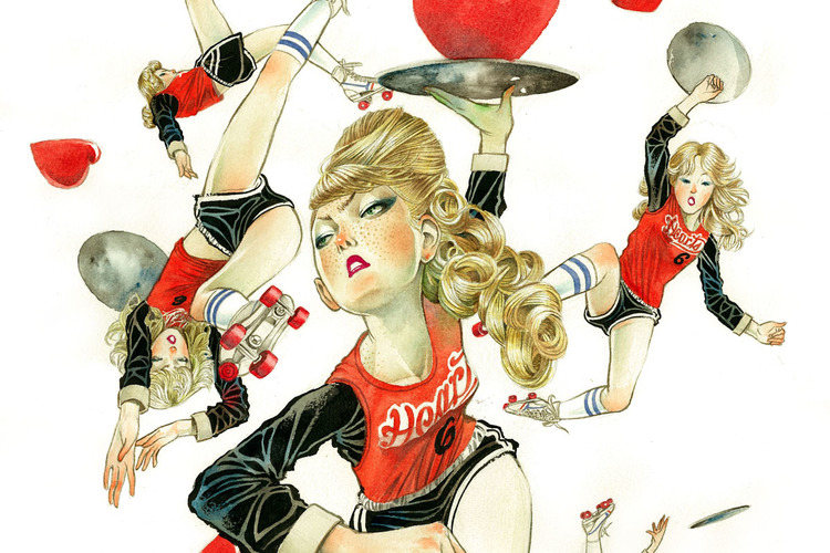
Javier Medellin Puyou a.k.a Jilipollo is an illustrator based in Mexico. His style is somewhat reminiscent of 50s pop art; infusing bright and contrasting colours into his work and taking inspiration from contemporary society but Jilipollo’s illustrations take on a much more distinctive vintage hue…
Jilipollo has worked under many aliases in his life, including ‘Big Polla’ and ‘Pimp Pollo’ when he used to DJ. Now he goes by the name Jilipollo and although he is a trained architect, it is the path of illustration that has captured the artist.
His work draws from Japanese and Mexican pop culture and also 70s vintage stylings. It is this fusion of inspirations which gives his illustrations such an individual look and feel. Predominantly utilising watercolour and ink, his art mostly revolves around women as their central subject, looking at their different moods and expressions. His pieces range in theme from fashion to the excess use of social media in society and he has even designed illustrations based upon the newest film of The Great Gatsby.
Creating illustrations for clients in advertising (like Coca-Cola), editorial and fashion, Jilipollo has experimented with diverse mediums, now selling not only prints of his illustrations but t-shirts, duvets and iPhone cases displaying his characteristic work.
Drawing from contemporary subjects, Jilipollo’s creations are vibrant, intriguing and hopefully he will continue to develop these subjects into these visual masterpieces.
jilipollo
All images © Javier Medellin Puyou a.k.a. Jilipollo
ROOMS 16 presents: JULIAN LORBER
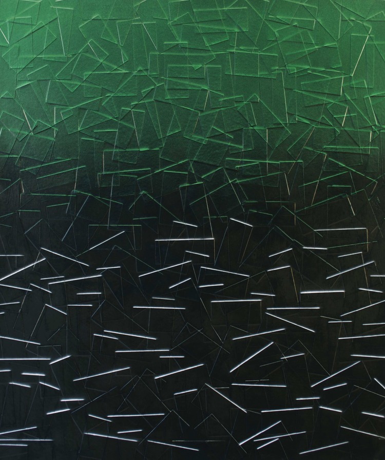
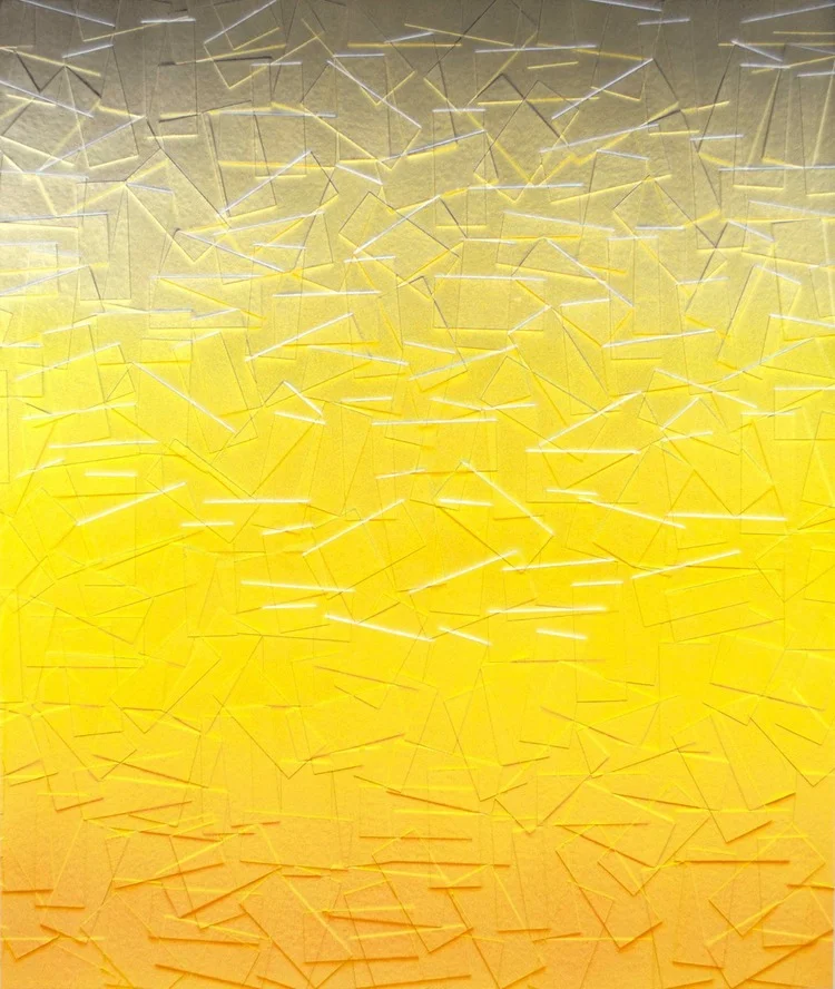
Soot accumulating on old brick buildings, paint and other media discarded by graffiti artists are not typically emblems of a burgeoning creative spirit; rather, the reminders of waste. But, artist Julian Lorber has a peculiar eye: he is also drawn to polluted skies, automotive coats, and cosmetics products. Artifacts of an over consuming society. In Lorber’s current series, he uses archival tape to create defiled landscapes.
Rooms: What does light mean to your practice?
In the work that I’ve been involved with for the past three years, I’ve used light to bring out illusions and visual hierarchies in the painted pieces. The work is painted so that depending on the type of light and the direction of the source, the artwork can have the faux-natural light of a particular time of the day. Part of the inspiration of these paintings was looking at the soot built-up on the edges of bricks and other architecture under certain light and thinking to myself, ‘that would be an interesting way to paint.’
The tape marks and application of paint in your work create an impressionistic quality. Was this intentional?
Mostly yes, and I’ve been resistant to saying my artwork is entirely abstracted. My work is mostly landscape or something objective and I do paint for a certain type of light, in a range of colors that might seem fugitive, for example, when I paint the shadows or soot lines with bright mixed colors. Now that I’m really thinking about it, some of these fugitive color combinations have been something that digital cameras can’t seem to capture. This might alienate viewers that look at documentation of art on the web, but the impressionist colours and styles had the same effect on their audience. Of course, seeing my artwork in person is profoundly better. It’s always interesting when viewers assume they are digitally printed at first, because of my painting methods, and then realize they are physically textured and painted.
In your latest series, as featured in ROOMS 16 Superluminal, you build your canvas with archival tape prior to painting. Has building up your canvas always been a part of your process?
Not always. I used to layer using just the drawing and paint to create tension and dialogue between the layers, but still retaining a surface focus. I was interested in the drawing under the paintings and what was underneath the exteriors presented around us. I presented these artworks in a show called the Real Illusions in Painting but I really felt there was something physically missing that I wanted to include. So I started cutting and layering with different media and eventually used archival tape.
Can you tell us a little bit more about the layers you create?
The physical layers are my way of creating my own surface or creating my own architecture on the surface. Falling bricks, bandages, or just the act of covering up with tape allowed me to make statements about surface and make walls that I could paint on. The physical tape also allowed me to build up colours on the edges in the same way soot accumulates on bricks and other surfaces, which was something I was observing and thought was interesting.
Your work draws from graffiti, urban, and man-made spaces, but also retains colors from natural properties. Color is also restrained on each canvas.
I enjoy color sensuality and the way it elicits an emotional response from viewers. The concepts in my work about the environment complement this response and create the dialogue that I’m interested in having. The dialogue being that one is looking at something that can be considered attractive, like a sunset or layers of paint on architecture, but at the same time there are positive and negative externalities present or being presented.
You control substances in order to create architecture of pollution. Is environmentalism important to what you do?
I care enough about the environment that I’ve dedicated years, and much of my work so far, to conveying ideas through my artwork about the subject. I think it comes down to intentions. Although I’m using materials that are harmful to produce, the fact is almost everything is: if you take an object like a brick, which was a good idea and intention, it just depends on what you do with it, despite the fact that if you go back far enough, it was probably made from Saudi, American or Chinese oil. The point is how you use those resources and what your intentions are.
Does living in Brooklyn affect how you look at decay and progress?
To a degree, yes. I’ve titled the project I’ve been involved with for the past few years Externalities because it is from observing the positive and negative occurrences from progress. Brooklyn is very industry-heavy, but because of people living so close to it, you can see its effects quickly, and also see the proactive response from lawmakers and scientists. Seeing street or outdoor/public art leap forward due to popularity has been another interesting experience. With that said, seeing outside of my town helps to keep perspective and to add nuances to the story I’m trying to tell. I often look at LA, China, and now Houston.
What sci-fi story does your work tell?
It’s dark humor. A story that’s about living with, and relying on, a system that is harming us. We have to look at this story in a type of light which is beautiful, and that pleases us so we can focus, all while knowing, and denying the truth, that we are not only part of, but also responsible for, this coexistence.
Check out Julian Lorber’s work in our current issue ROOMS 16 Superluminal
Undeniably Urban: Cartography Meets Street Art at the Somerset House
This month, London’s Somerset House explores new territories with its highly anticipated show, Mapping the City.
This month, London’s Somerset House explores new territories with its highly anticipated show, Mapping the City. Forgoing the traditional representations of exhibitions past and opting instead for a more modern focus, this exhibition features the work of over 50 street and graffiti artists – some emerging and some already on the map, like Cept, Shepard Fairey, Swoon and Aryz – and offers a diverse and contemporary look at the antiquated art of cartography.
Executed in collaboration with dynamic arts organisation A(by)P, the locations conveyed in Mapping the City span myriad cities, countries, and continents. Though varied in nature, the selected cities have not been arbitrarily chosen; the artists were asked to render their own interpretations of the cities they call home. Additionally, due to the unique style of each artist, each map differs in artistic approach and aesthetic preference. Spanning myriad media – predominantly painted works on paper and digital pieces – and ranging from realistic depictions to the abstract, the maps presented in Mapping the City offer a unique – and highly artistic – trip around the world.
Mapping the City embarks at the Somerset House on 22 Jan 2015 and is on view until 15 Feb 2015. Bon voyage!
On our radar: 5 new albums to look forward to in 2015
By AC Speed
Panda Bear - Panda Bear meets the Grim Reaper
Release date: 13 January via Domino Recording Company
Although set to meet the grim reaper on a day some would call unlucky, this is one Panda that shows no sign of becoming the subject of anyone's endangered species list!
Co-Founding member of Animal Collective Noah Lennox, aka Panda Bear not only graced us with a truly enchanted EP entitled 'Mr Noah' in 2014, he also teamed up with French electro pop dance kings Daft Punk on the highly addictive song 'Doin' it right'.
Panda Bear finished off the year by releasing a tantalizing glimpse of things to come with the enigmatic single 'Boys Latin', offering a truly diverse and underground cult like sound. With such an original approach to his craft 'Panda Bear meets the Grim Reaper' looks set to become one of the most unique albums of 2015.
Rae Morris - Unguarded
Release date: 26 January via Atlantic Records
Born under the shadows of grim grey northern skies in 1993, Rae Morris started shining her musical light onto the world at just four years old by learning to play the piano. She followed a musically orientated education through college and moved to London in recent years being picked up by Atlantic Records along the way.
Morris released 'Under The Shadows' late last year which instantly brought her career into the commercial spot light. An ever present influence of 80s driven base lines can be heard throughout the latest offering and we can't wait to hear the full album to see what pop influenced wonders await.
Hyenas - Deadweights
Release date: 15 March via (self release)
A politically heavy hardcore band from Germany not for the faint hearted, Hyenas really are a pack of wild animals! Formed from the ashes of several disbanded punk bands in 2012 they've spent the last year storming around Europe leaving a trail of defiled scent like noise in every venue that allowed them in.
In true DIY punk/art style the group single handedly made a limited and numbered edition of their first EP released back in January of 2014 met with critical acclaim amongst musicians and journalists alike.
Highly anticipated album debut 'Deadweights' is set to be a complete game changer in the hardcore scene, one that will grip it's vicious teeth into your soul and will not let go.
Viet Cong - Viet Cong
Release date: 20 January via Jagjaguwar
Although the name suggests a group of war torn patrons from a Peninsula of Southeast Asia, this band of Viet Cong actually hail from Calgary, Alberta and seemingly don't embark on many holidays to Cambodia.
A post punk outfit that have individually been through their fair share of tragedy over the years released an ensemble of atmospheric and Joy Division inspired songs earlier
in 2014, drawing the attention of underground indie fans across the UK.
New single 'Silhouettes' offers an insight into the development of a band trying to find it's own eclectic sound of emotive yet atmospheric noise whilst drawing inspiration from great artists such as Interpol and The Velvet Underground.
Expect big things from the new Viet Cong album, not least a revolution in tonality and creativity.
Tame Impala -TBA
Release date: TBA 2015 Via TBA
Formed down under in Perth, Australia around 2007 Tame Impala shot straight to the top with their psychedelic release 'Lonerism' back in 2012. The offering of chilled beats, space aged electro synth sounds and melodic pop vocals quickly made this a cult classic amongst indie and house lovers around the world.
With only a few hints from their management team about the release we can only guess at what the new album has in store for us, one thing we do know for sure is that we can't wait to hear more from the boys down under.
Footprints: A Walk Through Five Decades of Style and Subculture
Beginning in France in the early 1970s when designer Jacques Chevallereau created the first 'jean boot’, influenced by the newly-vocal youth movement of the previous decade - Kickers has been a youth brand, synonymous with identity, central to the uniform code of one youth movement after another.
Student riots in Paris had demanded a fairer, more democratic society and the cultural climate, including the bold play Hair, expressed a desire for a never-before-seen personal freedom. Since its inception, the iconic Kick Hi shoe has been part of the culture and image of many youth movements - really gaining popularity in the late 1980s and early 1990s on the Manchester music scene.
The celebrated the brand which is recognised as a part of history - for its 40th anniversary, Jocks&Nerds and Kickers came to together to create a series of five films, which underpin the significance of the Kick Hi shoe, interviewing key protagonists from some of these movements.
We see Johnathan Joseph aka DJ Spoony talking us through the origins of the UK Garage scene, noting how “the real super notchers - the top dons” would have “loads of the little Kicker tags” visible, photographer Ian Tilton discussing the ‘Madchester' scene, photographer Gavin Watson discussing the rave scene of the mid-1980s, and Kevin Sampson noting how the boys wore blue and the girls wore red Kickers during the distinctive dress code which is regarded as the “casuals”.
Inspiration to Wear: The new designers to watch out for in 2015
2014 was an exciting year for the emergence of new talents on the British fashion scene.
2014 was an exciting year for the emergence of new talents on the British fashion scene. From grungy Portuguese label Marques’ Almedia’s raw-edged denim designs, to Faustine Steinmetz’s hand woven pieces, Lucas Nascimento’s knitwear, and Molly Goddard’s pink party dresses that took the catwalk by storm - 2014 brought a plethora of fresh innovative designers to the forefront of our attention, thanks chiefly to NEWGEN - the platform which is recognised as producing the stars of London Fashion Week.
Drawing on inspiration from the youth subcultures of the 90s, from the old i-D magazines and the normcore style of today, Marta Marques and Paulo Almeida - the Portuguese designer duo behind grungy label Marques’ Almeida, are the rising stars of 2014 on the British fashion scene - winning the Emerging Womenswear Designer at the British Fashion Award this year. “Obsessed” with the youth code of raw, effortless and young, the brands main concern is to create wearable and desirable clothes in a way thats fresh with their signature raw-edged denim and grunge spirit.
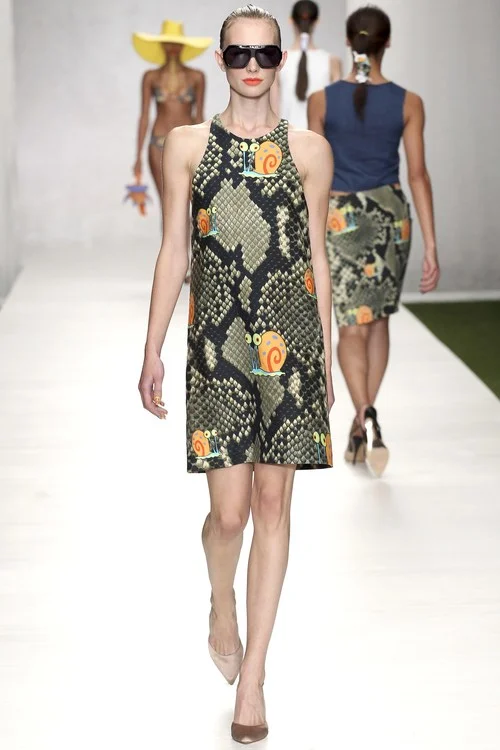
Since graduating the university of Westminster in 2012, 25-year-old Ashley Williams has taken the fashion scene by storm. Emerging this year as the runway success of Fashion East, pop culture enthusiast Williams’ camp, kitsch and lighthearted designs that see a melange of pop colours with cheeky graphics are more than just the face value, with ideas of great depth behind the creations. Her trademark pieces are the “Happy Ashley Print dress or big red knit jumper.”
Since graduating the university of Westminster in 2012, 25-year-old Ashley Williams has taken the fashion scene by storm. Emerging this year as the runway success of Fashion East, pop culture enthusiast Williams’ camp, kitsch and lighthearted designs that see a melange of pop colours with cheeky graphics are more than just the face value, with ideas of great depth behind the creations. Her trademark pieces are the “Happy Ashley Print dress or big red knit jumper.”
The Central Saint Martins graduate who has worked with Craig Green, Mark Fast and Alexander McQueen, and considers her greatest achievement as being a part of Fashion East, has made a name for herself this year for her unconventional well styled outfits. The London-based knitwear designer says her signatures are “handmade knits, PVC scribble embroideries, and wobbly shapes” with her trademark piece recognised as the “Powder pink PVC scribble jumper from SS14.”
Irish born “youthful and vibrant” unconventional womenswear designer Danielle Romeril brings “edgy and unconventional inspiration to street chic ready-to-wear with her uncanny visualization of style” through a focus on extraordinary fabric combinations and surface details. Her signatures are “details that are routed in craft but have been given a subversive, punk edge.” With her trademark piece “the humble t-shirt, but re-imagined in lace with leather detailing or laced with leather deck fringing.”
Extraordinarily self-taught through YouTube videos, Hong Kong born designer Ryan Lo creates clothes to make girls look “pretty, cute, gorgeous and sexy.” His trademarks are pink frocks, with his ideal client being “a woman who likes to spoil herself.” His signature aesthetic is “emotional. Grumpy. Lolita. Desperate. Selfish. Aggressive. Arrogant. Naughty. Sexy.”
The star graduate of the Central Saint Martins BA course in 2012, which led to a collaboration with ASOS, Molly Goddard is an emerging star of 2014 who is among the NEWGEN designers to receive presentation sponsorship. Inspired by the Spice Girls and Barbie, the newcomer boasts a whimsical, bold, yet fairy-tale-like aesthetic.
Thomas Tait
This years winner of the LVMH Young Designer Prize, 26-year-old Canadian born Thomas Tait is best known for his razor-sharp precision, immaculate tailoring, clever use of volume, and clean, almost clinical approach to design. He describes his signatures as “clean, understated structure with a focus on curve-linear silhouettes.”
Look me in the shoe. Meet designer CHIE MIHARA
A look inside the creative world of Spanish-based shoe designer Chie Mihara
A look inside the creative world of Spanish-based shoe designer Chie Mihara. Delving into the inspirations and stories that inform her unique designs, we reveal the complexity and depth behind her collections.


A household name for her practical approach to shoe design, whilst also maintaining a fun and feminine aesthetic - Brazilian born shoe designer Chie Mihara is every woman’s dream designer, for her comfortable yet creative foot furniture.
Working “in a man’s” industry as she describes it, in order to offer something different, the Alicante-based designer, who launched her shoe line in Elda, Spain, in January 2002, prides her brand on “footwear designed by woman for women.”
Architecture and craftsmanship is at the core the Chie Mihara designs. She believes comfort and design are married together - her designs tailor to the modern, active woman, who wants to look “attractive but without giving up comfort.”
Since her first collection in 2010, the designer has reflected an intrinsic vintage influence, predominantly from the 1970s, an era she describes was a “great decade of expressing oneself and breaking social barriers,” though she draws on various style inspiration, from 1930s femininity to 1980s humour. Her latest eclectic collection is inspired chiefly by Disney, with Cruella Deville, Mickey and Sleeping beauty particularly influencing her designs.
The iconic clean shapes, semi square toes, simple soles and flat bows widespread throughout Miharas designs, display her real passion for the 1960s. We see the 70s influence with the use of irregular lines and geometrical shapes in black and white, as well as metallic suede, perforated leather and platforms.
When creating her collections, Mihara draws on facets of her multicultural background, she believes the Brazilian influence informs the feminine details, the American influence contributes to the practicality and comfort, the Japanese influences the slightly more abstract approach to design, and the European crucially is reflected in the quality. She says: “when you talk about quality, you really are talking about Spain…there is no other place in the world that can make a decent level of quality.”
Each product is crafted with meticulous care, working in a mathematical sense, Mihara plays around with volumes until she is assured it provides optimal comfort. When creating, the designer likes to emerge into her own world of playing, enter into a free spirit and revert back to child-like ways of playing. Seeing each product in its own individual world, Mihara says she does not produce collections, but items.
She says: “creativity is the light of humanity, if there is no creativity there is no life… My personal view is that there's no need to suppress creativity because of social, economic and political factors, because art is the hope of mankind. Without art or creativity, there's no life! So, why limit our imagination? We should grow and prosper to the highest levels!"
The designer derives a variety of inspiration from museums, art galleries and her collection of books on pattern making, packaging design and illustrations that have nothing to do with shoes. She says: “sometimes you find a book with patterns, or flower patterns and it’s the colour combination you’re looking for.”
The truly unique designs emerge out of Mihara’s innovative techniques she practices to find the right compilation of colours. From placing small cutouts of the outlines of shoes on a magazine page to find the perfect palette, to playing around with pieces of leather she has cut in various shapes, to adding straps and ornaments to her feet - the exquisite footwear is born out of her organic creative flare.
Working with the philosophy that the instantaneous emotion felt when a consumer looks at her products is key, and the comfort, quality, and price of her handcrafted shoes are taken into account subsequently, Mihara focuses on channeling her fun loving energy into her shoes. She wants women to visually and emotionally connect with her shoes, which is why when working on each design she believes it is so important to feel genuine excitement which she can transmit that into the product, so women can receive her energy and “fall in love” with her creations.
She says: “if you put passion in something and you really feel that your heart is coming, and you feel so great about what you’re doing, in the end, that product maybe six or eight months later, maybe thousands of kilometres away - somebody is going to feel that same thing you felt.”
Graduating in fashion design at the Kyushu Design Gakkuin in Fukuoka Japan and accessories design at the Fashion Institute of Technology in New York, where she focused on shoes and handbags, Mihara said: “after a few months doing sculpture I really felt the need to have fashion with me, so I thought whats the combination of both things - and for me the answer was so clear - I can just remember now - shoes… and since then i’m so addicted into shoes!”
Mihara says she loves the concept of setting up a new children's line - a challenge she believes will be easy as her collection is “already very sweet.” She sees the Chie Mihara brand expanding and setting up new stores in Berlin and Paris, to add to her Tokyo store and outlet in Elda, Spain.
ROOMS 16 presents: LUCY LUSCOMBE
The Filmmaker Method
Lucy Luscombe's career is like cracking open a bottle of Moët et Chandon with the toughest cork, it felt stuck at first but once it's open, it just keeps gushing out in all her stormy glory, drenching her in a sea of projects that she comfortably swims though. Vogue, Channel 4, Nike and many other organizations are just a few of her high profile clients. Since the interview she's already released another music video for artist Juce! for her single “6th floor”, in which the banality of London lives of a few individuals are amplified and celebrated, in similar fashion to some of her other works including Tiny Ruins' video “Carriages” which features Channel 4 actor from “My Mad Fat Diary” Nico Mirallegro. The sentiment is very much reflexive in her works, it's invoked rather than shown or told. ROOMS exclusive interview with the 28-year-old Lucy Luscombe can be found in ROOMS 16 Superluminal
Some of my favourite tracks of 2014
Putting together a ‘top ten tracks of 2014’ is like trying to get a man pregnant – an impossible task
Putting together a ‘top ten tracks of 2014’ is like trying to get a man pregnant – an impossible task. So instead, we give you some of the things we found titillating this year. In no particular order:
Jack J - Looking Forward to You
Jack J, half of Pender Street Steppers and Mood Hut affiliate, stepped out on his own and delivered “Looking Forward to You”. A nod to a number of classic dance genres, the song’s easy drums, groovy bass line, and cooing vocals will have you wiggling your hips through an after party or bobbing your head smoking j at the beach.
Moodymann feat. Andres - Lyk U Used 2
Moodymann has been putting out fantastic house records for nearly twenty years. “Lyk U Used 2” is a soulful number that came from his self-titled LP that dropped earlier this year. Although the songs vocals tell the woes of a flame burning out, it really gets me in the mood… to dance.
FKA Twigs - Two Weeks
“Two Weeks” is a tantric song where FKA Twigs exudes empowered femininity. Twigs is seducing a man out of another relationship claiming that she can take better care of him.
Floating Points - King Bromeliad
Sam Shephard, aka Floating Points, dropped this lovely jazz-influenced house track via his label, Eglo Records. The song opens up with sounds of a crowd chatting (or a party?) and then shakes its head clear into loose drums, keys, and, squirming synths. Its dark and moody.
Pender Street Steppers - Openin’ Up
The Pender Street Steppers and other Mood Hut affiliates have placed Vancouver’s underground scene on the map. Their track, “Openin’ Up” is a hazy listen of something totally new.
Lnrdcroy - Sunrise Market (extended mix)
Lnrdcroy is another fantastic producer from Vancouver. “Sunrise Market (extended mix)” is an atmospheric dream. The track first appeared on his debut album on 1080p and later on Rhythms of the Pacific Volume 1.
Fatima - Do Better
It’s hard for a song to go wrong when you’ve got Floating Points heading production, Theo Pharrish assisting with writing, and, of course, Fatima’s lovely vocals. “Do Better” is the opening track from Fatima’s “Yellow Memories”. It was inspired by the pre-disco group 100% Pure Poison. People should start paying closer attention to this chick.
Seven Davis Jr. - Friends
Seven Davis Jr.’s “Friends” bursts with manic energy while remaining a pleasant and bubbly listen. Claps, frantic hi-hats, and Davis Jr.’s casual vocals make for a perfect weekend anthem.
ADLER GUERRIER, An Exploration of Sense

LIGHT
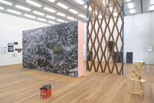
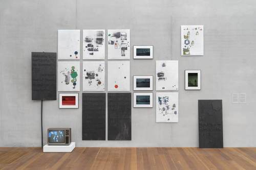
South Florida sun, windows filtering. I only think of light as in the visual. I don’t think of light as a weight, even though I probably should. What comes to mind is actual lighting and seeing what’s surfacing. Enlightenment comes into mind. There is a piece in my show Adler Guerrier: Formulating a Plot at Pérez Art Museum Miami that has a sort of light fixture as part of a theme. There is this lamp that is styled in the way of street lights in Paris. Gas lamps the way they were. When I saw that lamp and saw it on that building, I went back to just photograph that and it became a sort of item to make a series of work from and the whole thing had to do with the way adding light casts out darkness.
ILLUMINATION
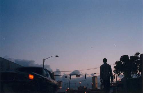
In my work, I tend to just use found lighting. I don’t add light, especially at night, which forces me to find places that have particular lighting where all the interesting physical elements of the landscape, architecture or plants, are well defined or defined by the lighting there. During the daytime, in South Florida, it is not a thing to think about so much. Only the direction of lighting and the time of day, clearly. At noon it is the brightest light. Deep shadows are not always a good thing. Everything is lit so everything kind of looks the same, whereas in the early morning it is moody. I like the way light is filtered through plants. I look for situations and places where light is as much of an element that shapes space, that shapes objects, as other physical attributes like concrete and architecture.
VISION
There are two words there that are tricky. One is “vision.” What I envision sometimes is not so much physical, is not so much the work. It tends to be a couple of layers around the work. Sometimes I want to make a work that makes me think about a,b,c and makes me feel x,y and z. I know these six things but a lot of times I don’t know what that looks like, don’t know how that is going to be made and don’t know how important those six things are. The idea of vision is only a blueprint to make an artwork and really, in making the work, I sometimes find that something I wanted early on, I totally discard or I have to put aside. So much of my practice is a playing of what I want to do and contextualising that on site and finding that the site has really good things to offer and bring those forth and then finishing the work. That’s how vision comes into light. The process needs to be grounded somewhere. It needs parameters that are more than me.
MIAMI
I have lived here for most of my life now. This is the place where I think, this is the place where there is ease in the process of creating and thinking and conceptualising. It is a sort of comfort that comes with being at home and clearly prize that more than anything else even though there is all the other factors about Miami, like light and temperature in the winter months, and even our diversity. I am always finding myself discovering new little things or new thoughts and knowledge that are connected to other people who come here and pass through. This is a dynamic place. I like it a lot.
COLOUR
Colours are important. I like colours. Colours tend to be the distinctive marks that make a place. The palette that we choose for ourselves, to either wear, or colour our homes, or to make artwork with, tend to be the specific things that indicate intention. Colours for me are indicators that make a thing a thing. The palette that appears in South Florida is not just specific to South Florida. Other places in the world use that palette, but here in South Florida, when we see them, there is something about the combination of here and the palette that’s like “oh yes, this is a Miami thing, this is a Miami moment.” It makes your day, it makes a building, it makes a moment more special. This is where colours come into play. Colours are part of a language that is the primary handle to connect with something. In Miami we can show colours. We see colours really well, I guess. It is a vital thing.
THEME
The themes in the show [Formulating a Plot at Perez Art Museum Miami] are about this idea of place as stage and where both, the individual and communal narratives are developed. The individual narrative is as much mine as the artist who is developing the work and the communal narratives are the secondary and tertiary stories that are shared by either the viewer or are implied by Miami being a place that is in the stories. Another theme in the show has to do with character and by that we mean individual figures that help develop works and that help with development of narration in the works. The flaneur is one of them. The story about Amiri Baraka is another. The short story of Tang is another one. The figures that appear in the political signs are a fourth. Those are all sorts of characters that become a beginning place to explore really interesting stories within the works. A third theme is geometric language as a marker of an objective tertiary point to narrative. By that we mean that it is sort of a language that we find, like the concrete blocks, like the political signs. Those are a language that serves other entities that are also background to bigger things; that by bringing them back into the show, they become platforms for other things. They become platforms for poetic gestures in my work, as much as they were a platform for either decoration or for political engagement.
GEOMETRICS
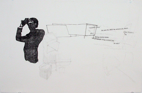
There are a few that flow into the work. I use geometrical language as an emphasis to mirror manmade language that is imposed on landscape. When we look at the landscape, architecture has straight lines and angles. Plant life does not always. We have flat lines like the line of the horizon, but usually the natural landscape is highly textured and highly complex. Geometric language tends to read as intentional and purposeful. This is where I tend to come into that space where we are seeing geometric language against a natural language and trying to decipher what was the original purpose for those geometric languages and how I can reuse them as well within the work for them to hold new meaning. I like the fact that geometric language is in a way a generic language. It is just rectangles or squares or circles or rhomboids. They do not necessarily hold true significance. I try to use them to add significance to them, so the “BLCK” works have a 12-sided polygon that I tend to use to connect to a history of protest, a history of descent. It becomes a marker, a repeated gesture. So even when I am making work that is not explicitly about that sort of consideration, by just introducing this polygon within a drawing or a sculpture, you hint that this is one of the considerations in the work.
INSPIRATION
One of my favourite films is “Two or Three Things I Know About Her” by Jean-Luc Godard. I really like that. I actually made artwork with images from the movie. The movie is, in a way, an ode to Paris. The “Her” is the city of Paris. It is Paris as a stage for political development. It is kind of hard to say what it is about. I also like “Alphaville,” also by Godard. That’s more of a sci-fi, also staged in Paris. In terms of books I already mentioned the short story “Tang” by Chester Himes. I like him a lot. I also like essays. I like James Baldwin. I like Ralph Ellison. Just yesterday I was reading a catalogue for Renee Green and I think I like her a lot. I like stories where I can participate in the development of a character in relation to their time and place and where characters are in that existential arch of becoming who they are.
Nature’s new reality: MARK DORF
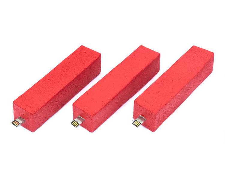
Now living in Brooklyn, Mark Dorf fascinates with his images of juxtaposition. Dorf captures stunning landscapes around the world through a lens of science and technology, “reorganizing” nature and its beauty. His collection //_PATH is currently being displayed in Barcelona’s Mobile World Centre for its New Realities Exhibition ending on the 17th February



Hi Mark, first of all where are you from originally and where are you living at the moment?
Hi! I was born in Laconia, NH, grew up in Louisville, KY, and now live in Brooklyn, NY.
When did you first become fascinated with science and nature?
Since I was a kid, I have always been someone who loves to spend time outdoors, so the interest and love for the landscape has a long history with me. It’s where I find myself to be the most relaxed and focused really, which is of course funny because I now live in Brooklyn. As for science, that too has been a long time interest for me. If I hadn’t gone to school for art I certainly would have studied physics or something of that nature. Additionally, my family has a history in science as well – both my aunt and uncle are marine biologists and my father works in medicine, so science has always been near me. Most of all I am fascinated in the ways in which we understand our surroundings albeit through math, science, or art.
Do you spend a lot of time outdoors? What have been your favourite landscapes to travel to and capture?
I try to spend as much time outdoors as I possibly can, but as I said before I am now living in Brooklyn so that results in a lot of travel. One of my favorite more casual places to explore and capture are the Catskill Mountains – they’re pretty easy to get to from New York City and are absolutely stunning in the summertime – pick a stream and go swimming! But I have to say that my favorite landscape that I’ve travelled to recently is that of the Pariacaca Glacial range in the Peruvian Andes – I just got back and I’m certainly still living in the glow. I had never spent time at such high altitudes (our camp was at nearly 15,000 ft above sea level) – the landscape, wildlife, and culture is so drastically different from that at sea level.
Your work juxtaposes nature’s beauty with science and technology. What intrigues you about the combination of these?
One of the most basic intrigues about this mixture for me is the contrast in age. If you want to take it back hundreds of thousands of years ago, the landscape is the sort of birthplace of all culture and is quite literally the visual language that humans have been looking out to for the longest amount of time. Taking technology into that context provides an interesting relationship of looking at the most ancient and most contemporary of languages simultaneously.
Your ‘Emergence’ collection seems to make use of digital tools and technology to enhance or enrich the natural landscape in some way. Where does the inspiration for your ideas come from?
In ‘Emergence’, I wouldn’t venture to say that was looking to enhance the landscape as much as I was compartmentalizing and reorganizing the landscape. All of that work was made while I was an artist in residence at the Rocky Mountain Biological Laboratory in Gothic, CO. While I was there, I was working directly with ecologists and biologists in the field helping them with their field research while additionally making my own works. What resulted was ‘Emergence’, which was a reflection and personal exploration of the scientific process as a whole. You will see when looking through the images that there is a common theme of breaking down and re-assembly. I was totally fascinated in the ways in which science collects data, analyzes it, transforms it, and then reassembles it into something that when compared to another set of data, can reveal information that is new or that you had not seen prior: the idea that the whole is, or could be, in fact greater than the sum of its parts.
Do you think your work reflects a growing trend in the combining of art and technology? Is this the future?
I think that technology’s presence in art will do nothing but grow as it becomes more and more present in our every day life. As technology becomes more accessible, artists will of course find some means of using it and taking advantage of its possibilities.
//_PATH is currently being displayed in the New Realities exhibition in Barcelona. What ‘new reality’ do you hope to create in your works?
In my recent works I wish to address the larger older world, the landscape, in the context of the contemporary mindset that is situated in science and technology. Think of it as the difference between looking at a Renaissance painting today versus a Renaissance painting when it was made: today we look at composition and light in context of a world that can stop time through photography and replay it through video. When that painting was made, this perception was not even fathomable thus their perception of the work was inherently different. I want to create a reality that examines how science and technology have changed the way in which we see and experience the world around us.
In January Mark will be part a two person exhibition in Brooklyn’s Outlet Gallery with Julian Lorber. Dorf’s “Emergence” collection will be displayed alongside Lorber’s “Externalities”.
PATH is currently being displsyed in Barcelona's Mobile World Centre for the New Realities Exhibition curated by Alpha-ville ending on the 17th February.


