Michael McIlvaney: beautiful serendipity in street photography
Subordinate
The daily collisions between one's inner private self and the everyday reality of urban city living, form part of a project intended to explore the metaphors associated with this tension: vulnerability; alienation; subordination; fear; threat; isolation; infringement; intrusion, as well as the tripartite relationship between victim, perpetrator and image maker. The series calls into question the photographer's participation: whether as documentarian, witness, narrator, facilitator, voyeur, conspirator or a combination of these roles. Ultimately this project is about this threefold dynamic.
from mikemcstreet
Collision
The city encounters record temperatures. The glass and steel of the latest structures reflect the light and magnify the heat causing distress and anguish to the city's inhabitants. When the natural and created worlds collide things get uncomfortable. A passerby approaches: "Do you know the news today?" "No" "It's the same as yesterday! The world is careering toward a climate apocalypse. Didn't you know? And you just stand there. Taking photographs. Do something man. Something needs to be done!"
from mikemcstreet
Memoirs of a gaze, the portraits of Carole Pueo
Carole Puéo is a painter with a passion for literature and music. She nourishes her reflection and her painting with a double curriculum as a visual artist and an art historian. She has studied feminist art and gender studies.
Life, Love and the Galaxies: Colouring with Natalie Foss
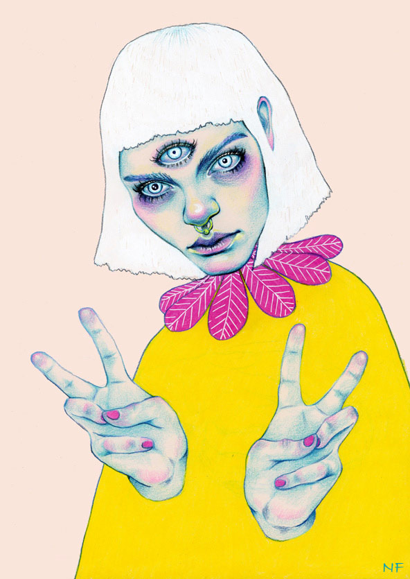
Norwegian illustrator Natalie Foss’ out-of-this- world portraits and pictures are an exploration of the delicate intricacies of life, love and the galaxies in which all of these beautiful things transpire
Perfecting an aesthetic that successfully communicates feeling and expression through coloured pencil on paper, Norwegian illustrator Natalie Foss’ out-of-this- world portraits and pictures are an exploration of the delicate intricacies of life, love, and the galaxies in which all of these beautiful things transpire.
Frequently juxtaposing bright, contrasting colours with brooding and turbulent subtexts in her work, Foss skilfully creates images that linger long after they have been viewed. From an exploration of the life of an animal outsider in The Urban Shadow to Addiction, an allegorical work depicting the similarities between love and drug addiction, Natalie’s work exhibits an urban edge and youthful cool, no doubt attributable to the various subcultures from which she derives inspiration.
After completing two years of study at Norway’s Strykejernet School of Art, Natalie went on to achieve a BA in Illustration at London’s Kingston University. Although currently based in her hometown of Oslo, prints of Natalie’s work are available for sale on her website; she is also an artist featured on Print All Over Me, an independent website dedicated to the production of original clothing items that ships all over the world.
Working on commission, one of Natalie’s recent projects includes a poster and t-shirt design for New York five-piece pop band Lucius, an undertaking which exemplifies the illustrator’s ability to seamlessly lend her style to a wide variety of subject matter.
Natalie Foss’ name can proudly be included alongside the likes of Hattie Stewart and Lizzie Stewart (no relation!) on the growing list of outstanding talent in the contemporary global art and illustration scene.
Natalie Foss
Joanna Piotrowska’s Other Family Albums
Polish photographer Joanna Piotrowska creates intriguing staged images, deeply embedded with meaning
Winner of the MACK First Book Award in 2014, and among one of three winners for the first Jerwood/Photoworks Awards this year for FROWST - the unsettling and uncomfortable familial inspired album - Polish photographer Joanna Piotrowska creates intriguing staged images, deeply embedded with meaning.
“Interested in psychotherapies within the family structure, particularly focusing on the inequalities of power between individuals,” the London based artist who achieves her shots through experimentation, explored the oppressive and sinister side of family life in her thought-proving body of work, which was inspired by dance and performance and the German therapist Bert Hellinger, who is best known for his theory and practice of Family Constellation therapy.
FROWST captured intimate family scenes, including two adult brothers lying together on a Persia carpet wearing only white briefs, and black-clothing bodies of two embracing women, which as Mack write suggest the “atavistic overlap of mother and daughter.”
Working in black and white, as in her words it is related to the act of documentation, the photography is intentionally nostalgic for lost moment of happiness. The artist also often uses flash as she notes it “flattens the image, merges bodies with domestic interiors, objectifying them.”
Other projects using the medium include the honest series of portraits “Never is a long time” which featured in the winter 2014 issue of Dazed, capturing the “controlled chaos” and “defiant optimism of a Latvian rehab centre.”
Piotrowska’s works have been internationally exhibited in Ireland, Spain, Poland, Russia, France, Latvia and in the UK. The artist began her photography education in Warsaw in 2004 and graduated from the Royal College of Art in 2013.
This march she will be exhibiting at the photography and art gallery on the second floor of the Science Museum, London.
Fahamu Pecou: Challenging Masculinity in the Media
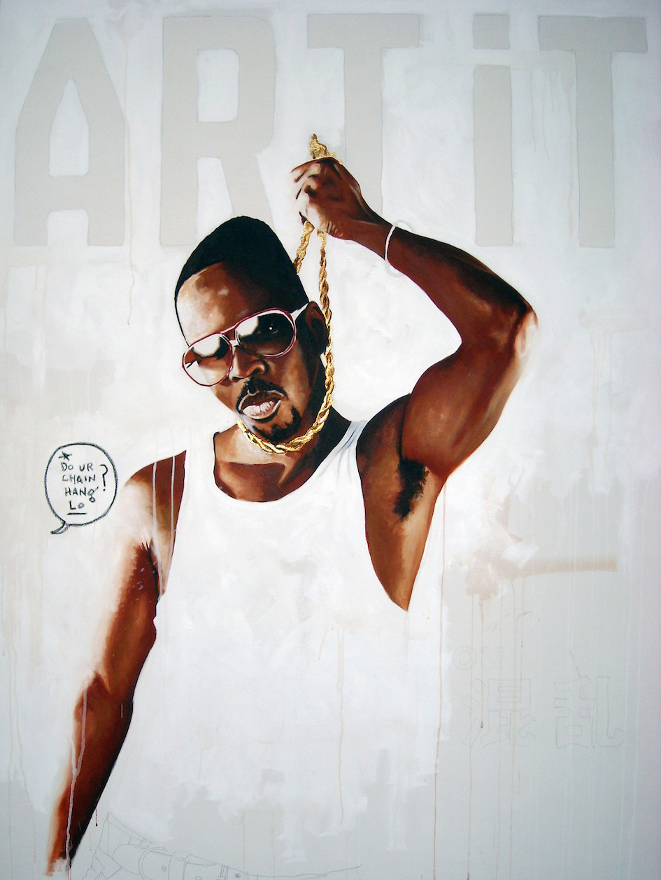
With his painting All Dat Glitters Ain’t Goals recently featured alongside those by the likes of Gustav Klimt and Jean-Michel Basquiat on the fictional set of new American TV show ‘Empire’, Fahamu Pecou is an artist well on his way to achieving similar status in the real art world
With his painting All Dat Glitters Ain’t Goals recently featured alongside those by the likes of Gustav Klimt and Jean-Michel Basquiat on the fictional set of new American TV show ‘Empire’, Fahamu Pecou is an artist well on his way to achieving similar status in the real art world.
Working primarily through the medium of paint, Pecou utilises his own image as a black male to comment on contemporary representations of black masculinity as it is commonly depicted in hip-hop music and entertainment, satirising the over-inflated egos, explicit wealth, and bravado in his work:
“I appear in my work not in an autobiographical sense, but as an allegory. My character “Fahamu Pecou is The Shit!” embodies the traits typically associated with black men in hip-hop and juxtaposes them within a fine art context. This character becomes a stand-in to represent the ideals and ideas of black masculinity and both the realities and fantasies projected from and onto black male bodies.”
Exploring this territory breeds questions of what happiness and fulfilment actually are, skilfully tackled in recent exhibition ‘Pursuit of Happiness’ in New York’s Lyons Wier Gallery:
Pecou’s work asks “Who are we minus the labels and attachments of popular culture? What does "happy" actually look, and feel, like?”
The artist’s most recent solo show was at the Museum of Contemporary art of Georgia, a series of studies exploring the ability of black males to succeed in modern society; entitled ‘GRAV•I•TY’, the paintings used the fashion trend of ‘saggin’’ as an allegory to comment on contradictions of mobility, access and agency for young black men.
Other notable projects by the artist include a series of conversations that took place in the spring last year; entitled interSessions, Pecou invited figures from the hip-hop community to dialogue with figures from the art world on issues on a range of subjects related to the arts and entertainment, and their impact on popular culture and society.
Also working as a performance artist, writer, and scholar, Pecou is currently pursuing a Ph.D. at the Institute of Liberal Arts Emory University in Atlanta.
Fahamu Pecou Art
Lea Colombo, A Self-Taught Photographer
Since relocating to her dream city of Paris aged 19, 22 year old South African native Lea Colombo has captured the atmosphere and essence of the fashion frontline, from London to New York, Paris, and Milan
Since relocating to her dream city of Paris aged 19, 22 year old South African native Lea Colombo has captured the atmosphere and essence of the fashion frontline, from London to New York, Paris, and Milan.
The self-taught photographer whose work “represents a vast collection of ideas, feelings and scenarios,” has brought us key moments and details from backstage and the runway since her debut in 2012.
As the resident fashion week photographer for Dazed & Confused, Colombo is the artist behind the authentic shots of models in the midst of backstage chaos. Famous images include the Jacquemus S/S14 show which caught models on a smoke break outside, whilst other shows have included Maison Martin Margiela, Jean Paul Gaultier, Alexander Wang, Jeremy Scott, Dior Homme, Prada, Lanvin and Balmain.
Her distinctive edgy cinematic photographs, which are saturated with colour, shot only using natural light, have earned her the recognition as one of the greatest young photographers in the fashion world, and ranked her at number 46 on the dazed 100 shortlist for redefining style and youth culture in 2015.
Inspired by “life itself, people, everyday surroundings and the joys of traveling,” Colombo’s photography stretches from landscapes, intimate portraits of models, skateboarders in Moscow, to haute couture fashion, often juxtaposing between chaos and stillness.
Based on her stunning backstage photography, the artist is highly in demand for editorial work. She has collaborated with the likes of POP Magazine, Elle UK, TANK Magazine, V Magazine, V Man and Interview Magazine, and says she is inspired by 90s fashion photographers Mario Sorrenti, Craig McDean, Nick Knight, and David Sims.
ArtEZ Academy of the Arts presents: Tessa Groenewoud
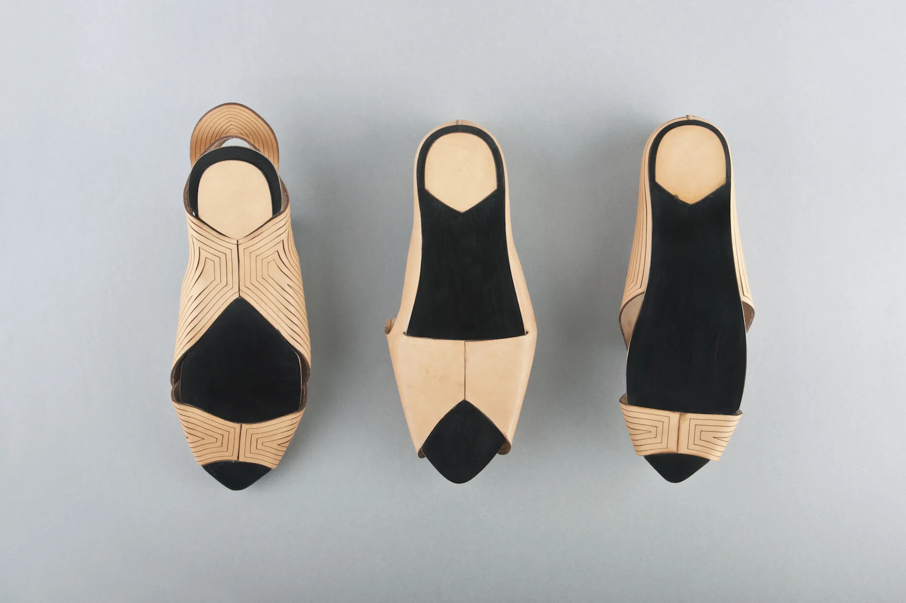
Tessa Groenewoud graduated from ArtEZ Academy of the Arts, Arnhem, specialising in footwear design
Tessa Groenewoud graduated from ArtEZ Academy of the Arts, Arnhem, specialising in footwear design. She has a strong interest in product design, material manipulation and attentions to detail, and is currently interning at United Nude, in China.
What inspired you to become a footwear designer?
Initially, I was interested in product design. I really like the aesthetics of product design, and then during my time at school I started becoming interested in shoes, and their functional properties.
What techniques do you prefer to use when designing?
I think the appeal of my shoes comes from the techniques I use, and the practicality of the piece. I have a fascination with form transformation, when something changes when you touch it or turn it inside out. It’s very important that it is not merely about the aesthetics – they come from the functionality.
What makes your work unique?
I think my work is minimalistic; I use a lot of graphic lines and industrial details, I feel this style makes me stand out.
You have worked with a variety of materials, one of them being leather. What was it about this material that attracted you to it?
For my ‘Craft the Leather’ project I used vegetable tanned leather, I used this material because it had the capability to be manipulated when wet. I folded the material into shapes, and because of the thickness of the material it held this particular shape, which worked extremely well for this project.
For your ‘Assemble’ project each shoe represents a technique based on the principle of connection, shape memory or compression – how did you incorporate these elements into your designs?
The shoe is about the connection between industrial parts, I thought I could use this to combine the shoe with the wedged heel. I really like the traditional leather, combined with a high-tech plastic material. This project was really about the construction of the shoe.
What techniques/styles would you like to explore next?
I’m really interested in injection molding and silicon printing. I think in the future I would really like to develop my own collection, and it would be interesting to develop these techniques.
What motivates you to design?
Nowadays, shoes are not only about the look of the shoe, it’s about different forms of producing shoes and how practical they are. It’s really motivational for me, as I am so interested in the practicality of shoes.
In Contemporary Conversation with ALICE WOODS
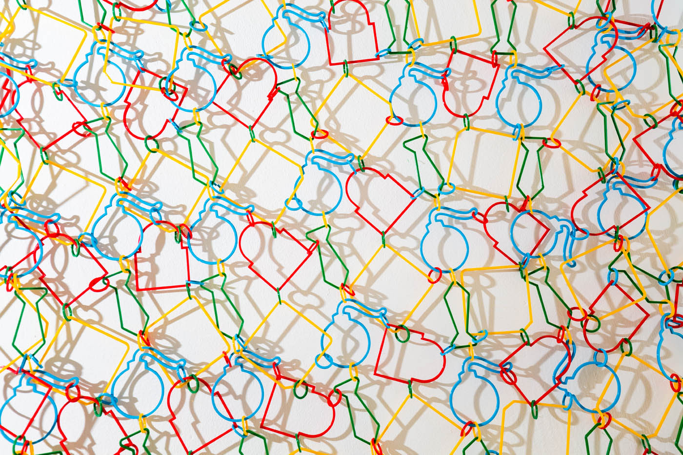
With a portfolio that is both aesthetically alluring and rooted heavily in social consciousness, it’s no secret that London-based artist Alice Woods does not shy away from bold materials, messages, and mediums. Hoping to “address our economic knowledge deficit and elucidate the relationships between economic decision making, cultural preferences and political transitions”, Alice uses in-depth research and meticulous metaphors to illustrate contemporary – and often controversial – issues. We chatted with the artist to find out more about her social stance, artistic process, and exciting plans.


Your body of work is clearly very diverse, spanning 3D sculpture, installation, video, and conceptual pieces. What is your artistic background?
My background is actually in music, and before art school I attended a music school for 5 years as part of my secondary education. This was an incredible experience, and one that taught me a lot about working under pressure and how to learn your craft. Although music will always be a massive part of my life, the particular nuances of the type of classical music I was studying are quite narrow and demand near perfection from the performer. In the end I think I turned to art as a sort of antidote to this way of working, and somewhere I could be much freer with my ideas and interpretations.
How did you come to work with so many different mediums?
I think it began right from my first experiences in art education. I was enrolled in the foundation course at Central Saint Martins and there I specialized in ‘Contextual Practice’ which focused on research led enquires. Because of this, the idea always came first and medium was determined by whatever was a natural fit. I have always continued this approach and try to not pigeon hole myself within any particular medium as a way of keeping my thoughts as free as possible, and to ensure I don’t place any preconceived limitations on my practice.
You note that, as an artist, you explore “the implications of financial & economic power structures”. With motifs spanning government surveillance, corruption within the stock market, and the proliferation of technology, this focus is extremely apparent in your work. What sparked this interest?
A desire to understand and reveal the workings of the financial sector was sparked by the onset of the 2008 global financial crisis, and through my experiences of growing up in North East England where the effects of the recession have been felt in full force. Amidst the rise of the Occupy Movement I spent time down at the encampment by St Paul’s and this solidified my interest in the implications of extreme income inequalities and how neoliberal policies filter down to the public whose interests are often in a very different arena from those in Westminster.
Did you explore these themes in your early work, too?
My early work was more concerned with value and worth, and then when the recession hit and Occupy gathered pace, these initial themes started to focus more on the nitty gritty of what we ascribe worth to in Western society and the implications that our particular form of capitalism has on communities and individuals.
While such concepts are rooted heavily in issues related to society as a whole, you also comment on the role of the individual with pieces like Sally (The Watcher) and the Al Capone experiment from your Google Trends series. I find your exploration of the relationship between society and the individuals that comprise it so fascinating. Can you touch on it a bit further?
I suppose I am interested in people’s perceptions of society vs. the individual. It is often quipped that we live in a very individualistic society, a sort of dog-eat-dog world where everyone is out for their own gains. But if you look around I don’t think this is actually the case; things like Occupy couldn’t happen if community and safeguarding opportunities for future generations didn’t matter to people. Maybe I’m just an optimist but I believe the ordinary person on the street will do the right thing if they have time to stop and think, often though modern life puts us under so many pressures (namely paying off debt of one form or another) that there isn’t time to really pause and take a moment to breathe.
Similarly, on your blog, you reference the relationship between the “powerful and the powerless.” Who do you see as powerful, and who do you see as powerless, and how is this conveyed in your work?
Within my work I try to take an objective outlook so I don’t explicitly acknowledge my personal opinions on who I think is powerful or not, but try to let the audience make up their own minds by introducing these forces within the fabric of the work. As much as I am interested in when power goes wrong I am also interested in when it works for the good of humanity. So exploring when power is used for inspirational leadership, for example, is as important to me as exposing elites who manipulate the system for their own gains.
Although the themes you explore are clearly quite grave, on the surface, your work appears jovial, as you often use bright colours and designate each piece with a tongue-in-cheek title. Can you explain this tendency toward juxtaposition?
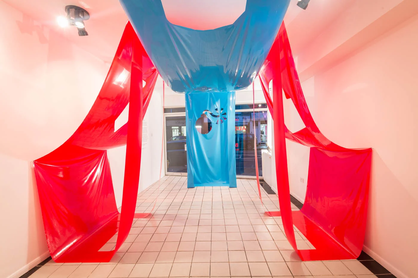
This was something that organically progressed over the last few years. I have always had a leaning towards quite seductive materials, i.e. ones that make you want to touch or have a particularly alluring finish, and this has developed into using their particularly enticing qualities as a visual trick to encourage engagement. So initially someone might be attracted inside an installation because of the materiality, but then upon entering, can hopefully begin to unpick what is going on beneath the surface.
How did you get involved with London-based gallery Light Eye Mind?
It was a happy coincidence! I had a grant to continue some work I had started on a residency in Berlin, which was looking at how the arts can be used as a tool to examine economic power structures, and had it in the back of my mind that I wanted to partner with a space to present the culmination of the work. Johnny Costi, a former Saint Martins student had put the word about that he was looking for socially engaged projects to host at Light Eye Mind, a space he co-runs with Goldsmith's graduate Alex Jeronymides-Norie and so the partnership was born. It was an absolutely brilliant experience working with them; there is a great team at the gallery, all of whom have a very positive ethos, and made the whole experience smooth and very rewarding.
And, lastly, what do you have in store for the future?
I am finishing off my final year at Saint Martins at the moment so beyond the degree show, I am working on a project funded by O2 looking at how social art practice can help address our economic knowledge deficit. I am also joining the team at Light Eye Mind gallery in North London where I had my first solo show. So watch this space for forthcoming exhibitions and events!
@alicejanewoods
Creating eye catching on screen: WEARESEVENTEEN
How would you describe your work and why do you do it?
We aim to create work that is visually beautiful but also means something, has a message or at least makes people think. We don’t always succeed of-course but our aim is always the same.
How do you bring your vision to light?
The creative process is always different depending on the project and techniques used - but there are common stages - i.e. We always clearly need to first work out what we are really trying to say or communicate, we then explore stylistically what aesthetic best coneys and reinforces that message, then its the classic process of storyboarding, designing, animating, audio, etc etc - the process isn’t 'rocket science’ and is always easier when there is a clear idea that we can refer back to and question whether all that we are doing is reinforcing that idea.
The trickiest part is coming up with good ideas that feel fresh and original.
By George Alexander
ANNA POGOSSOVA-Playful Master of modern still life
Moscow-born Anna Pogossova studied Fine Arts in Sydney. With a major in Photomedia and a flair for the waggish, Anna explores the dialogue between old and new, between still life and fashion.


Would you say your art is provocative?
Not intentionally no; my objective is more playful than provocative. The erotic collages for example, were made up of many fairly mundane landscape images and household fixtures. None of these are provocative in nature, whatsoever, until they are layered in a particular way to suggest bodies. Suddenly they become something of a more pornographic nature. I think that kind of thing is quite funny.
What is the common denominator of your work? Your concept, so to speak?
There is one underlying idea across my art practice, which is concerned with the experience of familiarity in fiction. This is something I observe closely throughout the process of creating an image, or while reading fictional works. I am always thinking about how it’s communicated and read in a way, which makes sense and triggers recognition, regardless of how fantastical the content might be. This is so, whether it can be attributed to the artist’s fluency in sign and symbol, which is learned and handed down, or if there are truly archetypal forms, which are created and understood, time and time again, intuitively.
And how does this manifest in your work?
Each body of work, so far, has focused on a particular iconography, where cultural snippets were abstracted and regrouped to create an identifiable narrative. I approach every series as a kind of experiment, hoping to reveal something about the nature of our collective imagination.
Could you talk a little bit about a recent piece and the inspiration, creative processes, material etc. behind it?
I had a very clear narrative and tone in mind for the H series images, which would borrow heavily from film, particularly science fiction. I imagined a fully realised world, with very specific scenarios and locations, which I wanted to execute (the shipping container in the middle of the road, the cinema, and the billboards), in which the identities of seemingly autonomous objects are embodied, to convey aspects of the human condition from multiple heterogeneous perspectives.
Most of the works needed to be constructed as small-scale sets, which were photographed in a studio setting, and later digitally composited with real-life landscape images collected during my trips overseas. I’ve built up a library of images of various landscapes and skies, which I often pull from to construct my fictional environments. I would generally shoot two versions of everything, one on medium format film and the other on a DSLR, depending on what kind of quality I am after.
Does your work have any connection with renaissance artists?
I identify myself as someone who only works with still life, but I’m always looking for loopholes within that genre, often asking myself questions like: “how can I make the body still life? What can I get away with?” There are some elements of my images, particularly in the Empires II series, which appear to be similar in composition to that of some renaissance artists. I was thinking about Old Masters paintings at the time, and was pulling out specific forms to include, which triggered associations with classical antiquity; the columns, clouds, statues and the shell vase, pictured in Venus, which instantly reminded me of Botticelli’s The Birth of Venus. As I moved further along in the process, it became more intuitive and less directly referential to any particular era or style. I was more interested in the types of imagery that I instantly responded to as having seen or experienced before without being able to pinpoint where.
And finally, what is the muse of it all?
The Moon.
MINNI HAVAS:The Photorealistic Helsinki Fashion Illustrator
Minni Havas’s illustration career begun evolving since she was a young teen, and later by attending the University of Art and Design in Helsinki. Known for her photorealistic aesthetic, not long after that she was signed by Pekka in 2008.


“I began illustrating already as a teen but more professionally all started after I was signed to Agent Pekka 2008. They contacted me and asked me to join after one of my friends showed them my illustrations. It was when I joined my current agency Pekka they made a selection of my work that defined my style more clearly.”
The main stimulus behind Havas’s work is fashion. “I would say my main inspiration behind my artwork is fashion... But it is more like the things i pick up from the stream (life, internet, friends, random stuff) and I want to make something original out of it. I would describe my art aesthetic in a pop, fashion, detailed, airbrush, playful style.”
Throughout her career, Minni was involved with clients such as Citroën, Diesel and BBH New York. However, currently she is focusing on working with smaller companies where she is able to have more creative freedom. “At the moment I work with small clothing companies that make mostly children's clothing. They give me a lot of freedom with the designs and its creatively a good challenge. Many ideas come from nature and pop culture phenomenons... Colors come naturally and I tend to have certain colors that I use like pastels.”
We asked Minni to describe one ordinary day at work: “Lets say I have to make a pattern design for my clients clothing collection. I usually have many ideas written down in my sketchbook and I try out some of them and send sketches to the client. They choose whats most relevant and interesting and I continue to make the finished piece from that. I draw elements like animals and scan them and continue on computer to make the pattern. One pattern takes about three days to make and I usually give some color options to the client.”
A lot of people in the art industry appreciate Minni’s sense for detail and colours. She has had many good responses from clients and completed interesting projects. What keeps her going is true passion, and love for what she does. “I started illustration quite young like 15 or something. I made some illustrations for magazines and books. Art has been part of my life since I remember. I have challenged my self over and over again to achieve the goals that i've set for myself.. Its a life long process.”
At the moment Minni lives in Berlin but says she’s absolutely in love with London. “I love how London is so versatile. Many interesting creative spaces. Helsinki is always my home but it was time to leave for new ideas and stepping out of my comfort zone. Helsinki feels too small sometimes and i like to be surrounded by life and space so in that sense Berlin is similar to London.”
Stella McCartney is Minni’s true fashion inspiration, and if she could be another artist it would be Jesse Auersalo. “In the future I would love to see myself working with maybe Stella McCartney because I love her design aesthetics. And now that I have done mostly pattern design id love to work with someone like her. If I could be another artist it would have to be Jesse Auersalo, I really admire his style and ideas... and I always wonder how he creates his work. Also, lately I have been really into rugs and textile design and I have many ideas concerning that. I would like to develop my skills further and continue to make the things I love. I’d like to work more and more with pattern design for interior and fashion design.”
ROOMS 16 presents: JULIAN LORBER
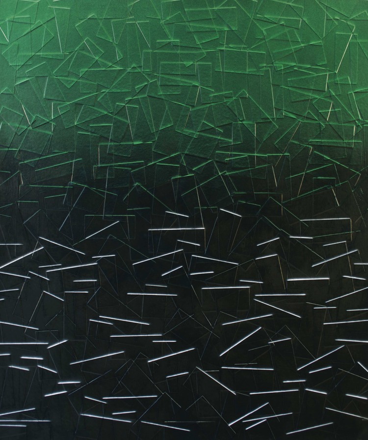
Soot accumulating on old brick buildings, paint and other media discarded by graffiti artists are not typically emblems of a burgeoning creative spirit; rather, the reminders of waste. But, artist Julian Lorber has a peculiar eye: he is also drawn to polluted skies, automotive coats, and cosmetics products. Artifacts of an over consuming society. In Lorber’s current series, he uses archival tape to create defiled landscapes.
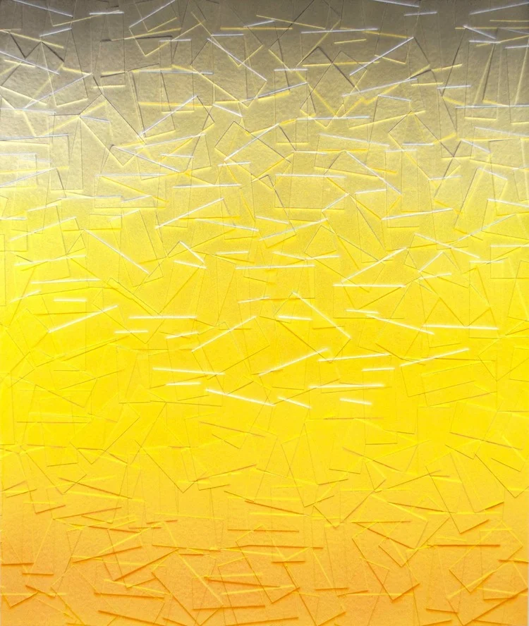
Rooms: What does light mean to your practice?
In the work that I’ve been involved with for the past three years, I’ve used light to bring out illusions and visual hierarchies in the painted pieces. The work is painted so that depending on the type of light and the direction of the source, the artwork can have the faux-natural light of a particular time of the day. Part of the inspiration of these paintings was looking at the soot built-up on the edges of bricks and other architecture under certain light and thinking to myself, ‘that would be an interesting way to paint.’
The tape marks and application of paint in your work create an impressionistic quality. Was this intentional?
Mostly yes, and I’ve been resistant to saying my artwork is entirely abstracted. My work is mostly landscape or something objective and I do paint for a certain type of light, in a range of colors that might seem fugitive, for example, when I paint the shadows or soot lines with bright mixed colors. Now that I’m really thinking about it, some of these fugitive color combinations have been something that digital cameras can’t seem to capture. This might alienate viewers that look at documentation of art on the web, but the impressionist colours and styles had the same effect on their audience. Of course, seeing my artwork in person is profoundly better. It’s always interesting when viewers assume they are digitally printed at first, because of my painting methods, and then realize they are physically textured and painted.
In your latest series, as featured in ROOMS 16 Superluminal, you build your canvas with archival tape prior to painting. Has building up your canvas always been a part of your process?
Not always. I used to layer using just the drawing and paint to create tension and dialogue between the layers, but still retaining a surface focus. I was interested in the drawing under the paintings and what was underneath the exteriors presented around us. I presented these artworks in a show called the Real Illusions in Painting but I really felt there was something physically missing that I wanted to include. So I started cutting and layering with different media and eventually used archival tape.
Can you tell us a little bit more about the layers you create?
The physical layers are my way of creating my own surface or creating my own architecture on the surface. Falling bricks, bandages, or just the act of covering up with tape allowed me to make statements about surface and make walls that I could paint on. The physical tape also allowed me to build up colours on the edges in the same way soot accumulates on bricks and other surfaces, which was something I was observing and thought was interesting.
Your work draws from graffiti, urban, and man-made spaces, but also retains colors from natural properties. Color is also restrained on each canvas.
I enjoy color sensuality and the way it elicits an emotional response from viewers. The concepts in my work about the environment complement this response and create the dialogue that I’m interested in having. The dialogue being that one is looking at something that can be considered attractive, like a sunset or layers of paint on architecture, but at the same time there are positive and negative externalities present or being presented.
You control substances in order to create architecture of pollution. Is environmentalism important to what you do?
I care enough about the environment that I’ve dedicated years, and much of my work so far, to conveying ideas through my artwork about the subject. I think it comes down to intentions. Although I’m using materials that are harmful to produce, the fact is almost everything is: if you take an object like a brick, which was a good idea and intention, it just depends on what you do with it, despite the fact that if you go back far enough, it was probably made from Saudi, American or Chinese oil. The point is how you use those resources and what your intentions are.
Does living in Brooklyn affect how you look at decay and progress?
To a degree, yes. I’ve titled the project I’ve been involved with for the past few years Externalities because it is from observing the positive and negative occurrences from progress. Brooklyn is very industry-heavy, but because of people living so close to it, you can see its effects quickly, and also see the proactive response from lawmakers and scientists. Seeing street or outdoor/public art leap forward due to popularity has been another interesting experience. With that said, seeing outside of my town helps to keep perspective and to add nuances to the story I’m trying to tell. I often look at LA, China, and now Houston.
What sci-fi story does your work tell?
It’s dark humor. A story that’s about living with, and relying on, a system that is harming us. We have to look at this story in a type of light which is beautiful, and that pleases us so we can focus, all while knowing, and denying the truth, that we are not only part of, but also responsible for, this coexistence.
Check out Julian Lorber’s work in our current issue ROOMS 16 Superluminal
ROOMS 16: The Fashtons The Cover Artists Uncovered
Photos by Alexandra Uhart
It’s that time of the year to join the festive reflections on togetherness. We here wouldn’t of course, resist revisiting the values of family when it’s novel and tantalising.
For ROOMS 16, we are welcomed to tap into the creative unity of The Fashtons – formed by husband-and-wife artists Ben Ashton and Fiona Garden. Ben being a figurative painter and installation artist, Fiona a music and fashion photographer: each is as adept in their own fields as in their collaboration.
I will always be drawn to the play of light on bone. The architecture of a face or body, as it stands, in light, whether made up or bare, discovered or intended, is what inspires me. It’s a constant wonder that in that interplay between light and shadow, I can capture the essence of a person – it’s an endless marvel.—Fiona Garden
I feel with every self-portrait I produce, I am constantly reminded of my own mortality and as a result I have become fixated upon the idea of legacy. I have plundered the history of painting, initially to teach myself to paint but after that I would always turn to the security of history to make my next decision.—Ben Ashton
For now, you can only read the eloquent and revealing exchange with Ben and Fiona in ROOMS 16, our hand-selected gift to you. And Merry Christmas for that matter.
ROOMS 16, out now


